Custom X axis in the power BI Line chart

Custom X axis issue.pbix (38.2 KB)


Dear Sir and DNA team,

I would like to request help for custom X axis label.
Like in the excel, we can do the adjustment in the attached pic which is the expected result.

However in the power BI, we can only able to choose the categorial, continues.

I am sharing the attached file for your reference. Please help and your soonest respond will be highly appreciated. Thank you very much in advance.

You need to have a good calendar table - that calendar should have a relationship in your data table to the relevant date, and then you can use columns from the calendar table for your reporting.

see @Melissa’s wonderful contribution to the community:

Dear Heather,

Thanks for your prompt help and the provided table is working as per the required Xaxis in complete dataset.

However the expected form is just to minimize the date label (Xaxis( without changing the trend.

For example, in the attached pbix (Start from 1Jul/ please imagine as 1May to align in the attached pic) : we can only see “Jul6, Jul13, Jul20, Jul27, Aug3, Aug10, Aug17” in the Xaxis WHEREAS excel able to see the date as per the attached pic. “many date showing 7 days per time”. As there is no adjustable function in the Line chart except categorial & continual, I am coming here and ask for help.

I am not sure it is possible or not so kindly asking for help from my mentors here.

Thank you very much. I am waiting eagerly for your respond, please?

The Excel image you are showing has dates of once per week - in this case, specifically the Friday of every week.

if you had a dedicated calendar table (which is a best practice for MANY reasons, including reducing model size), then you could have a column such as “Week Ending”, have it show the Friday date, and then use that as your axis - all values would aggregate to that.

However, if you want it to show the ebb and fall of amounts between the dates shown on the axis, and limit the dates shown, then your option is to use continuous. You can customize that view with a min and max date - but that gets more than a little fiddly.

see attached example - with a small calendar table that includes a couple of custom-sorted columns, and columns that you don’t want to use in visuals hidden.
Custom X Axis - eDNA solution.pbix (62.6 KB)

Dear Heather,

Thank you for the attached pbix, let me clarify a bit more by sending the attached screenshot:
As per checking provided pbix file, defined every week-7days group by sum but we are supposed to just show the value as it is (7days per times for 3months as per previous attached pic), _ means not sum, average or any of grouping so.

The main purpose is just to minimize only Xaixs in continuous. Yes, I observed we can adjust min, max date in the format painter but it will not fixed my issue. (as there is no single min/max date for my case).

Thank you very much in advance.

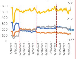
You’re wanting to preserve daily granularity in the line chart while controlling the density of x-axis labels. With core visuals, you’re limited by how the x-axis is handled. Categorical gives you full control over label frequency, but doesn’t respect time scaling. Continuous respects time scaling, but Power BI auto-fits labels and doesn’t allow you to set the density explicitly.

That lack of fine-grained control over tick/label density on a continuous axis is the core frustration here.

If you want full control, you can use Deneb with Vega-Lite. Here’s a template that keeps daily ticks but lets you control label rules with labelExpr:

{
  "$schema": "https://vega.github.io/schema/vega-lite/v5.json",
  "data": {
    "name": "dataset"
  },
  "mark": {
    "type": "line",
    "point": false
  },
  "encoding": {
    "x": {
      "field": "Date",
      "type": "temporal",
      "axis": {
        "title": "Date",
        "tickCount": {
          "interval": "day",
          "step": 1
        },
        // five examples:
        //  
        // show every 7 days:
        // 
        // "labelExpr": "toNumber(timeFormat(datum.value, '%j')) % 7 === 0 ? timeFormat(datum.value, '%b %d') : ''",
        // 
        // show only month boundaries:
        // 
        // "labelExpr": "timeFormat(datum.value, '%d') === '01' ? timeFormat(datum.value, '%b %d') : ''",
        // 
        // Every 7 days with an offset 
        // 
        // "labelExpr": "(toNumber(timeFormat(datum.value, '%j')) - 3 + 366) % 7 === 0 ? timeFormat(datum.value, '%b %d') : ''",
        // 
        // mondays only:
        // 
        // "labelExpr": "timeFormat(datum.value, '%u') === '1' ? timeFormat(datum.value, '%b %d') : ''",
        // 
        // 1st and 15th of each month
        // 
        "labelExpr": "(timeFormat(datum.value, '%d') === '01' || timeFormat(datum.value, '%d') === '15') ? timeFormat(datum.value, '%b %d') : ''",
        "labelPadding": 4,
        "labelOverlap": false,
        "labelFontSize": 10
      }
    },
    "y": {
      "field": "Sales Amount",
      "type": "quantitative",
      "axis": {
        "title": "Sales Amount"
      }
    }
  }
}

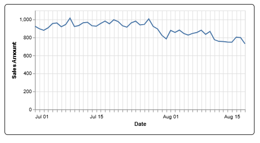
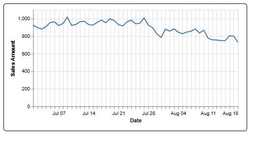
I gave a few different examples that would produce charts like these:

1st and 15th:

Every monday:

Add a Deneb visual to your report, drop in the Date column from your date table and the Sales Amount measure, then paste in the script. I’ve also added it to your working PBIX for reference.

Is that what you were hoping to accomplish?

Custom X axis issue-DEH Solution.pbix (2.4 MB)

3 Likes

Dear Sir HufferD,

Thanks a lot, this means a lot to my report however we need to customize to add the multiple line. I created by writing new script (kindly see in the attached pbix).

When I use it in the DENEB, no data in the line but there is data in the line chart and table chart for the same data. Would you mind to check it pelase?

DENEB line chart testing.pbix (2.3 MB)

Fold is the right approach, but you’re folding field names that don’t exist in the Deneb dataset, so the fold returns nulls and nothing draws.

You added [QCI16(TB)],[QCI17(TB)],[QCI18(TB)],[QCI19(TB)]to the field well, then renamed them by removing the first “1”. Deneb sees the renamed headers:

  • QCI6(TB), QCI7(TB), QCI8(TB), QCI9(TB)

Your spec folds the original names:

"fold": ["QCI16(TB)", "QCI17(TB)", "QCI18(TB)", "QCI19(TB)"],
"as": ["Measure", "Value"]

…but those columns aren’t in the dataset. Change that fold transform to use the exact field names shown in Deneb’s Data tab:

"fold": ["QCI6(TB)", "QCI7(TB)", "QCI8(TB)", "QCI9(TB)"],
"as": ["Measure", "Value"]

2 Likes

Dear Sir HufferD,

Thank you very much and now it resolve, only need to add the vertical dashed line which is not possible as far as I explored. Anyway, really appreciated and thanks again for your help :innocent:.

Warm Regards

Myat

Myat,

Glad you found it helpful.

You can add vertical dashed reference lines at specific dates. You just need to add a rule layer and define the conditions that identify the dates where you want the lines. Conditions can be anything you can think of, really, and they don’t need to mirror your ticks or labels. Like, every third Wednesday, or something like that.

If you’d like help building those rules and conditions, it may be worth opening a new topic on layering reference lines on an x-axis in a vega-lite spec.