Hello,
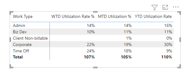
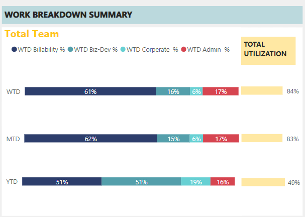
I have a problem where I have WTD, MTD, and YTD actuals for different categories.

I’ve slapped together a visual that looks like this:

I did this by layering a few different visuals on top of one another, but it’s sloppy and doesn’t work the way I want it to.
My question is: Does anyone know of a good visual where you can create a stacked bar chart with different categories in the y-axis?
Any insight is helpful and appreciated.
Devin
Hi @Devin_Solkov, I noticed you didn’t provide a PBIX file. Providing one will help users and experts find a solution to your inquiry faster and better.
A perfect initial question includes all of the following:
-
A clear explanation of the problem you are experiencing
-
A mockup of the results you want to achieve
-
Your current work-in-progress PBIX file
-
Your underlying data file (to allow us to go into Power Query if necessary to transform your data and/or data model – often DAX questions really end up being data modeling solutions)
Check out this thread on Tools and Techniques for Providing PBIX Files with Your Forum Questions
Not completing your data may sometimes cause delay in getting an answer.
Hi @Devin_Solkov, we noticed that you have not responded to our request last Sept 7. We are waiting for the masked demo pbix file, images of the entire scenario you are dealing with, screenshot of the data model, details of how you want to visualize a result, and any other supporting links and details. In case there won’t be any activity on it in the next few days, we’ll be tagging this post as Solved.
Hi @Devin_Solkov, due to inactivity, a response on this post has been tagged as “Solution”. If you have a follow question or concern related to this topic, please remove the Solution tag first by clicking the three dots beside Reply and then untick the check box.

