To my knowledge, there is no way to do this within the native visuals, but here are three alternatives I know of for how you could meet this requirement:
Hi @zeekstuarts , did the response provided by @BrianJ help you solve your query? If not, how far did you get and what kind of help you need further? If yes, kindly mark the thread as solved. Thanks!
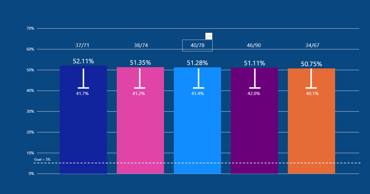
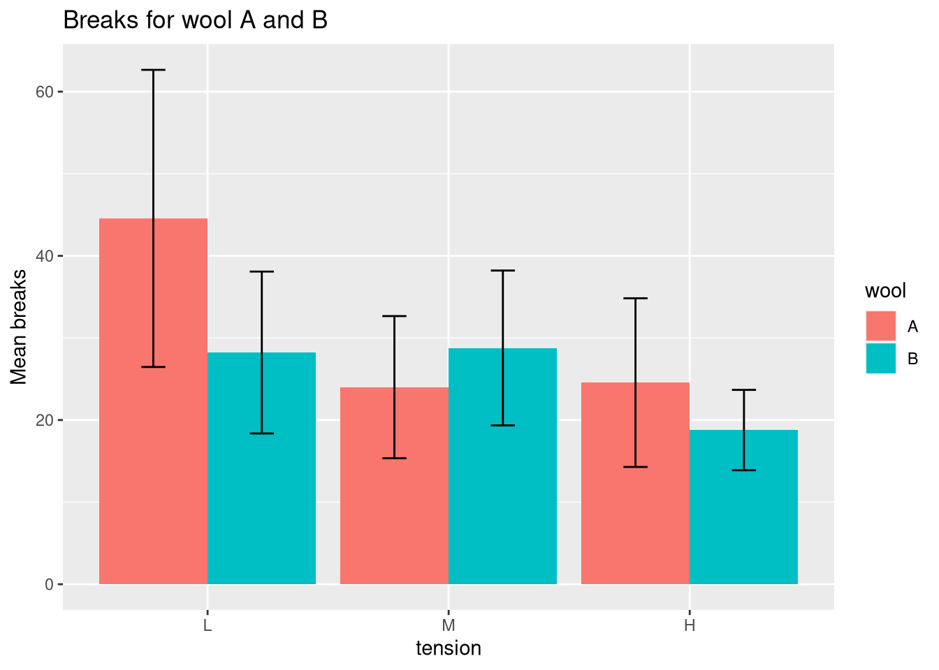
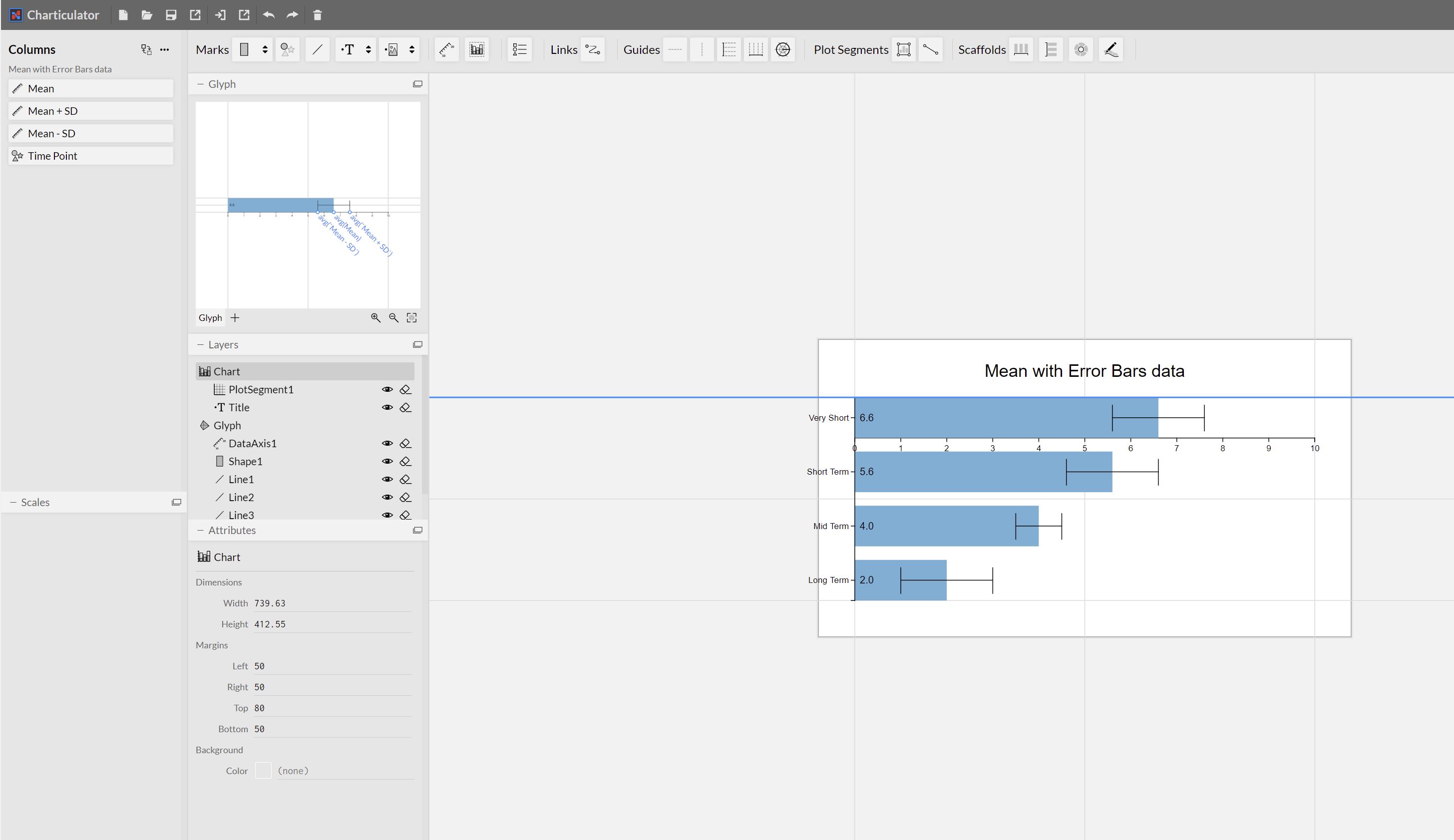
I’ve come across the same problem, and tried to recreate the Charticulator example from here: tutorial9.html (Bar Chart with Error bars)
but there’s a strange glitch.
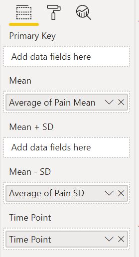
I am unable to place any value in the “Mean + SD” field well.
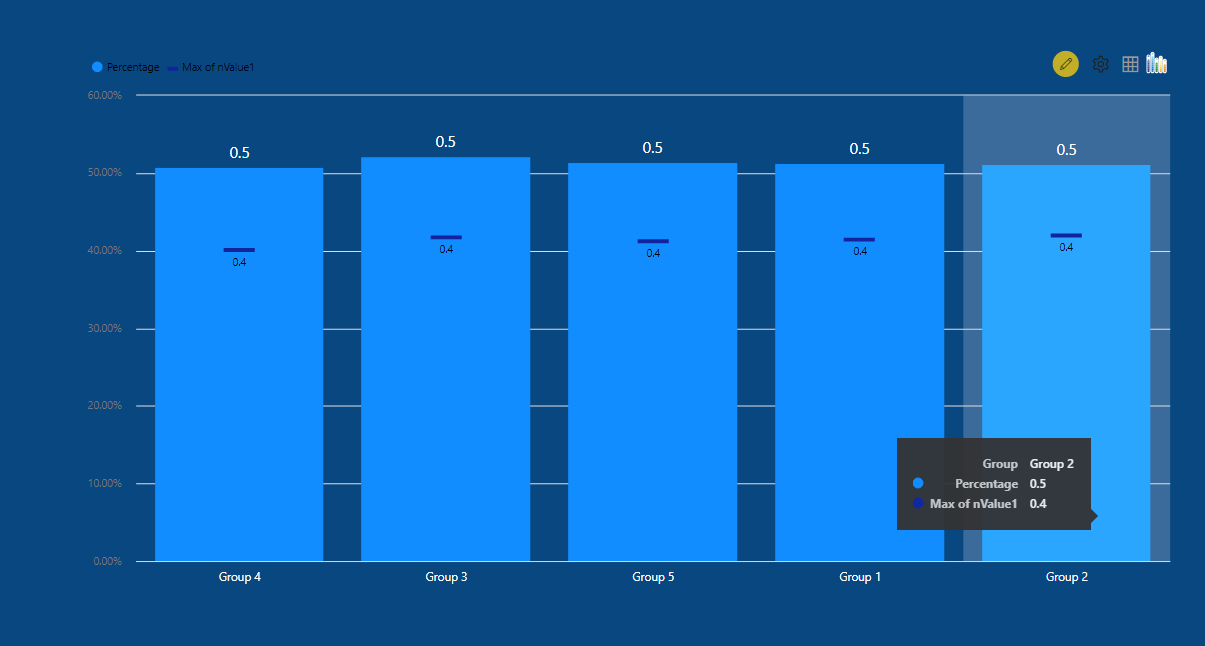
The available field wells are mean, Mean - SD, Mean +SD (along with Primary Key)
At first I thought this was because I was using measures (which calculate weighted means for these values), but I’ve also tried this using columns from the source table, and the same problem exists.
I have tried horizontal as well as vertical bars, and double checked each step from the tutorial, all to no avail.
I’ve attached the .pbviz file: and here’s a screen capture from both the final Charticulator output, and the available field wells: