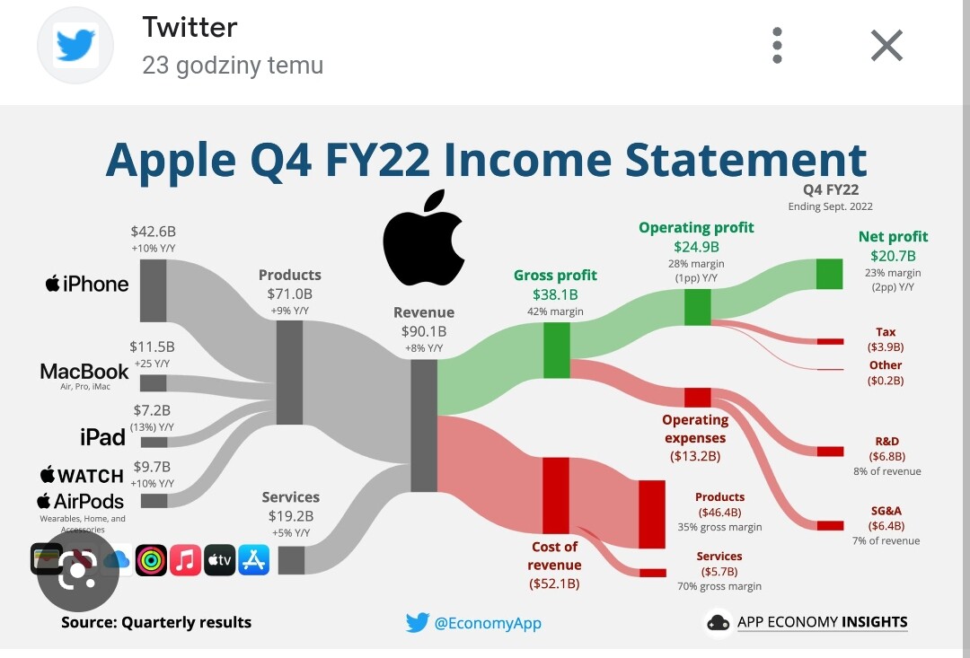
Hi, did someone implement a similar graph in power bi? Maybe someone has a template from a chartulator or other tool? I will be grateful for your help
[image]
Hi, did someone implement a similar graph in power bi? Maybe someone has a template from a chartulator or other tool? I will be grateful for your help
[image]
Not sure about Charticulator. Maybe Deneb. Also, check Sankey Diagrams. Although the data labels might be a challenge.

Hi @Harris,
Did the response above help solve your query?
If not, can you let us know where you’re stuck and what additional assistance you need? If it did, please mark the solution that helped you.
Thank you!
Hi @Harris ,
Due to inactivity, a response on this post has been tagged as “Solution”. If you have a follow question or concern related to this topic, please remove the Solution tag first by clicking the three dots beside Reply and then untick the check box.
Thanks to @pranamg for contributing to this post.
We request you to kindly take time to answer the Enterprise DNA Forum User Experience Survey,
We hope you’ll give your insights on how we can further improve the Support forum. Thanks!