Custom Gantt Chart

Hi Team,

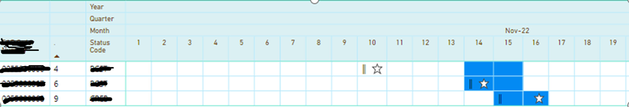
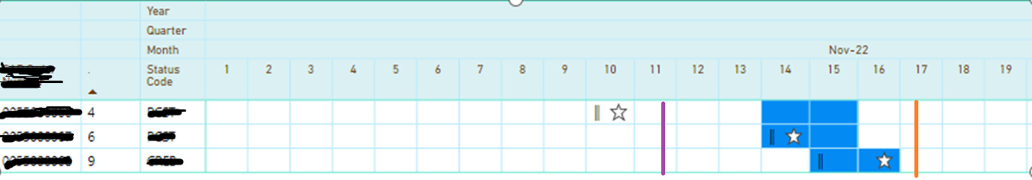
I had created a bar chart and used the background and icon formatting to show planned project start (
image) and Planned project end date (image) . However now i have additional 2 metrics to be added to this chart, however i have maxed out of options for this chart. Is there another way to build this similar visual?

Current View

Requested View

** Orange and Purple lines are the additional metrics requires to be added.

Any help in this regard is highly appreciated.

Any update on my query please?

Hi @dahlia.carroll,

Maybe Deneb Visual? You will have to research that on Youtube. Use chatpgtp, EDNA Data Mentor or another AI tool. There is Deneb Showcase that you can review within the EDNA portal

I also noticed that you put the topic under the Workout Section. The workout Section is used by EDNA for them to upload workout for member to use for there use.

Please change the topic to only “Data Visualizations”

thanks
Keith

Hi @Keith
Ok, I unable to change remove “workout section”. Could you please guide where i should be changing it?

Thank you

HI @dahlia.carroll

Please see attached video to correct the topic area.

I hope this helps,.
Thenks
Keith

Sorry @Keith , there is no option for me to change it. May be you could help me to delete my original post. I will create again.

you can delete yourself in the origional posting

Hi @Keith , This is the message i get when i tried to delete my original post:

Hi.

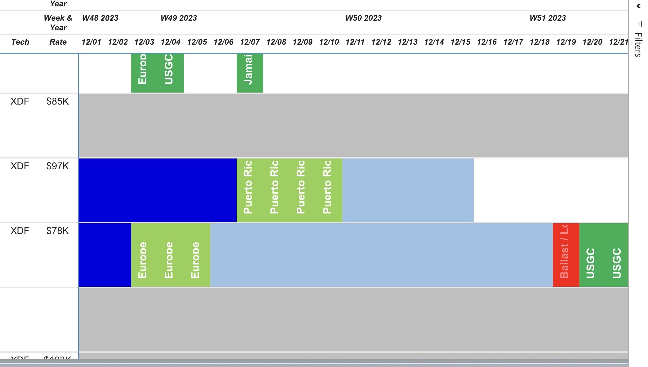
I had did a similar gannt using the matrix. However, I used SVG to rotate my text 90 degrees/vertical in the value section because ootb matrix properties won’t let you formatt position. Switched the measure to be url image. Commingled it with background conditional formatting.

You may have to do something equivalent since you are trying to put a line/ bar in the middle of cell.

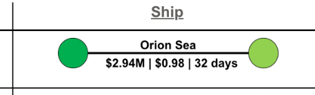
This is another SVG I created from scratch and laid in the measures for the formatting color of the circles and the text above and below the line. This was laid into a table viz as an attribute with numerous rows.
image

Here is sample SQL that made my custom SVG to get the idea of using the svg shapes and properties. I then use TSQL to concatenate the full SVG code to be imported into power query as a URL image. There is a bunch of youtube videos on Power BI and SVG. Almost anything is achievable and didn’t even used the OOTB Power BI Table visual to display it.

SELECT
SVGHeader =‘“data:image/svg+xml;utf8, <svg '” + Char(10) +
‘"xmlns:dc=’"’“http://purl.org/dc/elements/1.1/‘"’“'” + Char(10) +
‘"xmlns:cc=’”‘“http://creativecommons.org/ns#‘"’“'” + Char(10) +
‘"xmlns:svg=’”’“http://www.w3.org/2000/svg’“'”'" + Char(10) +
‘"xmlns=’”‘“http://www.w3.org/2000/svg’“'”'" + Char(10) +
‘"viewBox=’”’“-10 -15 225 40’”‘">’" + Char(10)

,SVGOrginCircleFOB =‘"<circle cx=’“7px’” cy=‘"7px’" r=‘"15px’" stroke=‘"black’" stroke-width=‘".5’" fill=‘"#00B050’“/>'”
,SVGOrginCircleDES =‘"<circle cx=’“7px’” cy=‘"7px’" r=‘"15px’" stroke=‘"black’" stroke-width=‘".5’" fill=‘"#92D050’“/>'”
,SVGOrginCircleOpen =‘"<circle cx=’“7px’” cy=‘"7px’" r=‘"15px’" stroke=‘"black’" stroke-width=‘".5’" fill=‘"#FFFFFF’“/>'”
,SVGOrginCircleReq =‘"<circle cx=’“7px’” cy=‘"7px’" r=‘"15px’" stroke=‘"black’" stroke-width=‘".5’" fill=‘"#FF0000’“/><animate attributeName=‘"opacity’” from=‘"1’" to=‘"0’" dur=‘"1s’" begin=‘"0s’" repeatCount=‘"indefinite’“/>'”

,SVGDstCircleFOB =‘"<circle cx=’“200px’” cy=‘"7px’" r=‘"15px’" stroke=‘"black’" stroke-width=‘".5’" fill=‘"#00B050’“/>'”
,SVGDstCircleDES =‘"<circle cx=’“200px’” cy=‘"7px’" r=‘"15px’" stroke=‘"black’" stroke-width=‘".5’" fill=‘"#92D050’“/>'”
,SVGDstCircleOpen =‘"<circle cx=’“200px’” cy=‘"7px’" r=‘"15px’" stroke=‘"black’" stroke-width=‘".5’" fill=‘"#FFFFFF’“/>'”
,SVGDstCircleReq =‘"<circle cx=’“200px’” cy=‘"7px’" r=‘"15px’" stroke=‘"black’" stroke-width=‘".5’" fill=‘"#FF0000’“/><animate attributeName=‘"opacity’” from=‘"1’" to=‘"0’" dur=‘"1s’" begin=‘"0s’" repeatCount=‘"indefinite’“/>'”
,SVGAnimate = ‘"<animate attributeName=’“opacity’” from=‘"1’" to=‘"0’" dur=‘"2s’" begin=‘"0s’" repeatCount=‘"indefinite’“/>'”

,SVGVesselTextStart = ‘"<text x=’“75px’” y=‘"0px’" font-family=‘"Arial’" text-anchor=‘"start’" ominant-baseline=‘"middle’" alignment-baseline=‘"Middle’" fill=‘"black’" font-weight=‘"bold’" font-size=‘"12’“>'”
,SVGVesselTextEnd =‘"’"

,SVGVesselLineSolid =‘"<line x1=’“22px’” y1=‘"7px’" x2=‘"186px’" y2=‘"7px’" style=‘"stroke-width: 2; stroke: black;’" stroke-dasharray=‘"0’“/>'”
,SVGVesselLineDotted =‘"<line x1=’“22px’” y1=‘"7px’" x2=‘"186px’" y2=‘"7px’" style=‘"stroke-width: 2; stroke: black;’" stroke-dasharray=‘"2’“/>'”

,SVGShipCostsTextStart = ‘"<text x=’“40px’” y=‘"18px’" font-family=‘"Arial’" text-anchor=‘"start’" ominant-baseline=‘"middle’" alignment-baseline=‘"Middle’" fill=‘"black’" font-weight=‘"bold’" font-size=‘"12’“>'”
,SVGShipCostsTextEnd=‘"’"
,SVGFooter=‘"’"

Thank you for your solution.
The major drawback of matrix visual is the limit of 100 columns. So at a point in time you could see only 3 months at day level, or use timeline/slicer to adjust the view. This approach is very manual and defeats the purpose of Gantt chart. I am currently trying to do this in Deneb, i am long way from achieving my goal as I am newbie to Vega lite/Vega.