Having issues getting my pareto chart to work correctly when I add a dimension to the column series. I know the solution requires me to remove the context of the column series dimension somehow but just can’t get it to work correctly!
Any help would be appreciated.
Thanks
Hugo
Hello @hbreakey! what do you want to achieve?
I suppose that the purpose of your Pareto Chart is to show the top X of vendors making XX% of sales. Meaning that you want to identify the strategic vendors.
What is the purpose of adding another dimension in the same chart?
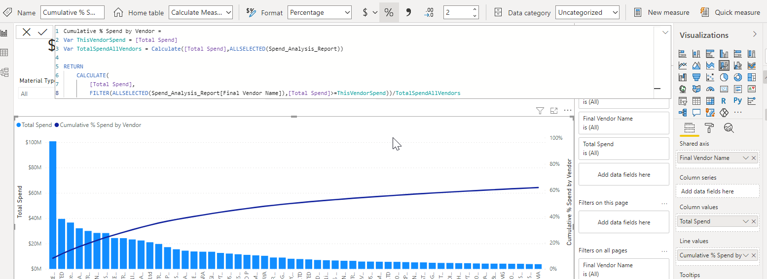
From a user experience point of view it is very confusing, it is difficult to understand what color is what and need to continuously go to the legend and back. The chart becomes, in my opinion, busy and hard to read as your dimension will not be sorted in a descending order and show too much information to send a clear message. What I would do, is to create a filter for the dimension or create another chart that is completing the analysis.
In any case, if you need support, please share your pbix file.
Best regards,
Alex
Hi @hbreakey, we aim to consistently improve the topics being posted on the forum to help you in getting a strong solution faster. As mentioned by @alexbadiu above, here are some additional tips so you can get the most out of the forum and other Enterprise DNA resources.
- Use the forum search to discover if your query has been asked before by another member.
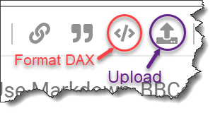
- When posting a topic with formula make sure that it is correctly formatted to preformatted text </>.
- Use the proper category that best describes your topic
- Provide as much context to a question as possible.
- Include the masked demo pbix file, images of the entire scenario you are dealing with, screenshot of the data model, details of how you want to visualize a result, and any other supporting links and details.
I also suggest that you check the forum guideline How To Use The Enterprise DNA Support Forum. Not adhering to it may sometimes cause delay in getting an answer.
Please also check the How To Mask Sensitive Data thread for some tips on how to mask your pbix file.
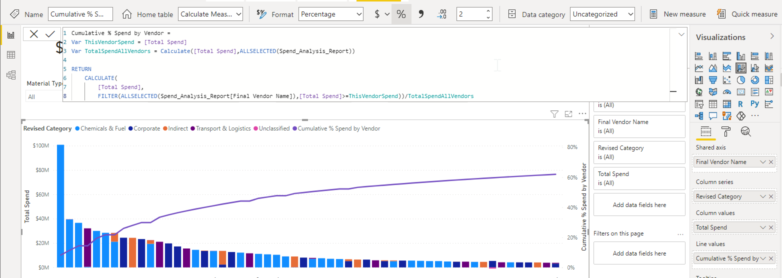
Thanks @alexbadiu and @EnterpriseDNA. I want to be able to show the cumulative line for the top 80% of vendors by total spend whilst ignoring the category overlay. The reason I want to include the category overlay is because individual vendors may exist across multiple categories (managed by our sourcing category managers) but they will generally go to tender / contract based on that Vendor’s total spend. Hopefully that makes sense as to why I don’t want to filter for the dimension outside of the visual. DAX is inserted below if you’re able to make any suggestions to achieve the desired result.
Also, the revised category field is in the same fact table as the final vendor name i.e. Spend Analysis Report. Total Spend is a simple sum measure for the total spend in the fact table.
Thanks
Hugo
Cumulative % Spend by Vendor =
Var ThisVendorSpend = [Total Spend]
Var TotalSpendAllVendors = Calculate([Total Spend],ALLSELECTED(Spend_Analysis_Report))
RETURN
CALCULATE(
[Total Spend],
FILTER(ALLSELECTED(Spend_Analysis_Report[Final Vendor Name]),[Total Spend]>=ThisVendorSpend))/TotalSpendAllVendors
@hbreakey
To help the forum members, could you please provide:
- Your work-in-progress PBIX file
- A detailed mock-up (marked-up screenshot of the Power BI visual of interest or Excel file) of your desired outcome.
Alex
1 Like
Hi @hbreakey a work-in-progress PBIX file and detailed mock-up (marked-up screenshot of the Power BI visual of interest or Excel file) of your desired outcome. is needed by users and experts so they can help you with your query.
In case there won’t be any any of the above request or activity in the next few days, we’ll be tagging this post as Solved.