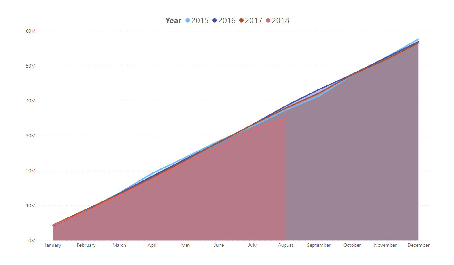
I’ve currently got a graph where I overlay this years sales compared to the same last years cumulatively, thanks to this video.
Comparing Actual vs Budget vs Last Year Results in Power BI w/DAX - YouTube
I’d like to improve on this by overlaying multiple years ontop of each other, with possibly a slicer for the user to select the years they want to view. I was hoping I could just use my normal cumulative measure:
 Cumulative Total Charges =
 CALCULATE(
     [Total Sales],
     FILTER(
         ALL( Dates ),
         Dates[Date] <= MAX( Dates[Date] )
         )
     )
and then drop in the year as a legend on the graph and job done. However instead it seems to do 1 year, then the next year starts at the end of the previous:
I’m assuming I have to group or something to make the cumulative measure restart at the start of each year but can’t seem to get it right.
I’ve pulled a dummy dataset from eDNA since it’s just basic sales data I’m using.
DAX Formula Patterns - Dataset.xlsx (785.5 KB)