Hi all,
Would someone critique or give me feedback on this design? What can I do to make it better, this is irrespective of filters, etc. I am looking specifically for design feedback.
Thank you all!!!
1 Like
Hi @ysherriff
There’s a lot to like in your design, the use of some icons, not being afraid to have white space and your use of lines to split up your report.
Some initial thoughts
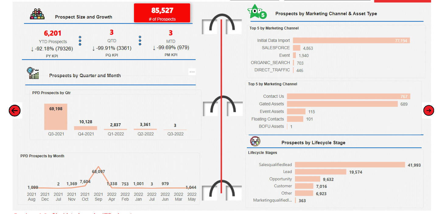
- The placement of this KPI, for me, is not in the optimal space. I think it should be placed in the far left of the area below. Having the background of the KPI card as red makes me think there is something wrong with this number and it continually draws my eye to it.
- You have got number formatting in quite a lot of your numbers that are on display by using the thousand separator which is great but it is missing from the numbers you have in brackets. Always try to keep your number formatting consistent across all displayed numbers. The alignment of your objects in each of your 3 designated KPI’s are out of kilter. PY KPI text is out of alignment (not at the same height) with PQ KPI and PM KPI.
- I really like the Icon beside the text Prospects by Quarter and Month but this takes up quite a bit of room and I don’t think it clearly explains that this is a new section. You also have the chart titles which explain what they are.
The red arrows, which I’m assuming indicate navigation, I’d change from the red colour as your eye is continually drawn to them. You want to make your navigation clear but the dark red is too strong in my opinion.
- The width of the PPD Prospects by Qtr and PPD Prospects by Month are different. It would be best to have these the same width so you have an imaginary line coming down so that the chart titiles are starting on the same axis/line.
- I find that this method of splitting your page in two is a bit distracting, I’d keep it simple by either using a subtle line or simply creating a natural break by using white space combined with the alignment of your graphs the left half of the page and right half.
- Your axis dimension names are a mix of proper case (capital letters for the start of each word), all capital letters and names which have the _ in them such as DIRECT_TRAFFIC. Unless it is requested by the user I’d keep it consistent by using proper case, decapitalise the others and remove the _ with a space.
- These graphs are out of alignment, make them start in the same place and end in the same place. It would also be ideal if you had your Y axis base set to the same starting point.
Just a few things, lots to like, small tweaks here and there.
Hope you find this helpful.
Now, back to my day job 
David
1 Like
Thanks Dave. I appreciate it and it was helpful and useful and I will implement.
Much appreciated.
Love Enterprise DNA awesome group of people!!!
1 Like
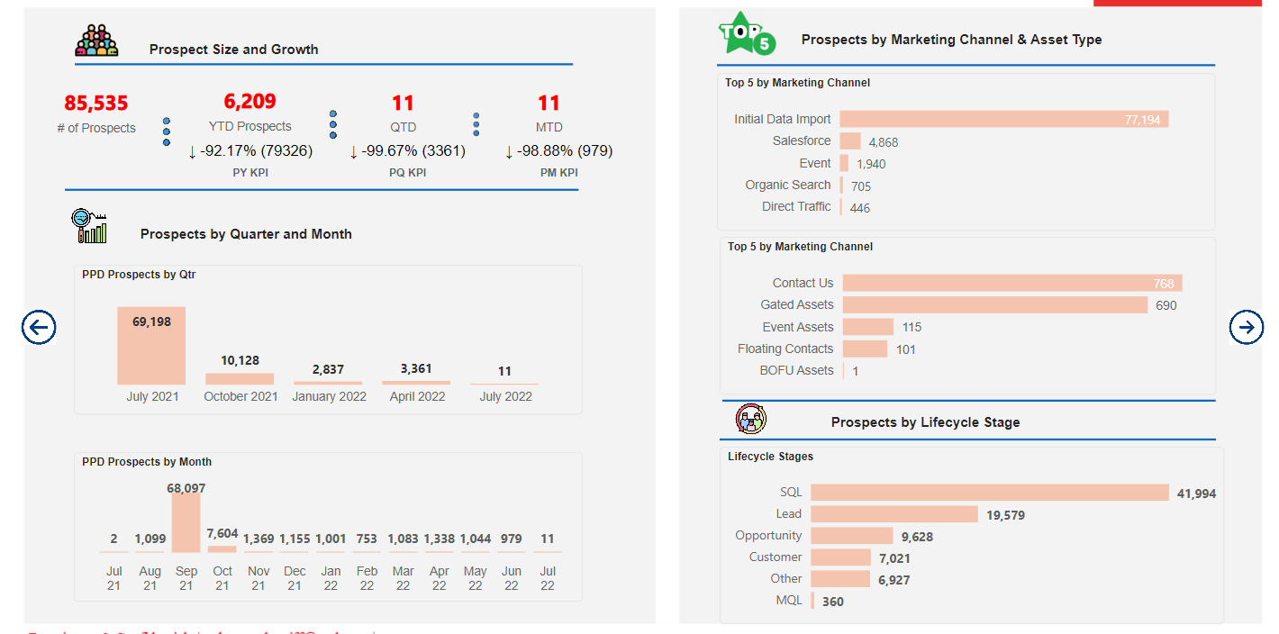
Okay David,
Please see the revised dahsboard. Two quick questions and I can post them seperately.
-
How can I make by Prospects by Qtr to show (Q2-2002, etc. versus the month)
-
How can I align the Y-Axis for the bar chart to the right.
Thanks for your help
1 Like
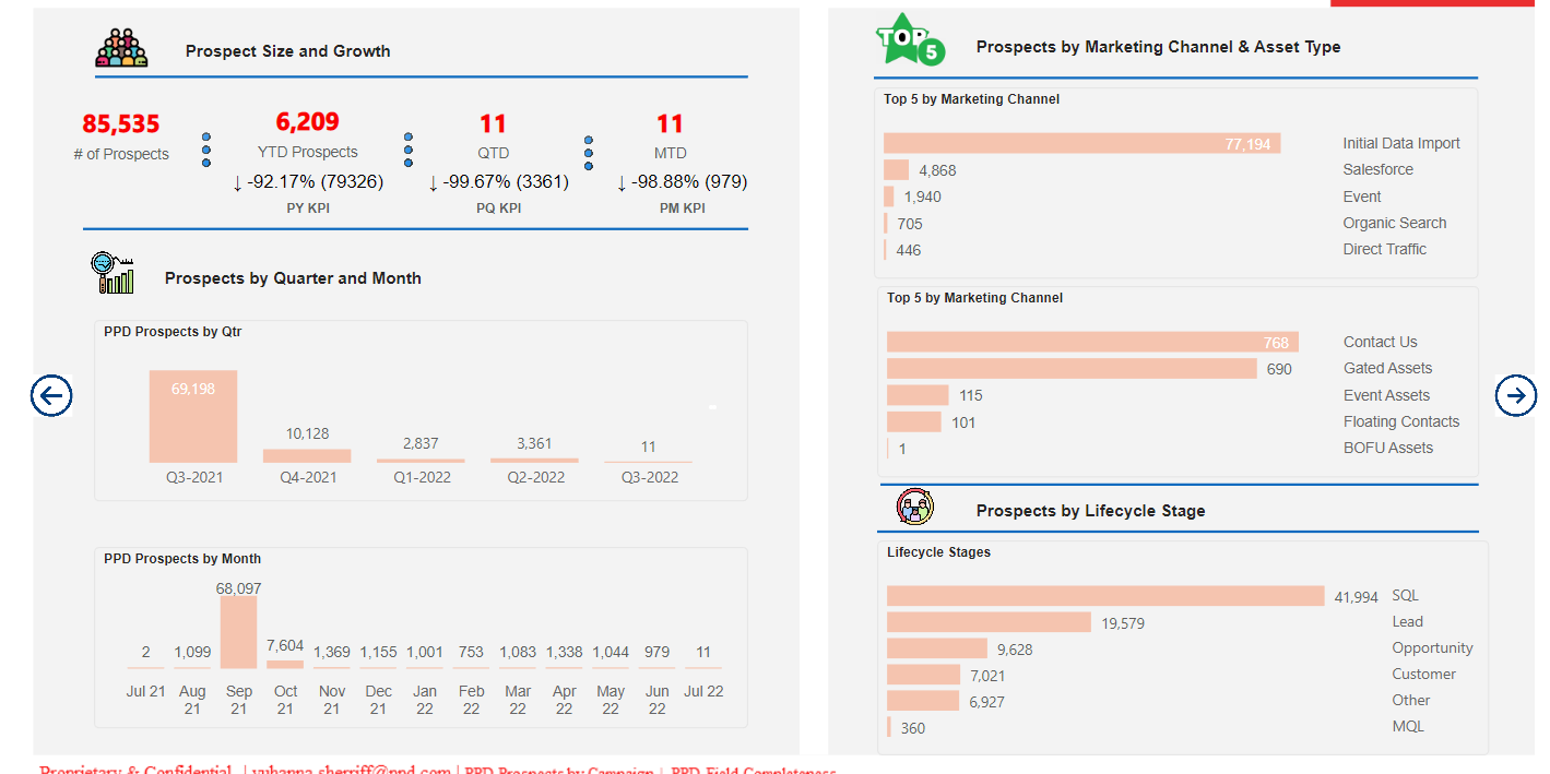
I think I fixed the Y-Axis alignment but don’t know how to add commas in my KPI.
Will research.
1 Like
Looks a lot cleaner @ysherriff
I’m afraid I’m off out for dinner to celebrate my girlfriends birthday so won’t be able to come back to you today.
DJ
1 Like
I would say to get the y axis text fields to be on the left hand side of the graph and not the right.
Enjoy your dinner. The question I have is how to have text in the bar justified to the left, if possible. I will switch the axis back.
1 Like
Hi @ysherriff just checking if you still need further help on this query. Was @DavieJoe able to help? If yes, kindly mark this post as solved. Thanks
1 Like
My apologies. Yes he helped.
1 Like