Hello,
I am very interested in exploring and creating animated visualizations within Power BI and looking to pick up and learn what the available tools or options are. To clarify, I wish to go beyond the timeline ‘play’ button which is more of a series of moving visuals to something a lot more dynamic and visually appealing that could be used to tell a story (for example: the impact on profit during the COVID pandemic by region/time, etc). Looking forward to hearing what the possibilities are to allow for this. Thank you!
@jay89 ,
Welcome to the forum - great to have you here!
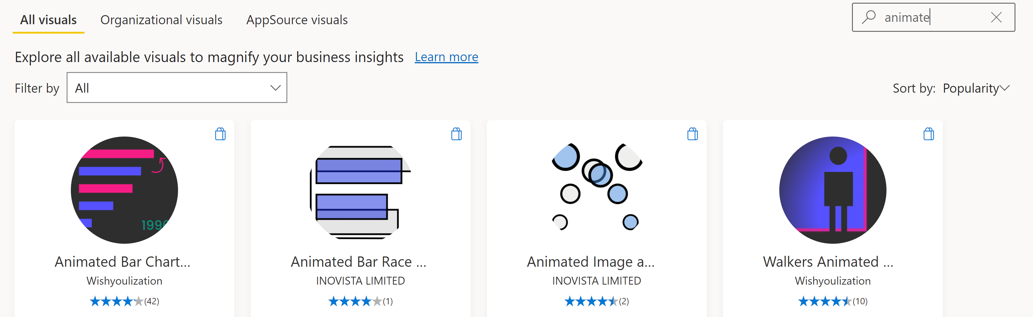
Generally, in terms of animated Power BI visuals, you’re talking about custom visuals. If you go to AppSource from within Power BI and search on “animate”, you’ll find a number of animated custom visuals:
In addition, the Microsoft Pulse Chart custom visual has some nice animation effects, but for some reason doesn’t show up on the search above. I suspect based on the information in your message that this one may be the best of the bunch in terms of what you’re looking to depict.

There’s also a cool animated liquid fill gauge custom visual that isn’t in AppSource at all, but you can get from the developers github site:
Finally, you can also create animated gifs and bring them in to Power BI as images.
I hope this is helpful.
- Brian
1 Like
Hello @jay89, welcome to the forum!
We hope that you are having a great experience so far. 
Thank you, Brian! That is helpful and I will go through these visuals.
Would Python be something that could be leveraged in this scenario as well in terms of visualizing data? Specifically, for example, heat maps showing dynamic data points, etc.
@jay89 ,
I can’t speak to Python, but I do know R has a number of packages available that you can use to animate your R visuals.
And here’s specific r code for an animated heatmap:
I’m looping in experts @gjmount @gmh1977 @AntrikshSharma @Greg to see what they know about visual animation in Python.
Hope this is helpful.
- Brian
P.S. If you want to go the R route, the first of eDNA Expert George Mount’s outstanding courses on R for Power BI users will be rolling out on the learning portal next month.
Hi @jay89, matplotlib (a very common Python data visualization package) does have some animation features which theoretically could be used in Power BI (I’ve not done it myself).
As far as the dynamic data points – that could be harder to do with Python <> Power BI. You won’t be able to do things like tooltips, zoom in/out etc (assuming that is part of the request of being “dynamic”). That is a possibility with R; this post as an example. It’s a bit of a learning curve and environment hassle to do the interactive visualizations, but IMO the sky’s the limit with what plots you can make with R.
Those are some great suggested posts from Brian as well – thanks @BrianJ for the shout-out on my forthcoming course as well.
4 Likes
Thank you for the recommendations! I will check these solutions out.
Hello @jay89 , good to see that you are having progress with your inquiry. Did the response above help you solve your inquiry?
If it does, kindly mark as solution the answer that solved your query.
If not, how far did you get and what kind of help you need further?
Hello @jay89, just following up if the responses above help you solve your inquiry?
We’ve noticed that no response has been received from you since a few days ago. In case there won’t be any activity on it in the next few days, we’ll be tagging this post as Solved.