Hi DNA Team,
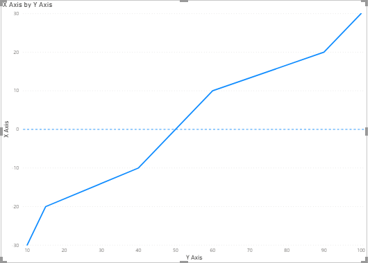
I’m trying to replicate an S-curve Chart Below.
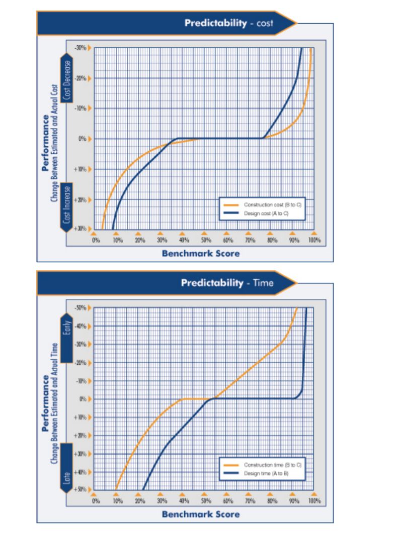
I would like the Percentage on both the X and Y Axis of my chart and 0% in the middle.
Can you please advise me if this is possible or a the custom visual required.
Thanks
Adam
Hi DNA Team,
I’m trying to replicate an S-curve Chart Below.
I would like the Percentage on both the X and Y Axis of my chart and 0% in the middle.
Can you please advise me if this is possible or a the custom visual required.
Thanks
Adam
Dear Adam,
you can simply use line chart in power BI. you can adjust the filters and fix start point and end point ( for both X-axis and Y- axis to do that.
Regards,
Hi @adam !
I found two questions related to S Curve in the Power BI Forum:
Let me know if I was able to help you with your S-Curve Chart!
Cheers!
Hi @adam:
Can you please share a similar sample dataset that you are working? I believe its possible to generate that S curve by using the default line chart without going for any custom visualization.
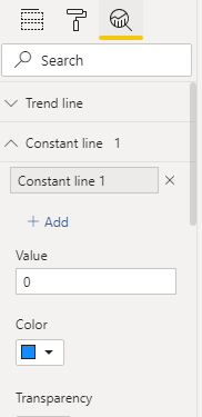
You can give a try to format your axis by setting the expected “upper value” and “lower Value”. I am sharing a screeshot of line chart formatting menue from where you can do it.
Let me know if it helps.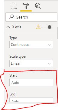
Regards
Hi @adam, we’ve noticed that no response has been received from you since the 5th of June. We just want to check if you still need further help with this post? In case there won’t be any activity on it in the next few days, we’ll be tagging this post as Solved. If you have a follow question or concern related to this topic, please remove the Solution tag first by clicking the three dots beside Reply and then untick the checkbox. Thanks!
Hi @adam:
Pls check out more efficient way to do it!
I hope this will solve the issue more perfectly.
Regards