I am trying to create a dashboard in which to show the cash balance on monthly basis. The monthly basis is fine. However, I dont know how to get a chart to show the high-low balances so wanted to see if you guys have done something similar. I am able to get the highest level of cash and the lowest level using dax. However, I am not sure how to use the chart to show it.
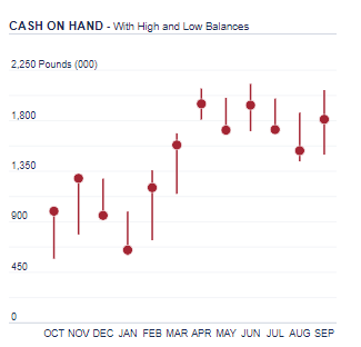
Attached is the graph I would like to achieve in my dashboard.
take a look at this post from @MudassirAli, showing how to create a lollipop chart (which is what you are showing) using the custom visual Charticulator, which lets you create your own visuals.
Hi @Heather. Thanks for getting back to me on this. Unfortunately, the Lollipop Charts didn’t give me the result. Not sure if I am using it the wrong way or what.
The way I want to get the result might be better explained through this example:
Apr-21
May-21
Jun-21
Jul-21
Aug-21
Sep-21
HSBC Current Account
1770905
1574348
1770433
1587364
1324485
1585777
Highest balance
1964777
1865344
1982089
1818100
1668019
1903240
Lowest balance
1693073
1574348
1563107
1557856
1239861
1289604
Coop Current Account
147244
120286
147299
106058
180297
198415
Highest balance
266671
147244
147299
154727
180297
198415
Lowest balance
85386
102842
121891
106047
106058
139520
As you can see, the starting and ending point at each month is different and certainly not zero. This was one thing that I didn’t manage to get.
Secondly, the dot in the like represents the closing balance and again, this could be the highest balance, lowest balance, or somewhere in the middle. I didn’t manage to get the chart to work.