Attached are a mockup file. My data has much more columns, but If I can solve this data set I will be able to understand the principle.
In it I have my own effort and no matter what I do I end up with muliple rows of data. One can create mulitple queries of data, each referencing the main query and then merge all the queries. But I found it inefficient when it comes to the actual large data set and loading times can end up bein an hour.
I have workarounds in Power Bi with complex DAX trying to achieve certain calculation.
The problem is easily solved in Excel and was the way I used to do it to create reports and dashboards. There is one tab of what the end result should look like using Excel.
I know this community has some of the brightest and creative minds in PQ.
Hi @Desn,
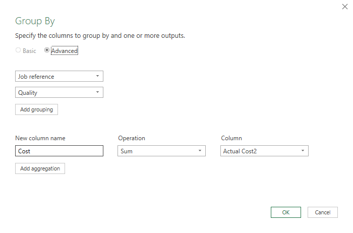
Welcome to the forum. The prep of your data is super easy with Group By, just follow these steps: Select both “Job reference” and “Quality” columns and choose Group By on the Home tab of the ribbon. For the aggregation you can enter a new column name (I’ve called it “Cost”), select an operation “Sum” and select the column that contains the values to be aggregated, in this case “Actual cost2”
Hello Melissa, thank you for your response! Appreciate.
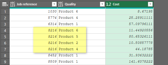
I did try it and still ended up with multiple rows of the same reference as per the screenshot.
My end goal should have a table that have the following table
Job Reference, Product 1, Product 2,…Product 7
Each will have values based on the reference number and if there is none, it just returns a blank or zero, like the spreadsheet example.
I hope this clears up a bit of what I am after. Thank you again.
PS. I’ve been sitting with this problem since the beginning of the year and just don’t seem to be able to wrap my head around the solution yet.
@Desn, for data analysis this tabular format is the structure you should aim for. As mentioned this can easily be presented in the form you have requested.
.
That said. I you are not doing any analysis and are just looking to present these figures in excel, you can pivot your data in Power Query as well.
Follow these additional steps:
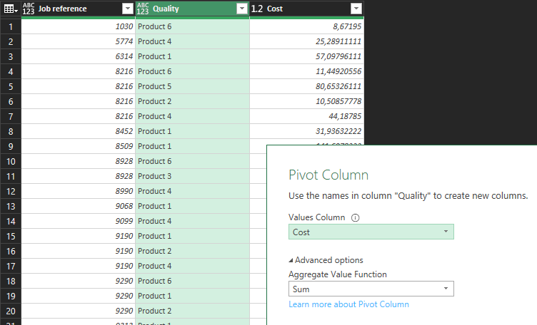
Select the “Quality” column, choose Pivot Column on the Transform tab, set the Values Column to “Cost” and under “Advanced” make sure Sum is selected.
I think you might have just solved months of trying to figure this out with a simple solution. I am going to try this on an actual dataset with a small sample.
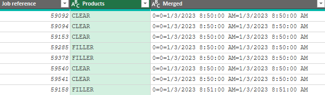
It worked, thank you very much. Because I had two metrics for each product, quantity, and cost, as well as a date for each, I merged those columns and joined the values by delimiter, when I pivoted the column, I then separated each one by the same delimiter and renamed the columns.
After this, I had unique references and values for each product.