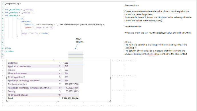
I’ve been trying to solve the problem using a tempTable but I haven’t been able to fix the problem.
Unfortunately I cannot share the PBIX with you due to data confidentiality.
I really appreciate your precious help.
Please create sample data and use it in a work-in-progress PBIX and upload it along with an Excel mock-up of exactly what you’re trying to achieve.
Greg
Book.pbix (108.1 KB)
Book.xlsx (26.2 KB)
Hi @Greg
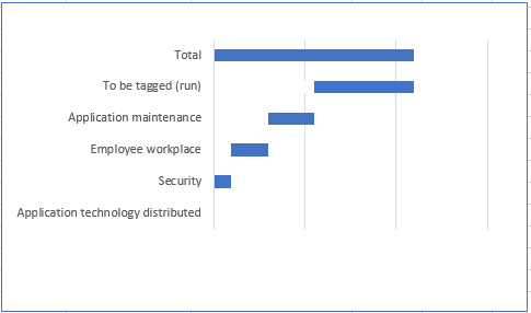
My goal is to be able to dynamically create this type of Chart in Power BI.
I’m working with Power BI RS so I have many limitations and I only can use the visuals available by default.

The graph should always be displayed in this way, that is, with the bars growing from below to the top and with a ‘Total’ bar at the ending.
As the order can dynamically change over time, in this way ‘Security’ which is now second to last, could come to be first or second at a future time, it’s not possible ‘hard coded’ the measures.
I am sending the pbix and xlsx as an attachment so that you can have a more precise idea of what I want.
I feel like I’m close to the solution but I’m missing any small detail.
Thanks for your help.
Hi @Greg
I’ve done a step forward.
It’s already working except for the Total bar.
I believe that one of the ways would be to create a table with only a row with value ‘Total’ and make a UNION with the table that contains the column with the other values.
Hi @JoaoMonteiro. Is the included PBIX updated? If not, can you please upload your latest work-in-progress?
Greg
Hi @Greg
The PBIX is a sample of the original because I cannot share the original due confidentiality rules.
As I mention in the previous message I’ve already move a step forward.
Now I only have to think in a way to create the ‘Total’ bar.
JM
Hi @Joao… I took a quick look at your initial PBIX.
I’m unclear on your data modelling, and have the following initial comments:
- your dimension table has 4761 rows
- your fact table only has 2 columns and, at 4443 rows, has fewer record than your dimension table
- your fact and dimension table are linked with a bi-directional relationship (usually not a good sign); can this be changed to a single direction dim → fact?
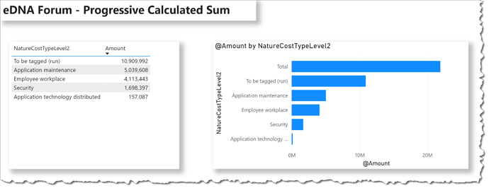
I used the ROW construct to build a table for the total value, then used a UNION to combine it to the item values.
I’ve attached my PBIX, but this is using the public version of Power BI Desktop and will likely not be accessible in your Power BI Report Server version, so here’s the code:
Items (Calculated Table) =
-- create table of Cost Type Levels
VAR _ItemTable = ADDCOLUMNS(SUMMARIZE( DimTable, DimTable[NatureCostTypeLevel2] ), "@Amount", [Amount] )
-- create table for total
VAR _TotalTable = ROW( "NatureCostTypeLevel2", "Total", "@Amount", [Amount])

-- return combined table
RETURN
UNION( _ItemTable, _TotalTable )
I then used this calculated table in a standard stacked bar chart.
Hope this helps get you a little farther.
Greg
eDNA Forum - Progressive Calculated Sum.pbix (113.7 KB)
HI @Greg,
You are absolutely right about the model.
The data source comes from a SQL Server with dozens of tables, and as I believe you know, when the model builder has a normalization mindset, the data doesn’t come in the best shape for Power BI to use.
I know I could model it in Power Query, but the client doesn’t want that.
I had already taken an approach similar to yours, creating an additional row, in each table used, through Power Query, but this led to other problems.
I think I’m going to use the ugly solution of using two graphs, one with the bar for each line description and the other showing just the total.
Thanks for your help.
Regards,
JM

