For those looking at “good” dashboards I saw this one posted on Linkedin.com and wanted to share.
Maybe Enterprise DNA can cover some of design set-up.
For those looking at “good” dashboards I saw this one posted on Linkedin.com and wanted to share.
Maybe Enterprise DNA can cover some of design set-up.
Thanks for sharing the link @mbraun.
In the same spirit as @mbraun’s earlier post, I wanted to share this COVID-19 simulation analysis/visualization created by Mass General Hospital and Harvard Medical School. While not done via Power BI (this was created using R and a visualization add-on library called Shiny) I think it’s a great merger of complex statistical analysis, powerful what-if scenario development, and easy to understand visualization.
Hi @mbraun,
Glad to know that you are interested in COVID-19 dashboards.
Here is the link to the COVID-19 dashboard that I have made using the live dataset from JohnHopkins dataset (GitHub) and it also got featured in the Power BI Community forum.
Hope you would like it.
Let me know your thoughts.
Well done on your report. I like many aspects of it. Great design and really solid insights.
Sam
Do you think you can add some screenshot of the pages here, it would be great to showcase it more and give inspiration to others
Is there anyway you could share the .pbix (not to steal). I love looking under the covers and see how things were setup so I can create dashboards as comprehensive as that.
Matt
Thanks for the appreciation Sam.
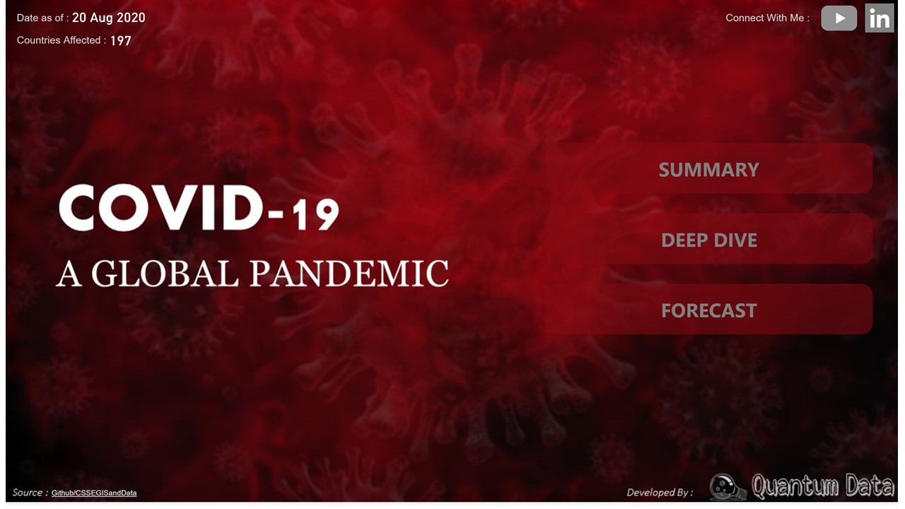
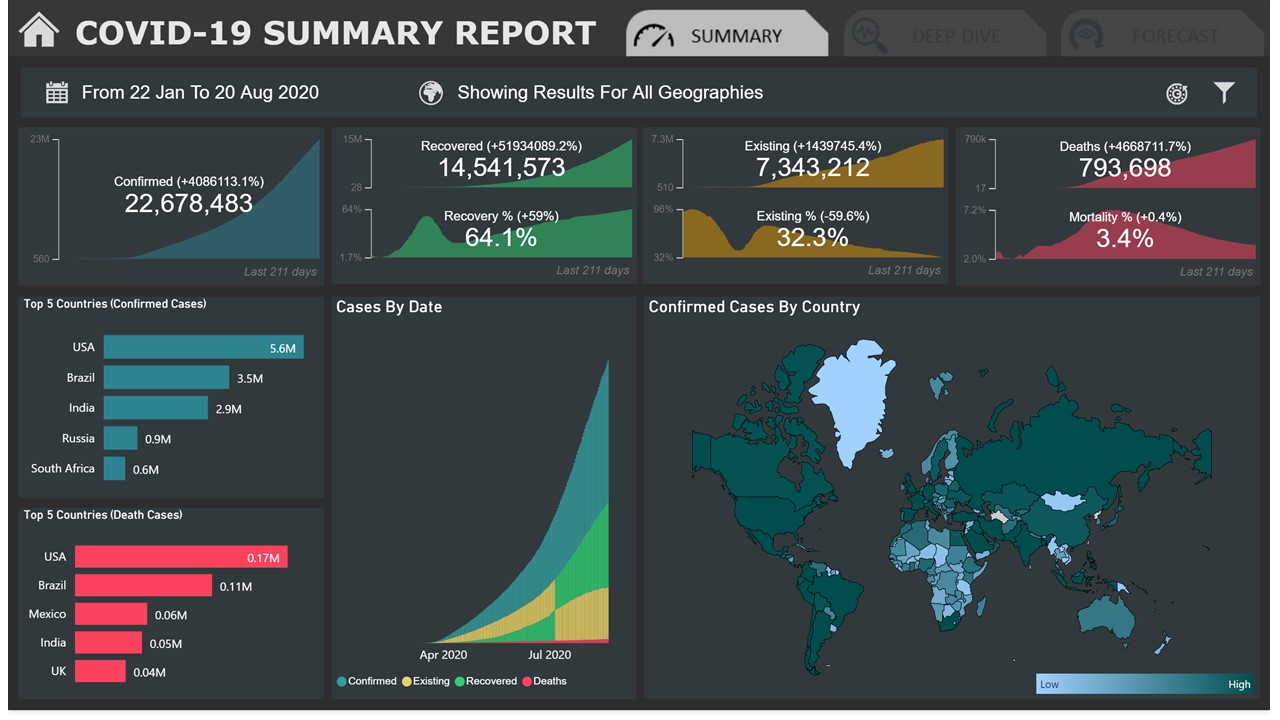
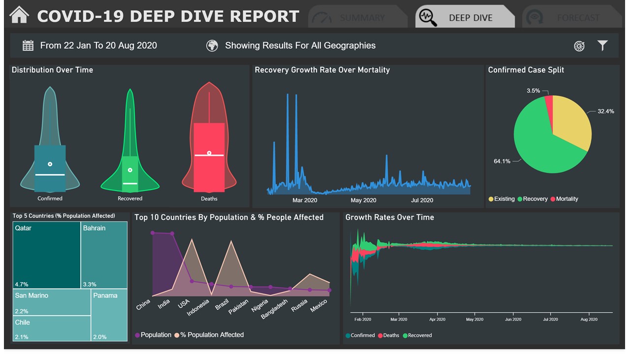
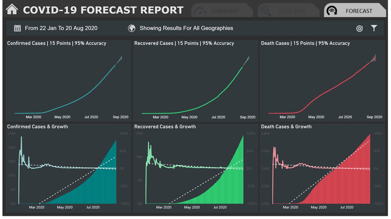
Attaching the screenshots of "COVID-19: A Global Pandemic " Power BI report here:
For this thread highlighting excellent COVID-related dashboards, I wanted to add one I came across recently developed by the UN using Power BI. Some really excellent design elements in this one.