Hi,
Admittedly, some of these items may not be addressed through DAX calculations, but the items are related to one PBI report page. We have a Power BI report as a company “Directory” of projects and personnel. It is here where the Enterprise DNA community shines in detailing precisely how to accomplish each item.
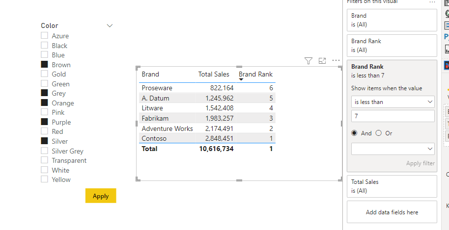
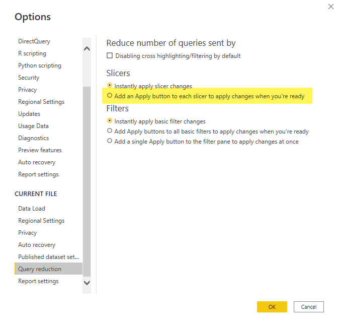
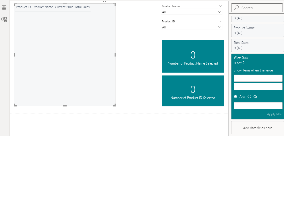
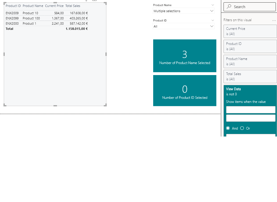
Item #1 - there is no obvious default value for any slicer to filter the table display of resulting personnel, and the display of every personnel member in the company has no value. Thus, what is the “best practice” or a recommended approach to NOT display results in visualizations before the user makes some form of selection to limit results? This may or may not include a “GO” button. We do see approaches to add measures for each slicer’s “SELECTEDVALUE” (we have 8 slicers) which, in turn, become a filter for the resulting table visualization leading us to think a GO button makes more sense.
Item #2 - Impacted by the volume of rows of staff members in a visual display, a profile photo is being introduced. A table visualization of all personnel will not render for all rows (see #1).
a) Easy one: We will introduce a Toggle button to allow the user to choose whether or not to include profile photos in the results. We’d really like to establish a standard toggle button. Is their a standard toggle icon available & recommended? note: We understand how to use a Toggle button to impact visuals, but want to establish a toggle button look&feel standard.
b) Hard one: Is there a recommended way to control the number of rows which a table visualization renders (with a photo)? For example, 100 rows display or are returned at a time before some action (ex. scrolling or a “next set” arrow button) gets the next series of 100; thereby ensuring proper performance?
I look forward to seeing some great feedback here. I’m sure some effective videos exist, but haven’t quite found the right ones.
Best regards,
Kevin


