I’m going crazy with this… I’ve set up conditional formatting on my area chart. Very simply, if it’s below 0, then RED and it it’s grater than o then GREEN. The issue I have is that the conditional formatting seems to by pass the date in the area chart.
What’s happening is that if the overall variance is above o then it turns all the colors green regardless if one of the individual months are below zero. If i turn the area chart into a simply table and apply the same formatting it works perfectly. There seems to be an issue with the area chart only?
Hi @chad.sharpe, I noticed you didn’t provide a PBIX file. Providing one will help users and experts find a solution to your inquiry faster and better.
A perfect initial question includes all of the following:
A clear explanation of the problem you are experiencing
A mockup of the results you want to achieve
Your current work-in-progress PBIX file
Your underlying data file (to allow us to go into Power Query if necessary to transform your data and/or data model – often DAX questions really end up being data modeling solutions)
Hi Greg,
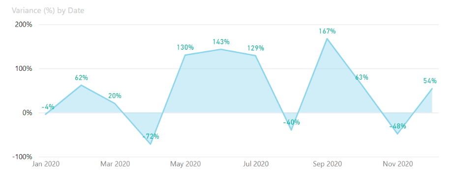
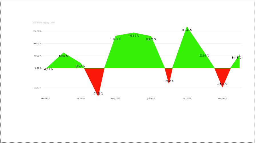
I had to take a moment to create a new test data set as my actual PBX has sensitive data. Below is PBX sample and the image it produces. My goal is to set the conditional formatting so that anything that’s a positive number appears as green and anything negative appears as red. Ideally the area portion of the graph would also change color but I don’t think thats possible? I’ve spent hours on this,…lol… the formatting seems to only apply to the total. If the total is positive or negative then all the months are green or red? I don’t know what the formatting doesn’t filter by the month?
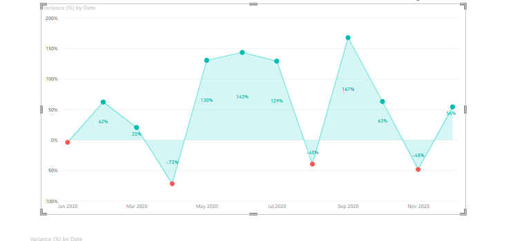
If the below image can solve your problem because i do not see any option where we can control the color of area but we can control the color of data point as shown in the below image:
While our users and experts do as much as reasonable to help you with your inquiries, not all concerns can be attended to especially if there are some learnings to be done.
Hi @chad.sharpe,
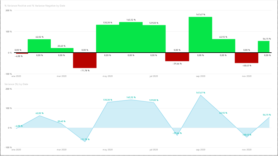
I share with you another possible solution in which two area graphs are being used and showing the positive values in the graph above and the negative values in the one below.
Hi @chad.sharpe did the response provided by the users and experts help you solve your query? If not, how far did you get and what kind of help you need further? If yes, kindly mark as solution the answer that solved your query. Thanks!
I’m not sure I would call it a full on solution, but it’s an option for sure. I didn’t go with it because it lacked the ability to update the data labels.