I have two hopefully straight-forward questions about the attached pbix file, and its lone visualization.
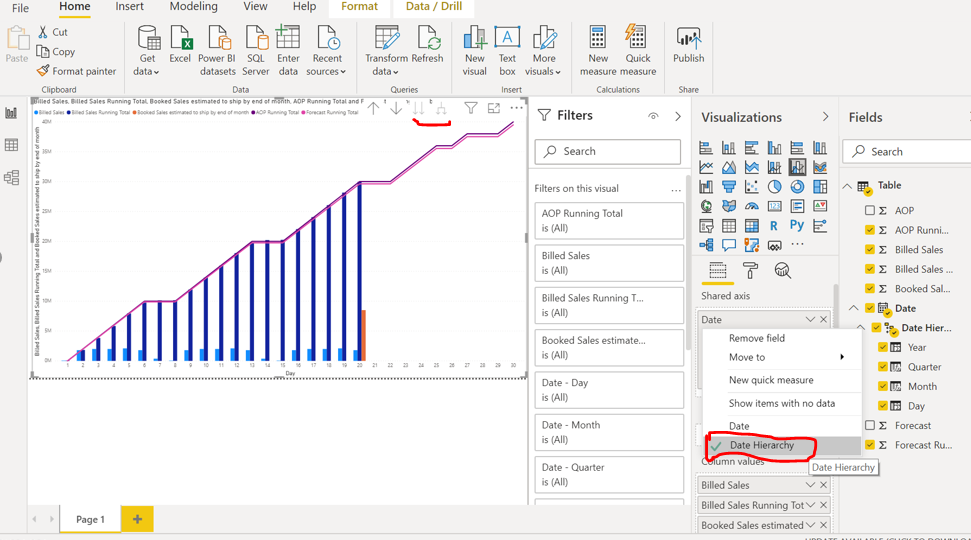
Can I - or how do I - modify the Date legend to remove the day from the date (ex. Sunday, November 1, 2020)?
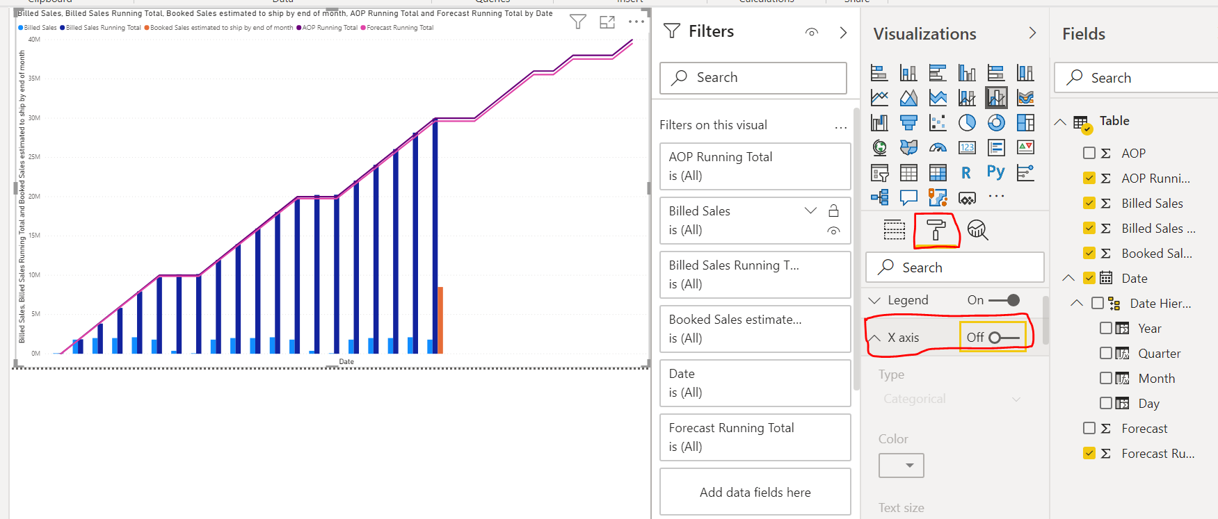
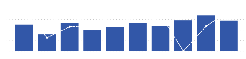
I’d like to stack the “Booked Sales estimated to ship by end of month” on top of the Billed Sales Running Total for the date on which both occur (November 20). Keeping a clear distinction of the two measures while portraying their sum is the objective (in order to compare to an end of month forecast). How can I accomplish it?
I’m open to any improvements to [or best practices for] the visualization which compares sales to date with planned and forecast amounts, with projected (estimated) sales for the remainder of the month.
If you just want to remove Day alone then Right click the Date field and select Date Hierarchy. And if you get different visual then you remove the Day field and then again add it to shared axis make sure you have drill down to see the entire field.
Here you are using Auto Date so please turn off this and create your own date table and follow the below link for a great explanation how and why you should use it which is very friendly for charts.
For this point please try follow below link which will help you achieve it once you use your Date table.
Hi @kkieger, we’ve noticed that no response has been received from you since the 21st of November. We just want to check if you still need further help with this post? In case there won’t be any activity on it in the next few days, we’ll be tagging this post as Solved. If you have a follow question or concern related to this topic, please remove the Solution tag first by clicking the three dots beside Reply and then untick the checkbox. Thanks!
Thank you. The response was very helpful. I’ll attach what you recommended doing which is certainly a step forward.
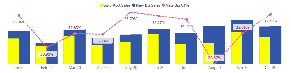
Ultimately, I’m looking to see how far I can take the visualization. The best case scenario is that I can continue to show the AOP and Forecast measures as trend lines, but would like additional capabilities to reflect rolling total billed sales, billed sales, and PY billed sales as clustered columns and to stack the “billed sales estimated to ship by end of month” measure with (or top of) the rolling total billed sales. Now, I can continue to show PY Billed Sales [and its rolling total] as a trend line (per the attached), but I’d prefer not to create a new measure of Billed Sales Rolling Total minus Billed Sales in order to stack with Billed Sales and “Billed Sales estimated to ship by end of month”. Thus, I’m really looking for a clustered column with a stacked option for two measures in particular and line combo chart… possible?
Just a thought … if yo can create separate visuals that contain the components, then overlay them on top of one another, perhaps you can “create” the visualization you’re looking for.
Yeah, my understanding is it’s a bit painstaking, but the results can be unique. I don’t have the source, but remember a Guy In A Cube video a couple of months ago where they talked about a COVID Power BI report that had 5 levels of overlay. Good luck.
Greg
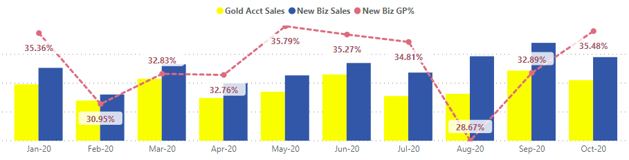
note that I have the axis in both visuals - but the bottom layer the axis is white to match the visual background. This makes the layering easier to handle. GP% (line chart portion) was included with both visuals to make the spacing of everything work.
My purpose here was to show that the gold values were part of the overall total, which is why I needed to have the gold portion take up only some of the total blue column.