Hi,
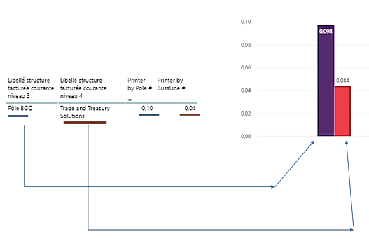
I want to create a column chart like the one I’m showing, but the values come from two differente measues and I’m not able to create a correct legend neither the correct X axis labels.
I thought in using the Line and Clustered column chart but I do not want representing the second value as a line, but as a column.
It is this possible?
Do you have any suggestion that could help me achieve this visual layout?

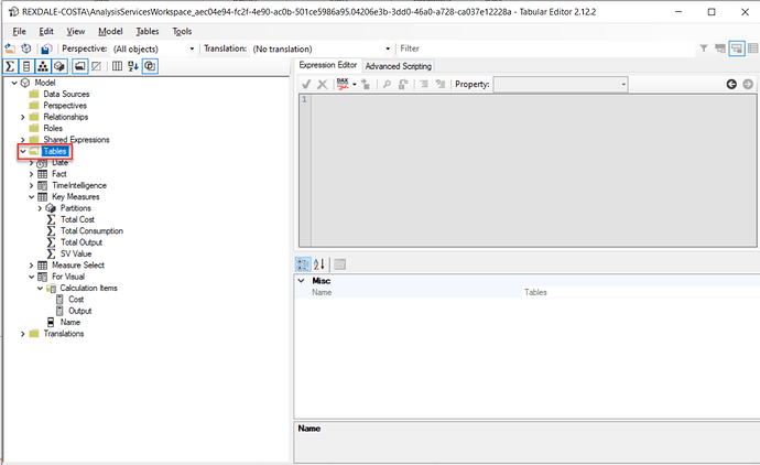
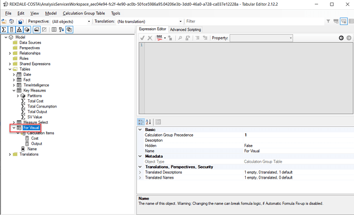
@JoaoMonteiro For me the easiest method would be to achieve the required visual with the help of Calculation Groups. To create CG, you should go to Tabular Editor & on Tables, right click and select create calculation groups & rename that CG.
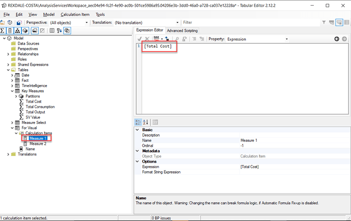
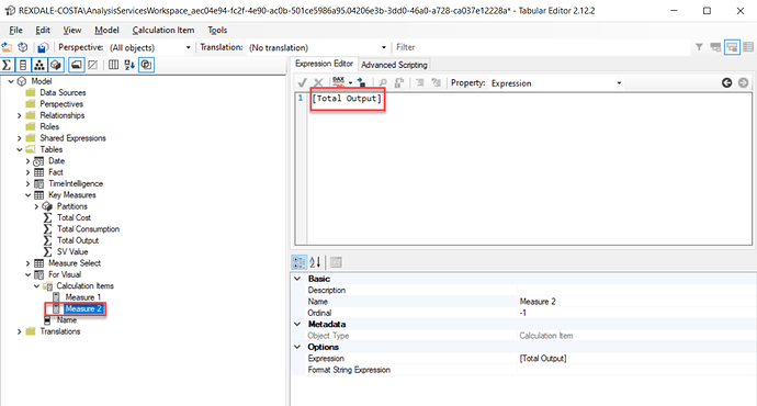
Then right click on the renamed CG and select create Calculation Items. I renamed the first calculation Item as Measure 1 & the second one as Measure 2:
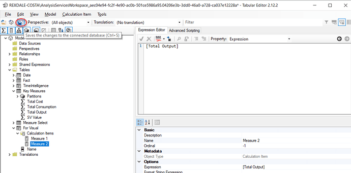
Then save your changes in Tabular Editor & refresh the page in PBI desktop:
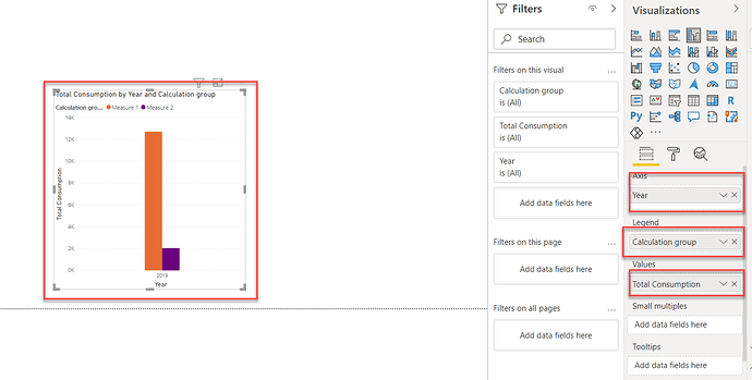
Then you can bring the category/date on X-Axis, the newly created calculation group in legend and measure in Values:
Now you are good to go. I hope this solves your problem.
Thanks,
Mudassir
Column Chart with values from different measures.pbix (123.9 KB)
2 Likes
Hi @MudassirAli
Thank you so much for your help.
Regards
Joao Monteiro
1 Like
