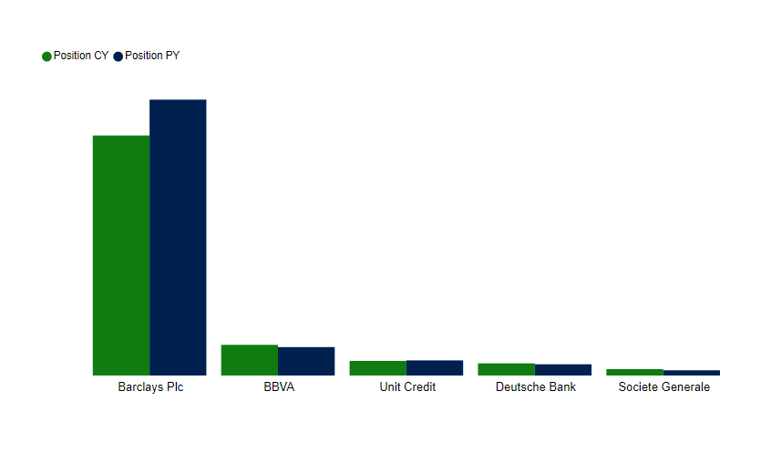
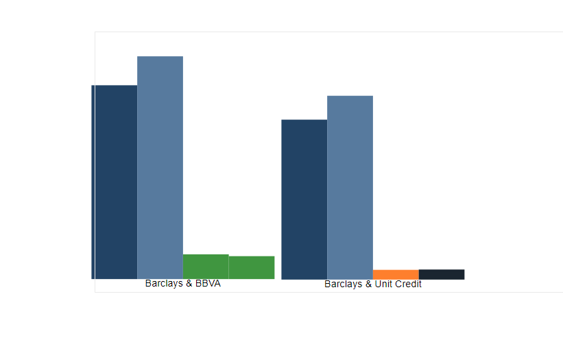
I need to sit in the chart ie Barclays next to BBVA and then Barclays and Unit Credit and so on for Deutsche Bank and Societe Generale. So it will be kind of
Barclays (CY/PY)-BBVA(CY/PY) and so on for the others.
Please let me know of any idea or if you need further explanations.
Not sure I understand the question. Is this issue just getting the columns displayed in the proper order? If so, you can add a “Sort Order” column in your dimension table either via Column by Examples in PQ, or SWITCH to create a calculated column.
Barclays ie is my client and I am comparing my client to the other peers (BBVA, Unit Credit, Deut Bank and Societe Gene…). See attached by creating a group in the peers table and I can put together Barclay and BBVA and then add the measures CY/PY to the chart. I need to do the same for all other groups ( groups and calculations are done) the issue is displaying it all in a single chart.
See below something like this but a single chart - this is 2 chart together.
I definitely feel like this should be doable. Can you please post some nonconfidential sample data representative of your dataset that we can play with to test some different approaches?
Hi @Fpastor, we’ve noticed that no response has been received from you since August 27.
We just want to check if you still need further help with this post? In case there won’t be any activity on it in the next few days, we’ll be tagging this post as Solved.