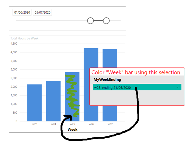
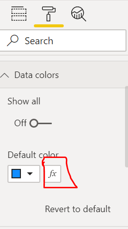
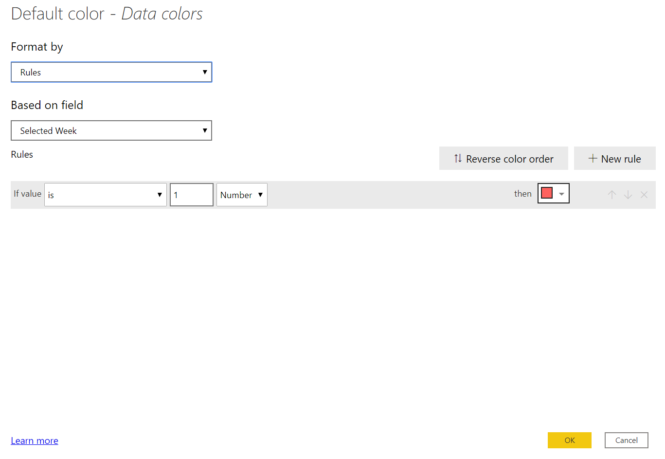
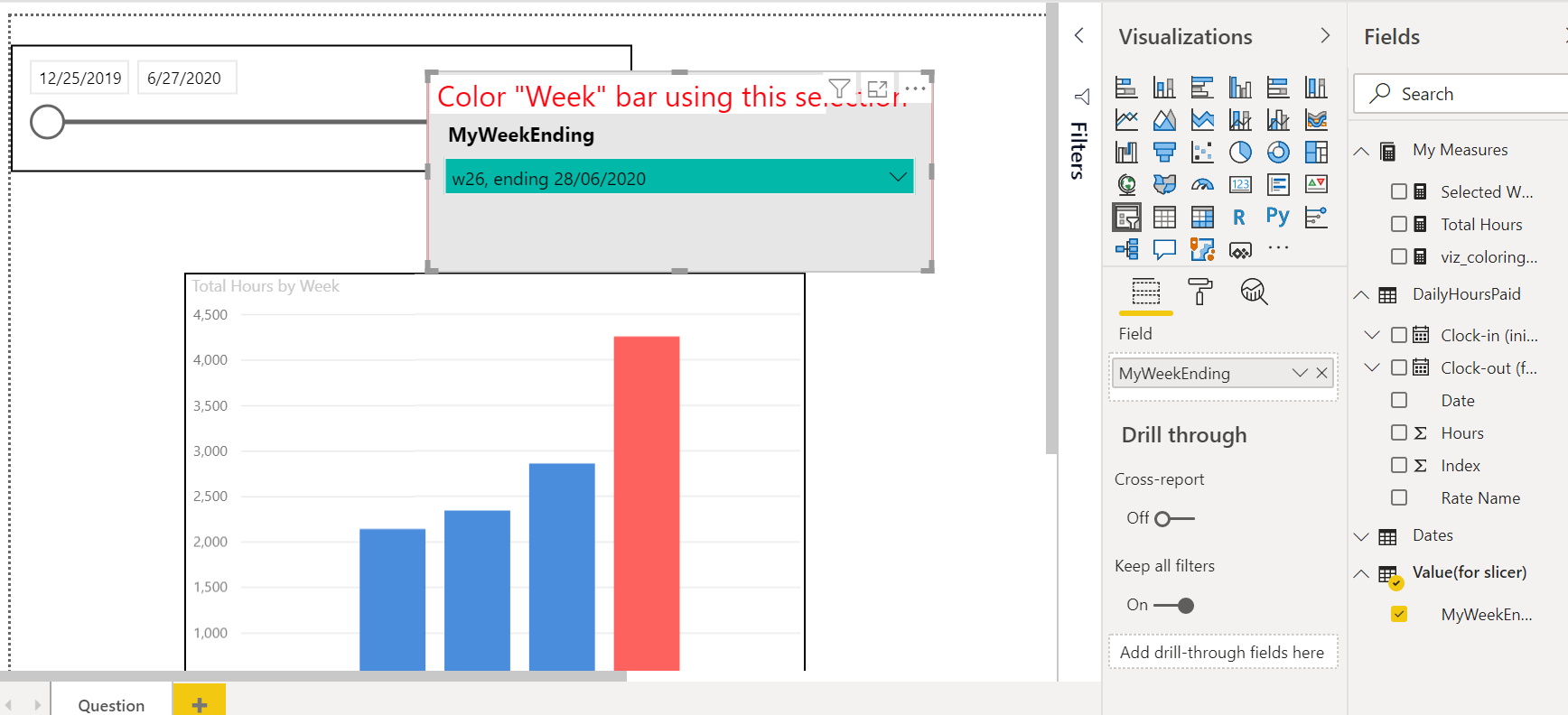
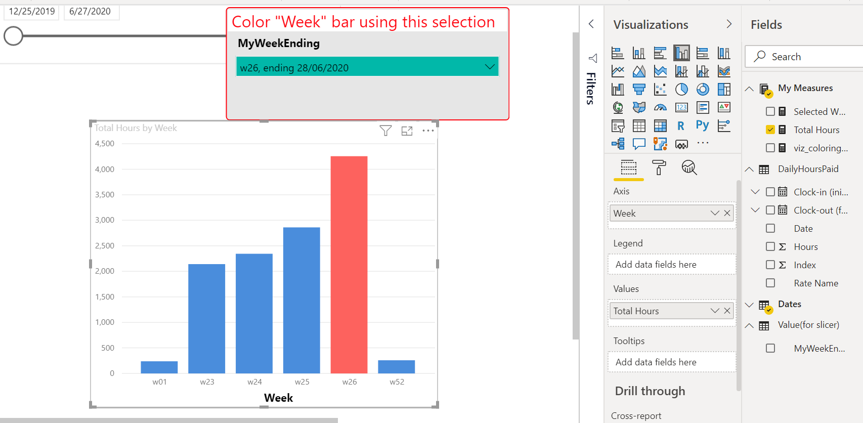
Good morning. I would like to colour the corresponding Week bar when my user makes a MyWeekEnding slicer selection. I’m at the beginning of my DAX learning curve and I’m struggling with this one. Could anyone please help me with the measure that needs to get written and then applied to the conditional formatting of the bar chart?
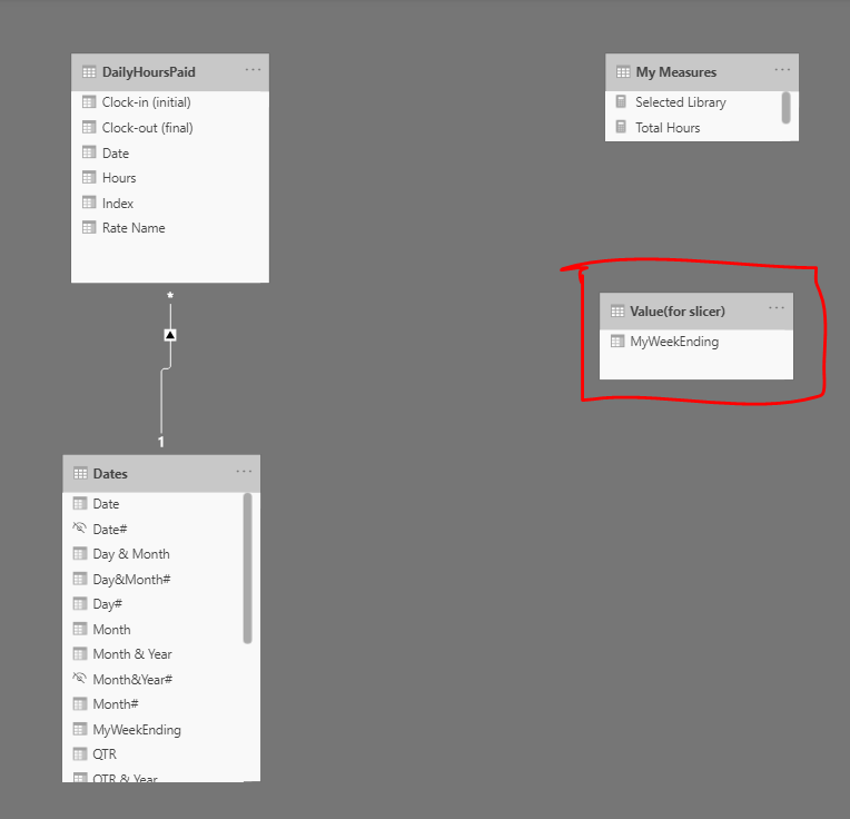
Hello Mukesh, thank you for your reply. Sorry I should have mentioned this in my original post. I stumbled across this solution late last night. To try keep things “neat”, I’d really prefer not to create a new table. Is there perhaps another way of solving this such that a new table is not created?
I think its not possible without creating new table, Here you are using same table for bar chart and slicer and also disconnecting interaction from slicer.
Here its not possible to get slicer value on bar chart.
I agree with @Rajesh , that you need to separate the interaction of the slicer from the table to make this work. There are two ways I can see to do this - the dual table approach that @MK3010 provides in his solution, or turning off the interaction between the slicer and the visual (which will basically render it a disconnected table, and you will lose the ability to filter the table).
I never like to say something is not possible in Power BI, because almost every time I do some clever member pops up with an ingenious hack and proves me wrong, but I’ll just say I agree with the prior posters in this thread, until someone proves the existence of “Schrodinger’s Slicer” which is connected and disconnected at the same time…
Re: your comment about keeping things “neat”, are you familiar with the ability to create custom views within the data model view? For almost all of my reports, I create a custom view with only my data model tables and any supporting tables I want to see. In addition, you can hide these types of helper tables in your report view. The combination of these two practices keeps things neat and makes these helper tables nearly invisible until you want to access them.
My 2 cents: It’s not a bad idea to use a simple and clear way to do something instead of a more complicated (but perhaps better) method, as you’re not only writing for yourself now, you’re also writing for yourself or the next developer 6 month or a couple of years in the future when the report needs to be enhanced/extended and then ease of understanding will likely be more important than the most elegant code. I make liberal use of disconnected supporting tables as, for me, they solve the problem and provide clarity (possibly at the expense of the most performant solution, but I’ve found that’s rarely the case).
I tried doing other way but i had to disconnect it then the filter functionality was not available so couldn’t share anything apart from earlier solution. You can have this solution(hide the disconnect table) until you find what you are trying to achieve it. Hunger to achieve something gives best results.
It’s not a bad idea to use a simple and clear way to do something instead of a more complicated (but perhaps better) method
Yes. This is very true. Thinking about it likes this… Mukesh’s solution is perfect. Thank you Mukesh.
Re: your comment about keeping things “neat”, are you familiar with the ability to create custom views within the data model view?
Oh goodness… no. I’ve never heard of it. Does this learning curve ever have a sight in end?! Just as soon as I turn a corner, I seem to know only more of what I do not know. What an impressive piece of software. Thank you gentlemen. All solid replies and very helpful. Mukesh’s solution it is.
are you familiar with the ability to create custom views within the data model view?
Oh goodness… no. I’ve never heard of it. Does this learning curve ever have a sight in end?!
Here’s a great short video on creating custom data model views. It also has great tips on turning off the default summarizations and creating measure subfolders.
And, no - there is no end on the learning curve. I literally learn new things about this program every single day - much of it on this forum and in the Data Challenges. And even once you start feeling on top of things, a new version of PBI comes out each month, with a bunch of new stuff to learn. Between data modeling, DAX, Power Query/M, visualization and administration, I think it’s nearly impossible to truly master all five areas, which is what makes the diversity of expertise found on the forum so valuable. But I guarantee you’ll never get bored with this…