There’s a way to do this, but it’s sort of a ridiculous kludge:
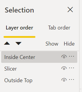
Basically, what you need to do is make two copies of the visual exactly overlaid on top of each other. For the first one, put the data label in the center of the bar, and for the second one put it on top. Then, using the Format, Bring Forward command – bring the one with the label in the center of the bar to the front, and turn on the Maintain Layer Order option, to make sure that it looks right in the service. Here’s how it should look:
As a side note I did find a marketplace visual called “Line and stacked column chart with table”
That will add below the chart a table/grid view of the data. Then I just turned off the color for the secondary calculation in the axis. Not the best looking visual but it helps keep me from having two seperate visuals and worrying about them getting out of alignment as the axis’s changes.
There’s actually a way to handle the shifting axis problem by overlaying a column and line chart on top of another column and line chart in the same way as above, and then setting transparent backgrounds, transparent line colors in the different visuals, etc. to give the desired effect, but if you’ve got a custom visual that does all that without all the rigmarole, that’s probably the way to go.