Clustered Bar Chart with additional Δ Percentage

Hello,

How can I add the percentage of the difference to a Clustered Bar Chart?
image

Could it be done with a Clustered Column Chart or a Combo Chart?
image

If it can not be done with the standard visuals, are there any (free) custom visuals with this functionality?

Thanks,
Matthias

Bumping this post for more visibility from our experts and users.

2 Likes

HI @Matthias - Can’t we use a Combo chart like Line and Clustered Column chart. Show absolute values on Bars and % value on line chart.

Thanks
Ankit J

Thanks @ankit!
I mentioned Combo Chart and I did try already Line and Clustered Column chart:
In Excel I can bring in the percentages relatively freely to the intended postion (data label can be independent from the value fo the line hight), but I don’t know how to achieve that in Power BI.

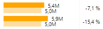
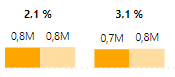
My current solution is a separate visual below which I use for the percentages. With a fixed number of items it would be easy to align the visuals perfectly, but for changing number of items it’s not ideal.

Thanks,
Matthias

Hi @Matthias - Yes agreed. Unfortunately don’t have another solution for now. Will let you know if found something.

Thanks
Ankit J

1 Like

Hi @Matthias

We noticed that your inquiry was left unsolved for quite some time now.
Looks like your inquiry was out of the experts’ and users’ bounds.

If you were sure you provided all pertinent context to your concerns and read how to use the forum more effectively and still find your question unanswered, your membership also comes with relevant resources that may help you with your Power BI education, so we advise that you check these resources as well.

While our users and experts do as much as reasonable to help you with your inquiries, not all concerns can be attended to especially if there are some learnings to be done. Thank you!

Hi,
Here is a description of how to implement a workaround:
-bring a separate chart with the percentages below the column chart.


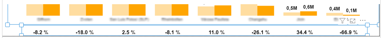
-turn off in the below visual Title, X-axis and Y-axis, turn on Data labels
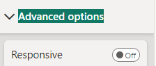
-turn off in the below visual under Advanced options “Responsive”
image
=> that will allow you to reduce the hight of the visual so that it is very slim (s. picture above)

If you have a fixed number of items it is very easy to align the two visuals perfectly.

If you have a changing number of items the alignment is can not be done perfectly (s. picture above), but in most cases it will be good enough.

Regards,
Matthias