Interested to know what people think would be the best visual to show the following…
Looking at IT support ticket data (e.g. Tickets Raised vs Tickets Resolved) and comparing performance week on week.
As an example, if 50 tickets were raised in a week and 50 tickets (not necessarily those same tickets) were resolved, this would mean we are “even” - not getting better, not getting worse.
If however 50 tickets were raised and only 20 tickets were resolved, this would indicate that we are falling behind and the backlog of tickets is increasing.
I’m looking to visually represent this so that anyone looking at the report can immediately identify than if the metric is uneven (more tickets raised than resolved), that this is a bad thing and the greater the delta between raised and resolved, the bigger the issue.
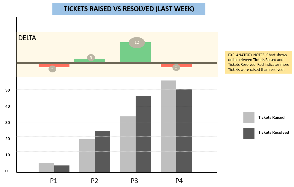
We started with a stacked column chart, but it’s not immediately obviously what’s good and what’s bad.
I personally would do a bar or line chart, however I’d plot the difference not the raised/resolved values, so 0 and 30 in your examples. That way anything above the bar is falling behind, on the bar is even, below the bar is getting ahead. Or flip it so getting ahead is above the bar as that may make more sense to users that above 0 = good. You could then have the raised/resolved values as tooltips if that detail is required.
You may have this open tickets approach which @jamie.bryan proposed to have clear picture.
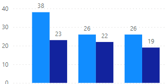
If you need side by side both measures maybe Clustered column chart will be the simplest solution.
In this case it will look like this:
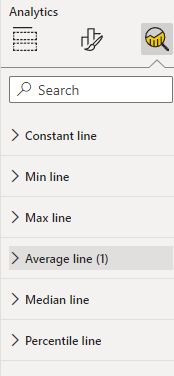
In addition you can add some of this lines
This is what I mocked up using PowerPoint. I think the column chart is the best way to compare sets of similar values (i.e. P1 Tickets Raised vs P1 Tickets Resolved, P2 Tickets Raised vs P2 Tickets Resolved).
But I’m particularly interested in showing the delta in a clear way that makes it very easy to tell what’s good and what’s bad.
I’d say a stacked bar and then add a status calculated column using if function dax to classify tickets as raised, raised overdue and resolved. Status column would be the legend, value would be count of ticket id and then the weeks would be the x axis. This would give you cohort analysis week on week where you can monitor all three elements.
Hi @Mthorburn, did the response provided by other members of the community help you solve your query? If not, how far did you get and what kind of help you need further? If yes, kindly mark as solution the answer that solved your query. Thanks!
Hi @Mthorburn, we noticed that no response was received from you since June 1st. We just want to check if you still need further help with this post? In case there won’t be any activity on it in the next few days, we’ll be tagging this post as Solved.
Hi @Mthorburn, due to inactivity, a response on this post has been tagged as “Solution”. If you have a follow question or concern related to this topic, please remove the Solution tag first by clicking the three dots beside Reply and then untick the check box.