Hi,
I was going through the Bar Chart Charticulator module in the the Advanced Data Visualisations P2 course and I had trouble creating the Max highlighted value (Where is highlights the highest value bar) by using my Max Tickets measure. I think I’d followed the steps correctly but seems unable to bring this measure into the Charticulator visual for some reason.
Bar Chart PBIX.pbix (1.8 MB)
Thanks
David
@DavieJoe I don’t think conditional formatting is supported yet.
1 Like
Hi @AntrikshSharma & thanks for your reply, I just couldn’t seem to bring in my MAX measure into the Charticulator visual at all. Seems a bit strange. I guess I can go to the website and try that way.
@AntrikshSharma,
@MudassirAli shows in his video how to color in the bars of the chart, and has it to where the max number is highlighted a different color.
Thanks
Jarrett
1 Like
@DavieJoe,
Did you do this on the Charticulator website, or use the app that is built into Power BI. When I click on edit on the three dots at the top right of the chart, I should get the Charticulator menu if you used the app. If you used the website, then you will have to bring in the visual you created. I’m working on doing this with the app right now.
Once I have created the finished product, I’ll post the solution.
Thanks
Jarrett
1 Like
That’s great that’s @JarrettM, it’s more for my own learning as I’m going to work my way through the course. I was using the app.
1 Like
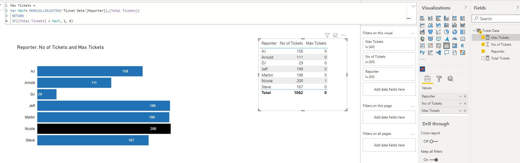
@DavieJoe,
Got it to work, but had to change the Max Tickets measure, and just bring in No of Tickets column, not measure for it to work. It didn’t like the Max measure as text, so I adjusted the measure to be a whole number and it worked.
PBIX:
Jarrett Bar Chart PBIX.pbix (1.8 MB)
Thanks
Jarret
2 Likes
Magic, thank you @JarrettM I did begin to wonder if that might be the cause!
2 Likes