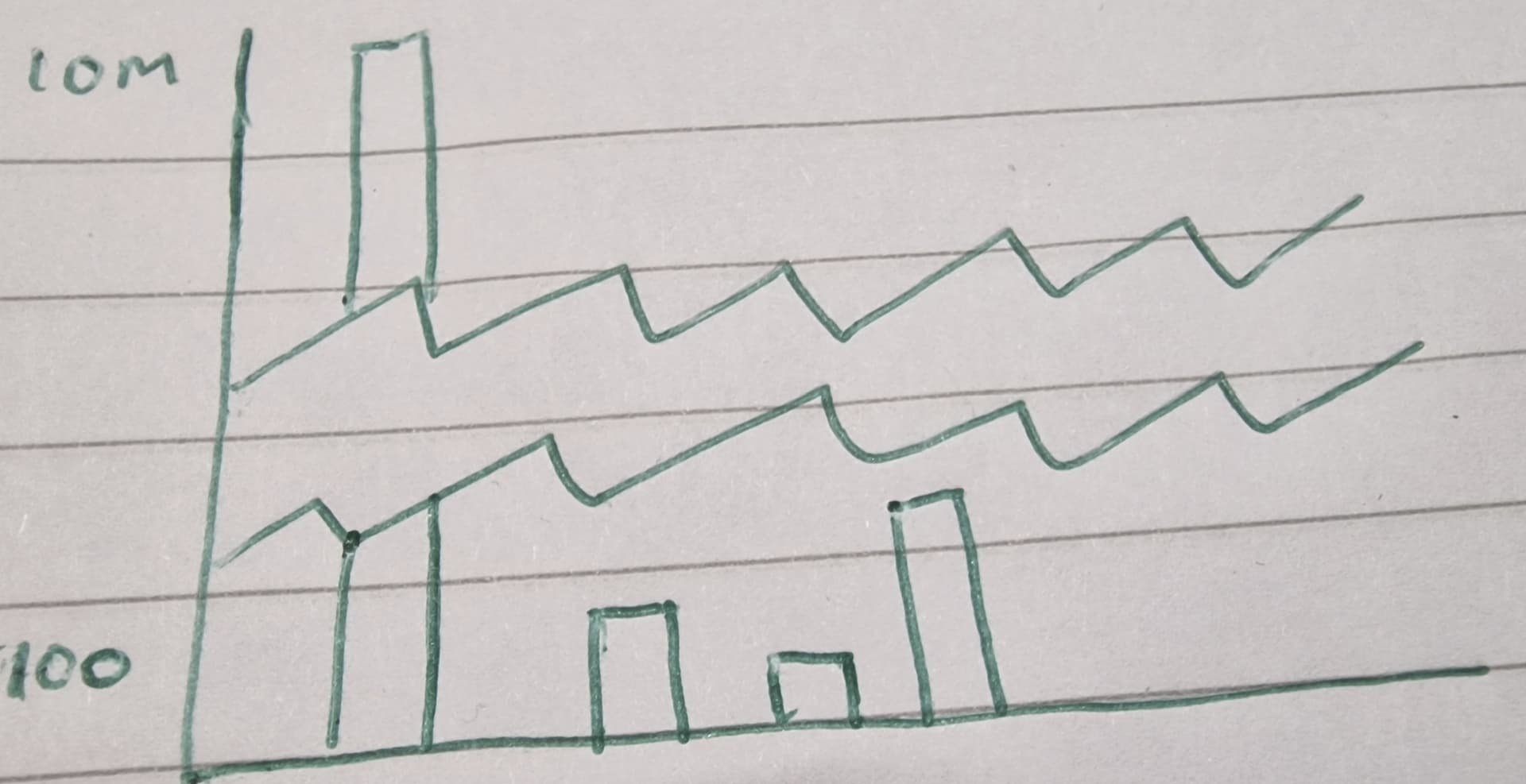
hello,
is there a possibility in power bi with the existing visuals to have a chart similar to this screen-shot?
Note, as there are very high values such as 10 Million as well as small values i.e. 100 then can this be achieved?

The point of a chart like that is to allow comparisons among relative heights of columns. Breaking the y-axis distorts reality and those comparisons lose meaning. The same can be said of rescaling either non-outliers or outliers simply to make the differences less pronounced.
You could transform all values so that large differences are less pronounced and then back-transform data labels and/or primary/secondary y-axes tick labels (to make it easier to understand).
You could also separate non-outliers from outliers in a nested visual with separate scales. A zoom in/out approach.
1 Like
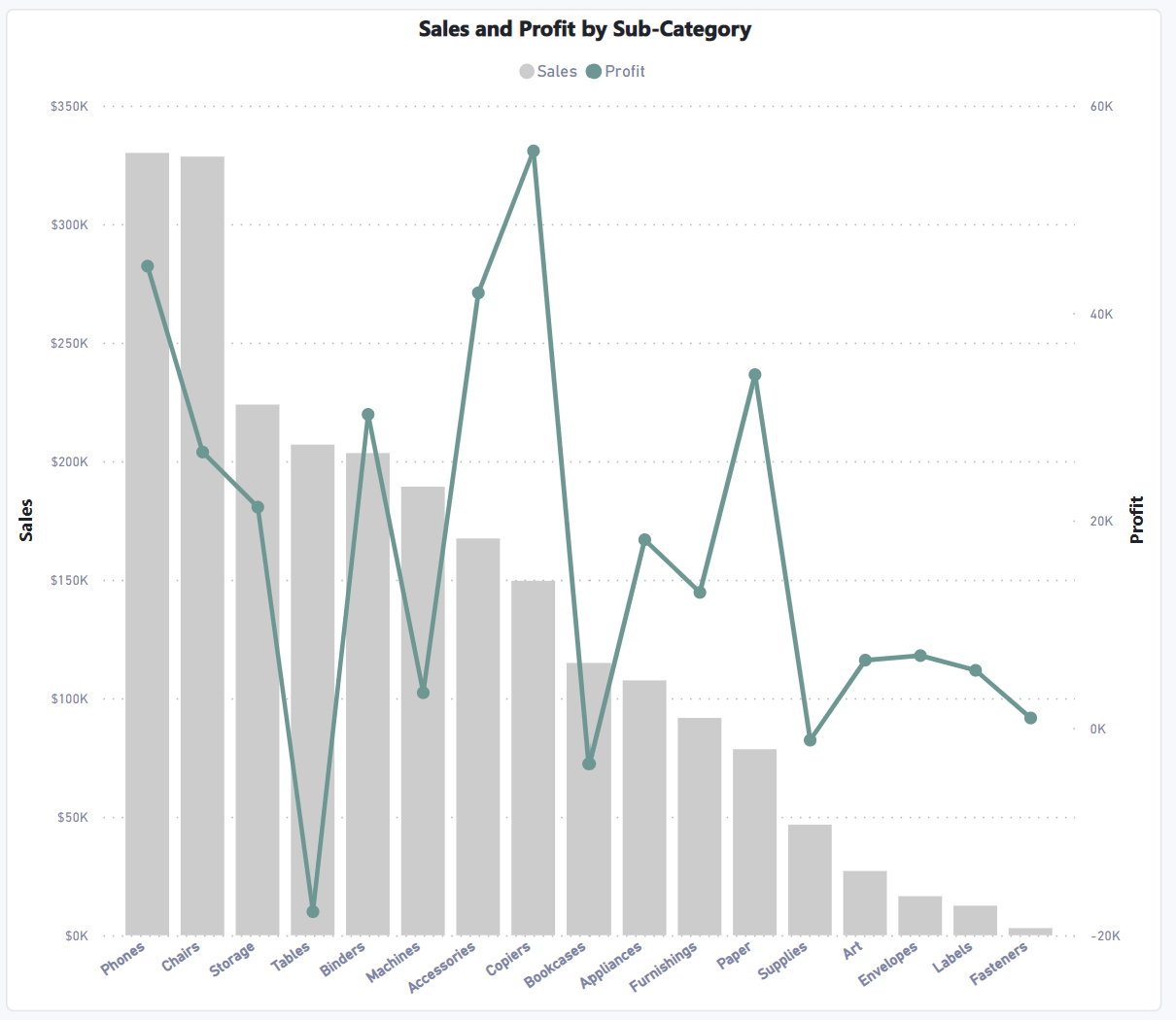
@arkiboys Yes, I think you should use the Combo chart (Line and Clustered column chart) where you can setup the Min and Max values as well.
Do let me know if that works for you! Thanks
Hello @arkiboys
Did the responses above help solve your query?
If not, can you let us know where you’re stuck and what additional assistance you need?
If it did, please mark the answer as the SOLUTION by clicking the three dots beside Reply and then tick the check box beside SOLUTION
Thank you