Here’s @sunip entry for Power BI Challenge 4. @sunip, would you like to share how you built this dashboard and what your inspiration is in building it?
Need to split the arrival date and then format again as the date time column and calculate the duration between the Arrival time and Departure time, join with date.
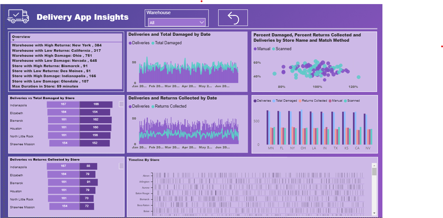
Created Key measures to get the count of deliveries, matched, scanned, returns, total damaged(label damaged & other damaged) and percentages.
Created overview key measures to get the dimensions & measures for min and max damages, returns for warehouses and stores
Used some custom visuals like cards with states for word wrap, tornado chart between 2 measures, timeline to get overview.
Used bookmarks to rest filters and also sync filters option
Wow I really love the colours here. I love it when I see really bold colours that make the reports and analysis stand out. Nice work @sunip
I also am intrigued by the very unique visualisation’s that you have used. These aren’t ones that I would have ever thought of using but I think they actually work really well. Especially on the first page showing the distribution of delivery times. This is a really superior way to show this insight, and I can see that you’ve put a lot of effort into thinking about it and putting it in the right place within the report.
I really like the way you’ve also use text to create a summary, I think that that is a great way to highlight the most key insights or take aways from the report.
Overall I applaud this great work I think this is a great submission. The only tiny thing that I don’t love so much as the different colours you have used in one of the visualisations. It doesn’t seem like it’s the same palette as your other colours. Just at one change I think this report would be given top marks from me. I love it otherwise.
Thank you, Sam for your valuable feedback! This is really encouraging to me and I get your point on one of the viz having different colors and will make sure to avoid different colors in future challenges. Looking forward for the next challenge.