This is a solid submission. It covers all the key insights really effectively.
I love all the cards displayed across the top. This is a favourite technique of mine, that tells a consumer exactly what they should be focussed on when they place any filters on the page or in the report.
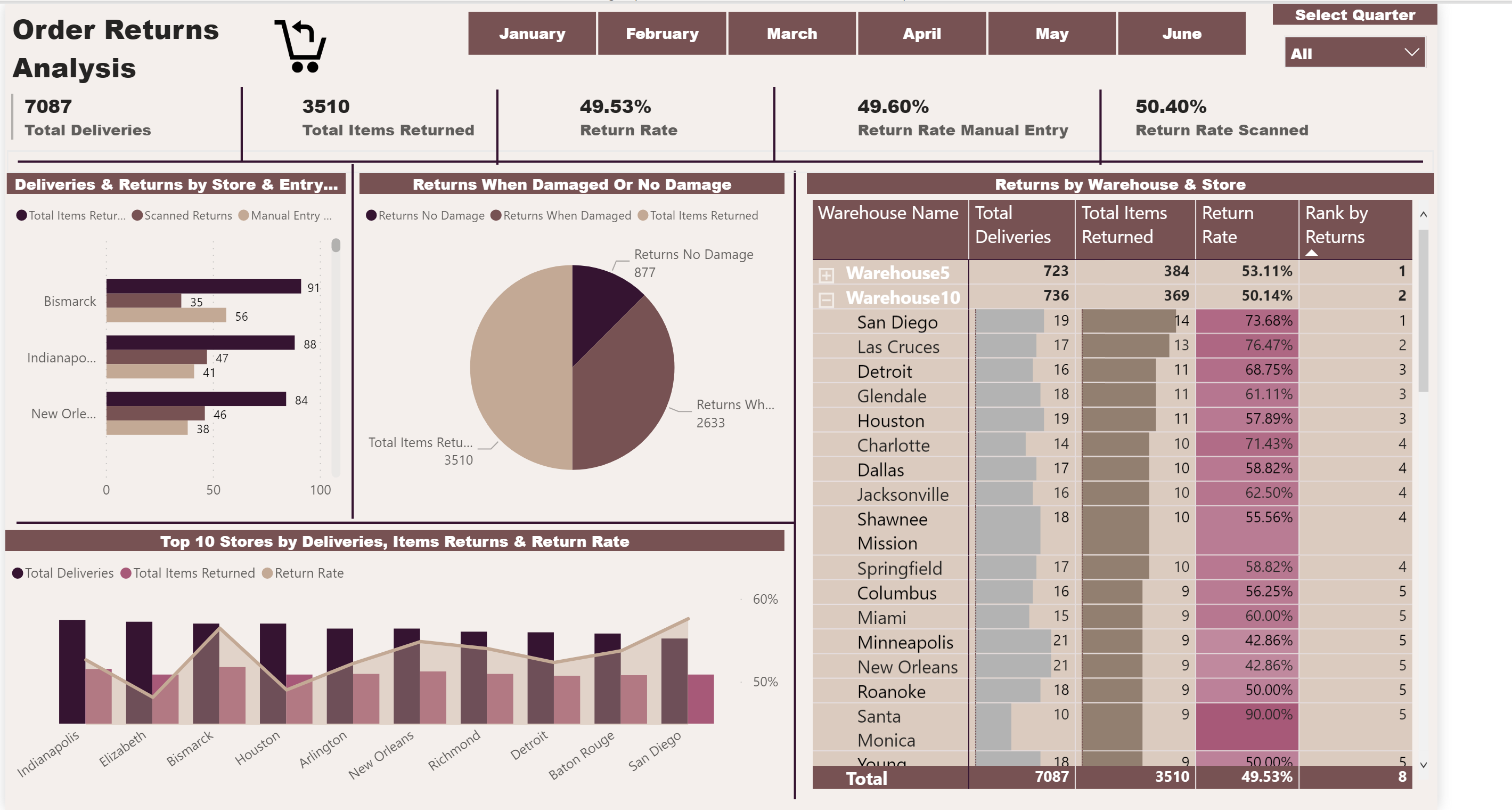
One things I would maybe do here is to be bolder with your labels and colours. The colours in the table don’t seem to contrast with the main theme you’ve used. But don’t be afraid to go bold with the colours, and maybe create some contrast within the background to make some information stand out when warranted.
Don’t forget to use the colour theme generator
It hard for me to fault much here. Really solid.
How did you find it?
What are some things you want to challenge yourself with next time round in the challenges. Try to think as much outside the box as you can and take as much inspiration from other submissions. There’s so much to learn
Thank you Sam for your feedback. Sorry, I had some urgent things I had to handle. So, I couldn’t submit my thought process( I totally missed challenge 3 too).
How I create some of these reports might not be suitable for a showcase as I am learning and a student teaching a student might not be
a good idea.
But generally, I was thinking of the requirements that was provided and based on that, I created a report which I thought should reflect, if the app the company implemented made a difference on how long it took to deliver to the desired destination by calculating the minute difference between arrival and left columns when it’s scanned or manually entered.
I wanted to create a time calculation by creating a date dimension but, because of the time stamp on the fact table, which I needed the date table to connect, didn’t work. So I figured that if the time the order arrived and left is the same day and this is the main analysis the end users needed, and the dates provided were the same date, I don’t need to create a date dimension. There fore, instead I worked with the dates that were in the fact table.
To calculate the average time it took in minutes between arrival and departure, I used datediff function - Averagex( Deliveries, datediff ( arrival,left, minutes) ) .
When it comes to visualizations, I thought a light and visually not too heavy might keep the clients look deeper to the report.
Obviously, The color palette, should have been better, will improve that and use the EDNA color generator in my future projects.