Here’s @Mohammed_ali entry for Power BI Challenge 4. @Mohammed_ali, would you like to share how you built this dashboard and what your inspiration is in building it?
To learn about the real-life scenario presented for the challenge, be sure to click on the image below.

1 Like
Well done on this Mohammed. You’ve created a really innovative report. The visualisations that you have used are really effective and I think you’ve implemented a nice navigation to the report as well.
Here are the things here that I really really like. I love the icons you have used, also the small trend lines in the bottom left of your page I think are really affective.
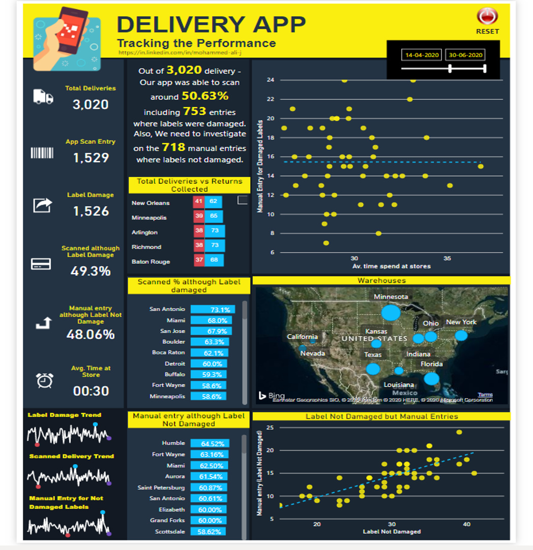
For me in this challenge I thought that the map visualisation perhaps didn’t show as greater insight as some other visualisations that you could’ve chosen. It does take up quite a lot of room in your report but doesn’t really showcase that much compare to if you just place this into a smaller chart.
One other thing I thought that could have pushed this report even to a higher level would have been to really simplify the colours you have used to maybe two or three. Also maybe just having a little bit more space between the grids where you have placed all of your visualisation’s.
Check out the palette generator here for many colour combinations
That’s all I could think of really other than that I think this is a fantastic submission to the challenge, and I can see you’ve really put a lot of effort into how this is all laid out.
Well done
Sam