Here’s @Melissa entry for Power BI Challenge 4. @Melissa, would you like to share how you built this dashboard and what your inspiration is in building it?
To learn about the real-life scenario presented for the challenge, be sure to click on the image below.

1 Like
Hi everyone,
This was the first time I participated in any of the challenges and I really loved doing it.
I think it’s a great way to practice what you’ve learned, experiment or just take a chance to focus on a certain aspect of report development to get a better understanding and/or expand your skills.
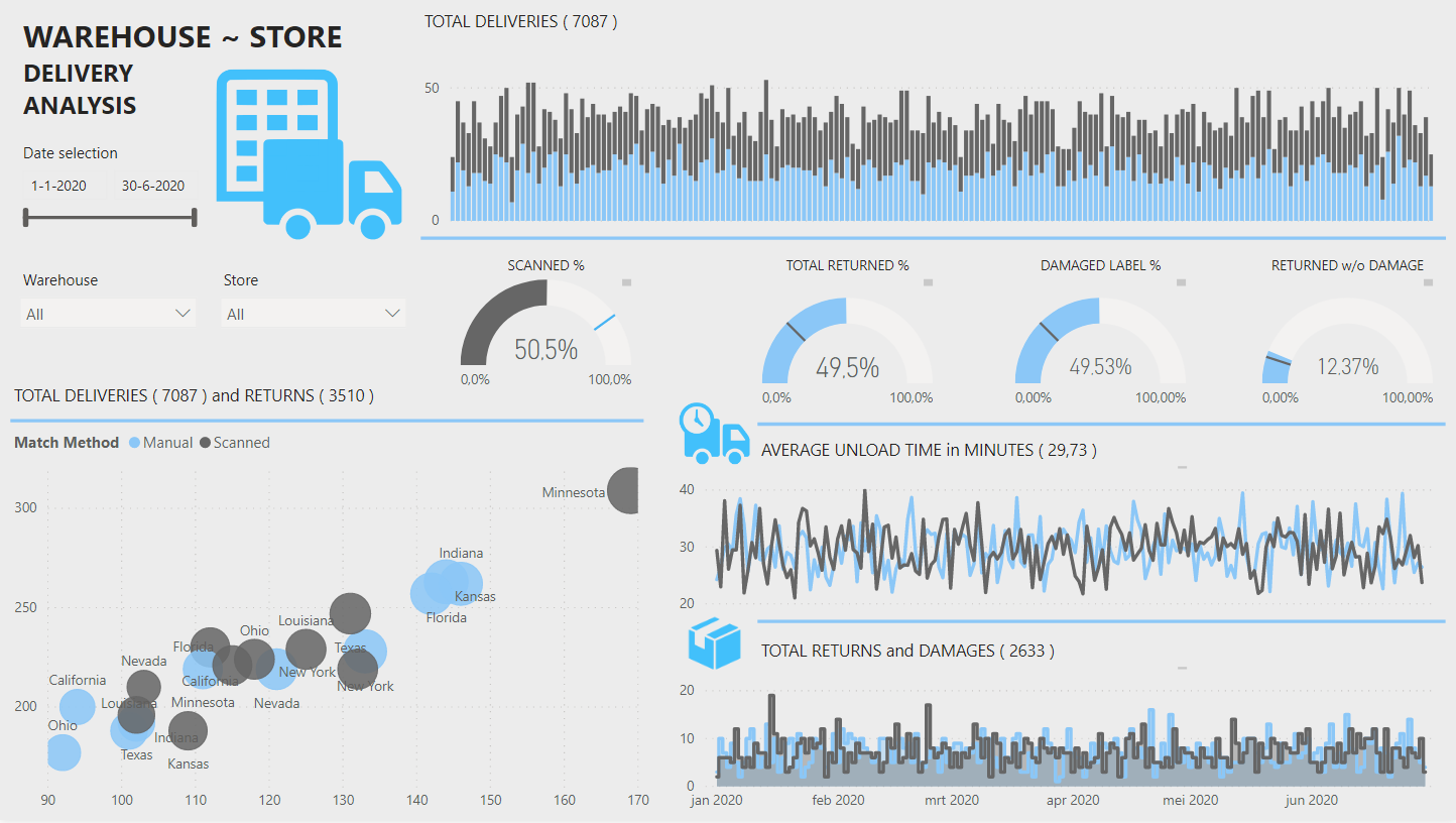
Every report begins with getting data, so first up: Data prep
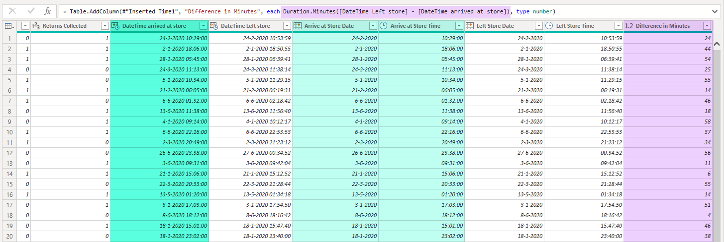
Combined DateTime values have a very high cardinality it’s best practice to split them up, reducing dataset size. And added “Difference in Minutes” to easily calculate Avg. unload time in DAX later on.
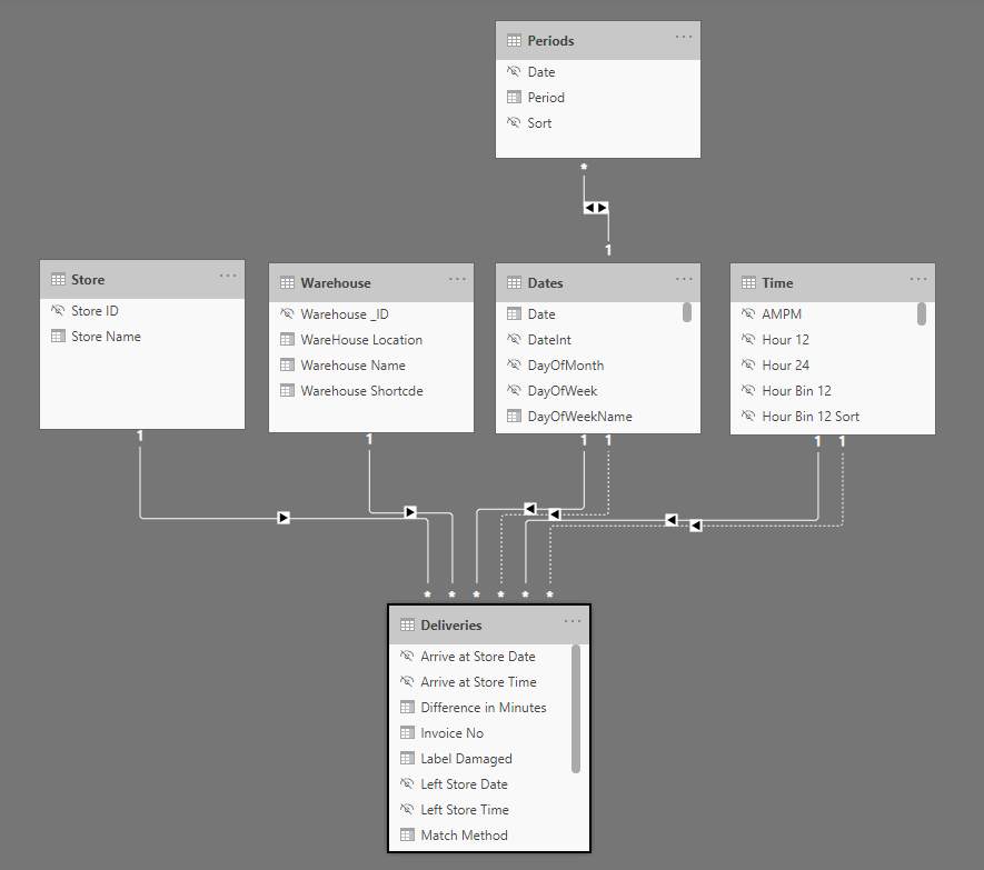
The Model. Beside the Dates table I added a Periods and Time table (all can be found in the M Showcase category) because I thought about exploring / using them but didn’t in the end.
I made a habit of hiding Key- and other fields in Report View that are not intended to be used in visuals.
The Analysis. I really wanted to keep things simple and stay close to the brief on this one. As a result I didn’t have to create any advanced measures to get all the metrics in.
Now not knowing the business of company behind the data made me wonder about the meaning of the large number of damages and returns. Returning damaged packages seems reasonable but returning packages without any damage at all perhaps less so(?). Decided to include that in the report.
All except the Gauge titles are based on Measures and dynamically showing the values for the selection.
Finally color scheme and lay-out. Really wanted to experiment using high contrasting- but as few colors as possible in combination with lines to arrange segments on the page. Think that worked well here.
3 Likes
As you said Melissa, we didn’t really have much insight to the business - I certainly would have needed to ask more questions if I got this from a client.
My take on damaged packages versus returns was this - the company I work for receives packages from a Wholesale Company (not from warehouses allover the US - just the closest three  )
)
And the packages are received in the very early morning (3am) by a single person. He does check for package damage, but does not open the packages to inspect the contents. Some packages may be damaged, while the internal product may be just fine and does not need to be returned.
So for us, returns don’t tend to happen on the same day as delivery.
Also, we may have returns for undamaged product - and in those cases it’s because our customer changed their mind about the purchase (either due to the product not being correct for them, or because they cancelled the order after we had submitted it to the warehouse).
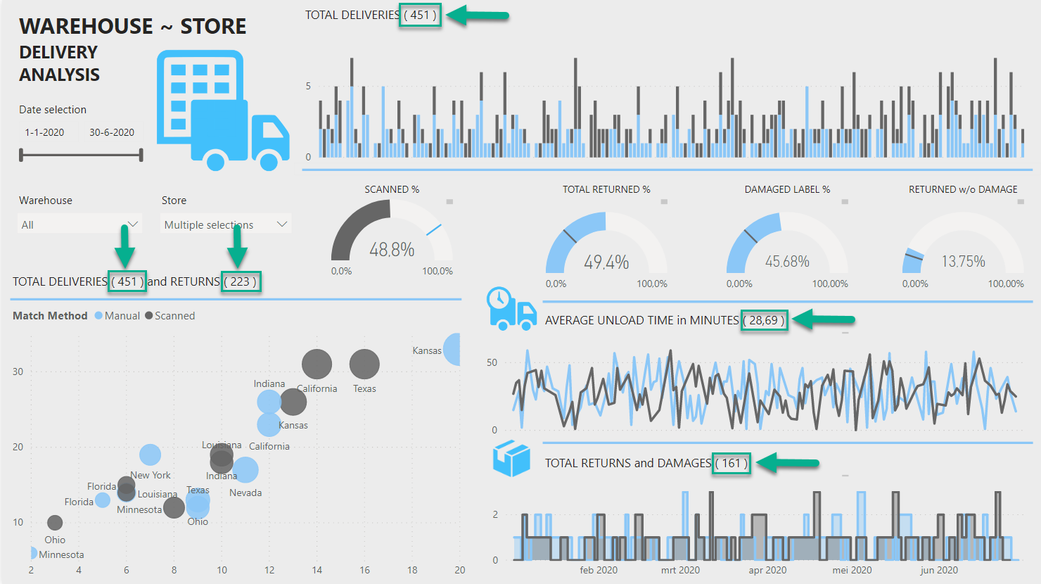
Just an example of how you can have 13% of undamaged packages to return.
I like the simplicity of your color scheme, one thing I always try to do is not let the background ‘steal’ the spotlight. Yes, I want my users to have a good response to the report, but I don’t want them to think about it being due to the colors/background used.
Definitely going to have to borrow your dynamic title usage - I rarely consider including the total value in the title, but I like the effect you have here.
1 Like
Definitely. I like report development to be a process you go through with the stakeholder(s). Depending on the complexity I try to go through a few short development cycles after the initial briefing especially if the stakeholders are relatively new/unfamiliar with Power BI. That way we can keep momentum and commitment, I’ll throw in a surprise analysis page now and again just my take on what the data can tell us - that’s lots of fun.
.
Just with the sheer amount of damages and returns I kept picturing something like this…
4 Likes
What I like the most here @Melissa is how this is such a creative and high-quality report in its simplicity.
In one single page you’ve showcased every main insight required for the challenge and you’ve also laid it out in a really effective way with only using a couple of colors.
This to me really highlights how you can create superb reports without overcomplicating things. Sometimes when you try and make things too complex in a report it totally takes away from the main things you’re trying to show, but with your submission here you’re used many techniques with your visuals and labelling that are so effective.
I’m also really leaning towards limiting colours within reports even more after looking at your report here. All you really need is two to three colours and I think that’s what makes things stand out better than any other method I’ve seen.
Also the dynamic titles and guauges here actually represent the key calculations maybe more effectively than any other report I’ve seen. I also like how you have created grids within your report without having to do anything fancy other than using a line. Really simple and effective I love it.
Nice work
Sam
2 Likes
Hi Melissa, awesome report.
I always have this date & time split dilemma when it comes to compare 2 timestamp fields in a DAX query.
And I want to ask for a general opinion from you. if my take is correct ?
In one of my reports, I have 2 datetime fields in a fact table.
Let’s call them: datetime_1 & datetime_2.
In my Dax Query I need to do a row count on the fact table where Datetime_1 > Datetime_2
With DaxStudio, I found out that this ‘materialization’ happened if I split Date & Time columns in my fact table. This appears to be expensive. However, this approach provides less cardinality.
Then I tried with Date & time in 1 single column (in this approach, I will have only 2 columns for my datetime fields). When checking with DaxStudio, no materialization happened, hence better execution time.
With this, I selected high cardinality approach - without splitting the Date & Time columns.
Am I doing it right ?
welcome any comments.
Hi @akiko_lim,
Guess the correct answer, as always is: “it depends”…
My first thought. Split DateTime values in Power Query and add a column for the logical test (Datetime_1 > Datetime_2), the resulting boolean values are cheap and will most likely improve DAX performance.
But in the end if you are experiencing a trade off, only you can judge which method is acceptable under the given circumstances.
I hope this is helpful.
Thanks Melissa for your input.
Definitely your trick on saving resulting boolean helps to further optimize. Great idea.
Got it. Appreciate your input.