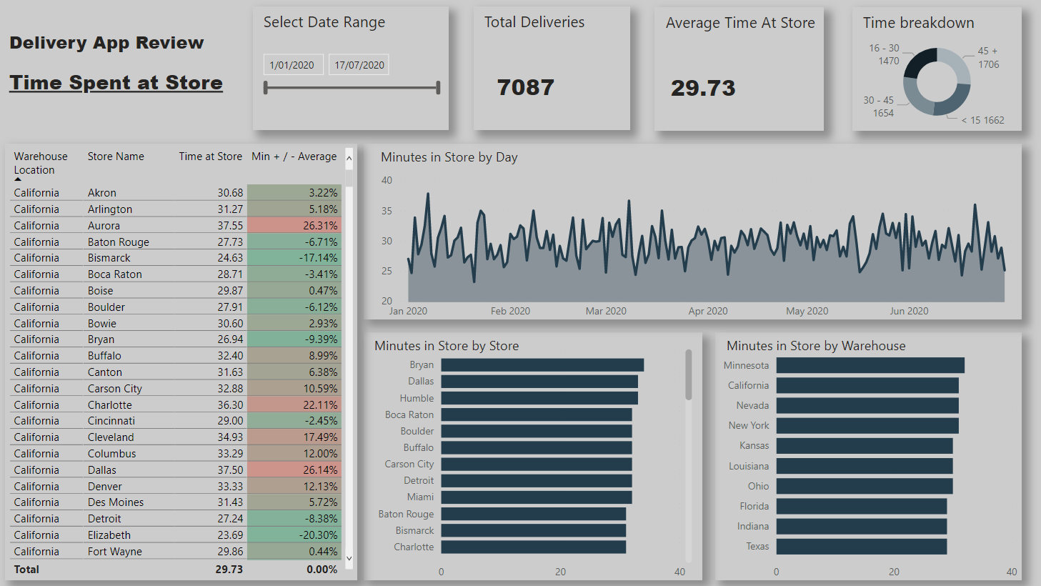
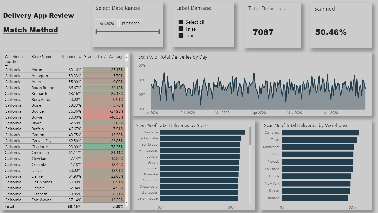
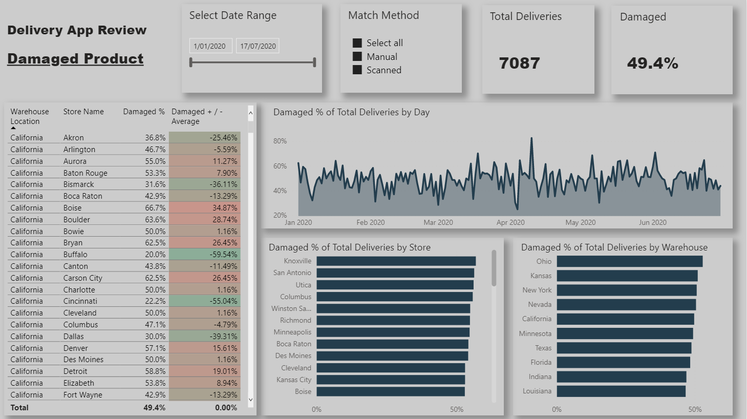
I chose to create a report page for each of the 4 key metrics that management are interested in.
It was also mentioned that management were particularly interested in warehouse store combinations. The table to the left of the page shows these along with a % increase/decrease to the average so that management can quickly identify the combinations that are/aren’t working well.
Each page is filterable via the bar charts so that individual store / warehouses can be viewed.
The Match Method page is filterable via whether or not it has scan damage so that we can identify stores/warehouses not scanning when they should be. The damage and returns pages are both filterable via the match method so that we can view the performance when the app is used and when it is not.
The Time breakdown donut chart uses a supporting table that is used to dynamically group the deliveries. and the + / - Average on each page is levering the ALLSELECTED function. (Both techniques I’ve recently learnt on this site )
Really well done with this @Luke a solid effort. And I can see that you’ve really thought about how you’ve laid this out and answered the brief really affectively.
I actually think it’s a good idea to lay things out in a step-by-step fashion as that’s what the challenge brief asked for. So if someone was looking at those key metrics they would be able to quickly go and find them on a specific page.
One thing that I think would be a good thing to think about and actually challenge yourself with in one of the upcoming challenges is to be a bit bolder with your colour choice and use a consistent and simple theme across all of your pages. And maybe also have a think about how you can creatively showcase these insights in a more condensed way. Maybe innovatively use filters or book marks or some other of the feature set that you have available in power BI.
Feel free to steal many of the other great ideas that others have been implementing in their submissions over the recent months.
Thanks for taking the time to provide the detailed feedback @sam.mckay. Much appreciated.
To be honest I had never used a bookmark or a button . I’ve gone ahead and condensed the report using bookmarks/buttons to create a pop out slicer panel that allows the viewer to select which metric to view and also adding additional slicing options . Doing that condensed the report from 4 pages to 2 whilst losing no functionality.
Not sure if this is the correct space to ask additional questions (please let me know if not). I could have also brought in the time at store metric to the single page however it is a different format (decimal and not %) and since we are using a single measure and a supporting table for the metrics i don’t think I can update the format from within the measure?
Have also added a moving average to the metrics by time chart as suggested by @BrianJ
I could probably have made further improvements in terms of chart choice and utilising some of the empty white space but i figured i wouldn’t reinvent the wheel this time around.
Have attached PBIX and link to report if you’re interested


 )
)