I tried to keep things simple with this Challenge, but after reviewing the dataset I had to adjust my thinking. I’m usually very quick to assess the situation, and come up with a solution in a short time. For some reason this one gave me a challenge, which I really enjoyed. I really enjoyed bouncing ideas back and forth with @BrianJ .
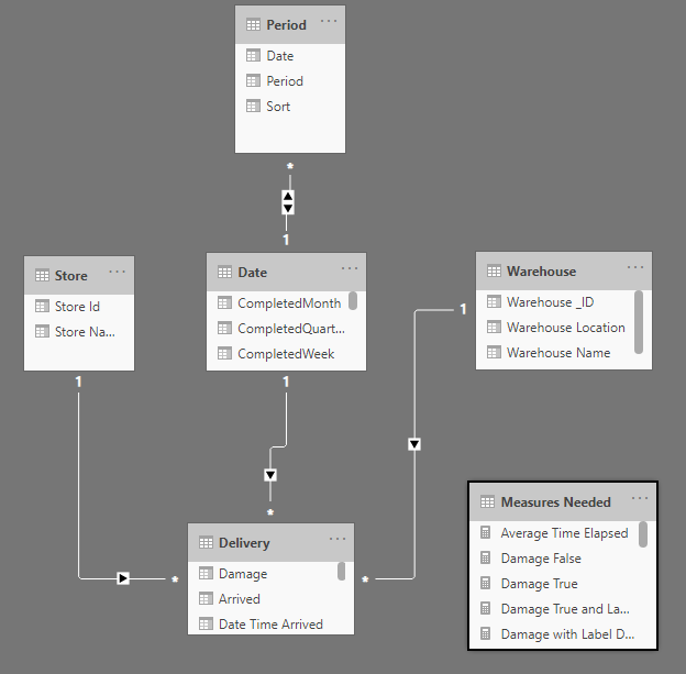
Here is what The model looked like. Nothing complicated here at all. I have a PBIT file that I use as a template for all of these challenges, which includes the Date & Period tables. I’ll include a copy of the PBIX at the end of the write up, and all you would need to do to use this as a PBIT file is get rid of all the tables, except the Date and Period tables, and save as a PBIT file.
I was looking online for images of current delivery companies, and came across a Uber Eats logo that I thought would create a great palette for this report. I just added a little twist to the name, and called it EDNA Eats. @sam.mckay was the only one to comment on it. Figured I would get a few more comments for the clever name, but no big deal 
Here are what my slide images look like from my design that I created in PowerPoint, that I add as the background to each of my slides:
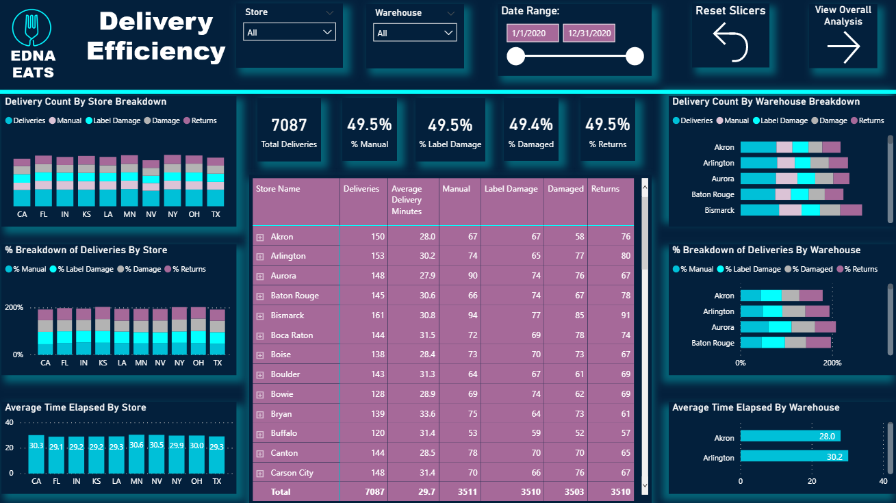
For the design of the Delivery Efficiency slide, I wanted to keep most of the store information on the left side, and the warehouse information on the right. A common mistake that many make in my opinion is not separating this data, which confuses the end user. One of the biggest questions that I ask myself as I’m designing reports is: “Am I making this user friendly and understandable for the end user?” I also try to make each one of the visuals a decent size, to where it doesn’t look like I have crammed to much info onto one slide.
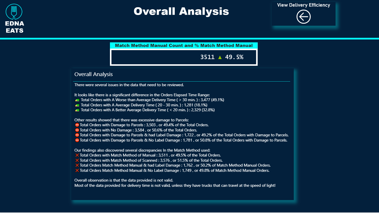
For the Overall Analysis slide, I saw @DianaB post her entry and observed that she used DAX & UNICHAR to create her summary. I have never really used this type of technique before, so this was a slide that took longer than anticipated, but worth the extra time spent. I got all of my UNICHAR codes from the following website: https://www.vertex42.com/ExcelTips/unicode-symbols.html
Here is a copy of my PBIX: EDNA Delivery App Review- Jarrett Moore.pbix (1.8 MB)
If anyone has any other questions regarding my entry, please feel free to ask.
Thanks
Jarrett