Here’s @Hideo entry for Power BI Challenge 4. @Hideo, would you like to share how you built this dashboard and what your inspiration is in building it?
First of all thank you for giving me this opportunity to submit my report.
This is my first challenge and I am still learning PBI as a student, in my level of challenge this time I wanted to complete my report in one page as efficient as possible.
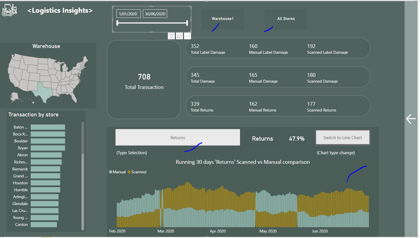
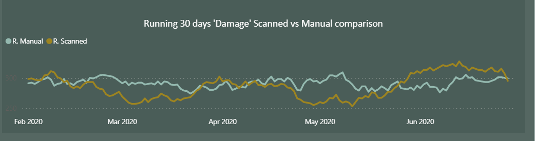
Also I have focused on to see how the App is working efficiently, how damage or return level is less or more compared with manual job.
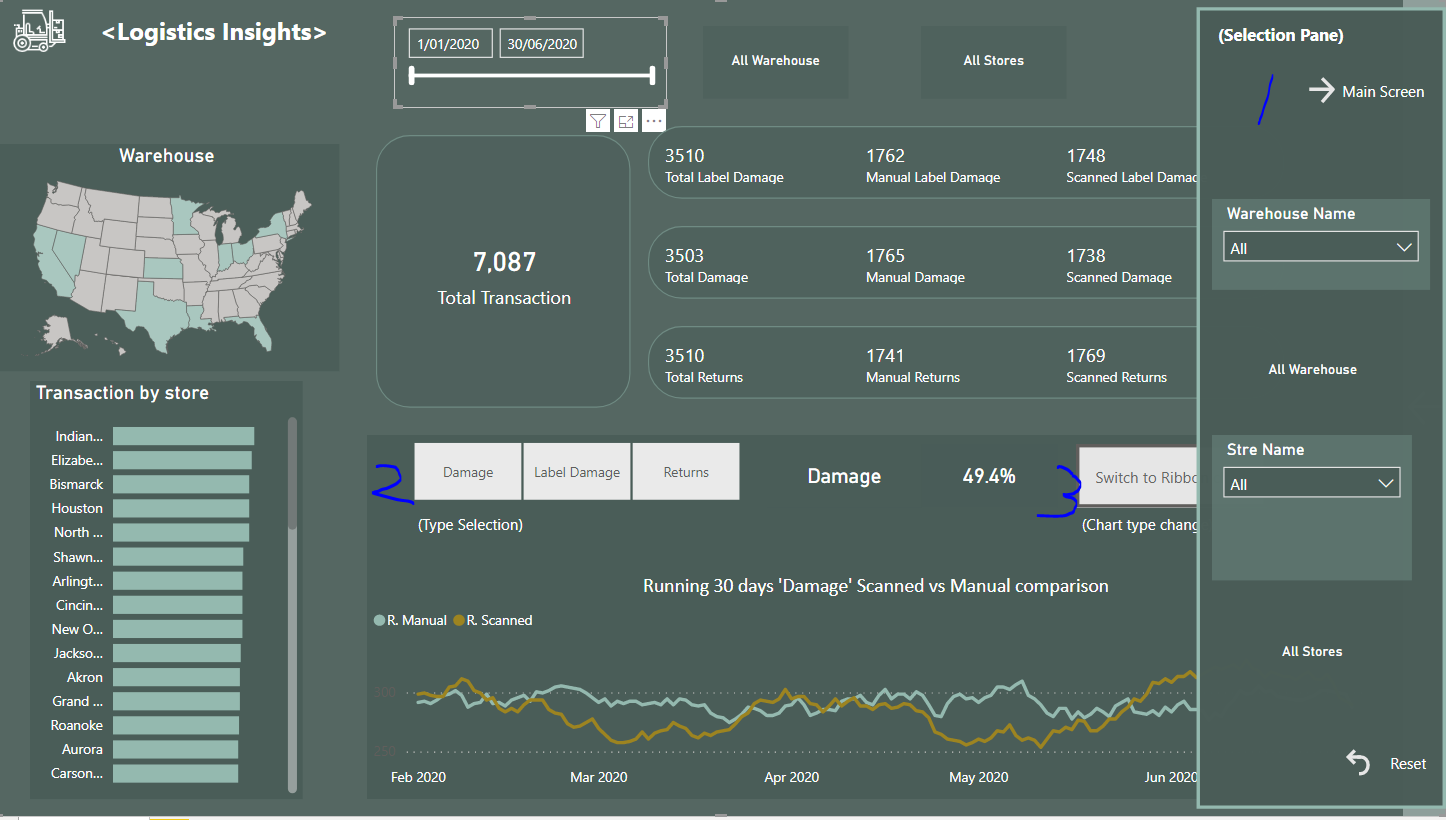
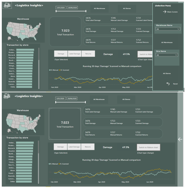
*To save some spaces I have created “selection pane” which saved 20% of screen.
Found this is much cleaner than before.
(used book marks to create selection pane)
*To make report as efficient as possible, I have created three dynamic measures.
One is to show percent of three incidents(“Damage”, “Label Damage” and “Returns”) against total transactions.
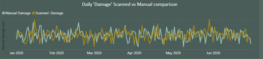
The other two are 30days running total by “Manual” and “Scanned” which allowed us to understand how this App is working good or not in each incident level.
Used running total because chart looks more comprehensive than daily total.
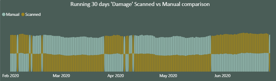
(below screen shots are to compare daily movement vs running 30days movement)
(I cut off first 30days for the running total to make the movement consistent)
As of my last challenge, I wanted to create button to change chart type from line chart to ribbon chart.
In my view the ribbon chart looks more obvious to know what’s going on.
I have used book marks again.(not quite sure this is an efficient way of doing this but I just wanted to challenge)
I admire all the participants of this challenge also EDNA experts who is working hard behind the scene to prepare this challenge series.
Also I respect all the PBI users and EDNA members.
Really well done on your first submission to the challenge @Hideo
I like so much about this report especially some of the unique visualization ideas you have embedded into it. Including the selection panel, the dynamic visualizations, and the way you’ve used a ribbon chart which I personally have not used ever before.
You’ve also used a consistent color palette which I think works pretty well. The only thing I would maybe add to the way the report is set out is maybe some contrasting colors and backgrounds laying out certain grids within your report. I can see your used backgrounds to certain visuals but they don’t seem to line up as much. Have a look at some of the other reports in the challenges and see how the alignment of backgrounds can really make your metrics and certain parts of your insights stand out.
One thing I also would maybe adjust for next time is have similar borders around visuals in your reports You’ll see that some are rounded and some are straight edges. I think you want to try and have them all the same.
With that aside though I can see that you’ve really looked to challenge yourself with this and you’ve thought outside the box creatively which is what this initiative is all about.
You’re definitely also answered everything that the challenge asked for and all of the key insights really stand out. Super work on this and look forward to seeing more submissions and follow-up challenges to come.
Thank you so much for your warm review @sam.mckay.
I’m really glad to know that you like my report.
I agree with your advice that having backgrounds laying out with certain grid will looks more line up.
Also similar borders around visuals which I have noticed later too.
The report looks simple with only one page but behind the scene I have created a lot of measures and concentrated on with only three buttons.
This wasn’t quite required on this challenge but I really appreciate you have looked at the details of my report.
I’m just one of your fans and have enjoyed the video on challenge #4 too.
(Fantastic grouping technique on the final report. )
What I think I have learned from EDNA is not only the BI skills but the sense of business through the videos.
And I believe everyone loves.
Congratulations for another challenge series success and thank you so much for your feedback.