(already done with my submission, but copied here as requested.)
NOTES:
General
imported Delivery data to staging table, then used as reference for Deliveries and Match Methods tables
used multiple transformation in Power Query to process the [DateTime arrived at store] text data into valid datetime values
used “Enter Data” to create Yes/No lookup tables for Damage, Label Damage, and Returns Collected and Manual/Scanned lookup table for Match Method
used eDNA extended date table
searched web for background image for warehouses
used 3-step PowerPoint process to darken image: apply 0% linear black gradient background (dark right to light left), import image, apply overlay 20% transparent rectangle using dark green colour from PBIX palette
used eDNA Colour Theme Generator to extract colours from background image; augmented colours with others from palettes found on various other websites
took inspiration from Diana Bello’s winning challenge #3 submission and used “tab” buttons and rectangles with slightly differing font sizes, font colours, and background colours
Analysis of Warehouse vs. Store
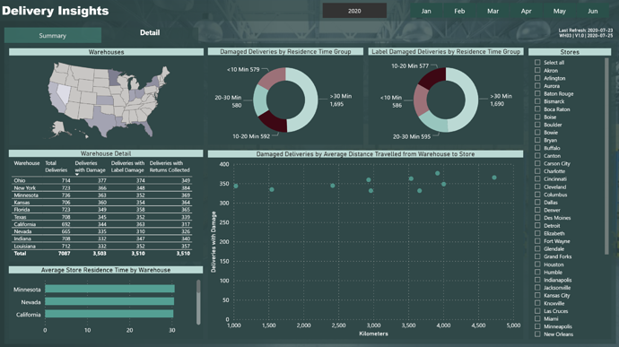
it appears that every store gets deliveries from every warehouse, and there appear to be many US cities with the same name
there were many matches for some stores/cities, so I made choices
there was no city name for warehouses, so I made choices (different than store cities)
the arrival datetime value was in minutes (no seconds), therefore used only minutes for [Store Residence Time (Minutes)]
Other
used Play Axis (Dynamic Slicer) custom visual to animate the month slicer on the Summary page
used Enlighten Data Story custom visual for static text/dynamic measures on Summary page
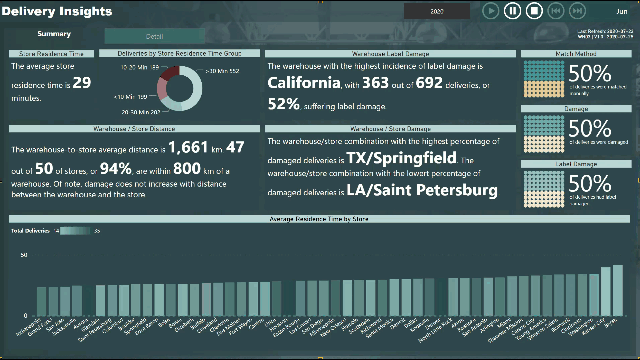
used Enlighten Waffle Chart custom visual for Deliveries Match Method (Scanned/Manual), Deliveries with Damage, and Deliveries with Label Damage on the Summary page
used gradient legend on Average Residence Time by Store column chart
used eDNA DAX Clean-up Tool to format all DAX queries
Follow-up
I know this was sample data, but if accurate city names and longitudes and latitudes were available, the key insights on the Summary page would be relevant
again, the sample data does not show this, but one would have expected an increased level of package damage and label damage with increased delivery distance (and the inherent increased number of handling/movement events); this was the goal of the scatter chart on the Details page
also, as @BrianJ noted, every warehouse delivers to every store, which is an unlikely situation
one would expect that each warehouse would be assigned a “radius” within which to deliver to stores; this was the goal of the Warehouse / Store Distance section on the Summary page
I love the creativity around the backgrounds and imagery that you’ve used. I think small elements like this actually add up to make a report so much more compelling.
I also really like the innovative visualisation’s you’ve used as well. I’ve never ventured so much outside the custom visual palette, but I can see that for certain insights these Custom visuals to work really well.
I think the colour scheme works really well together as well. It’s not too complex and using similar shades of green works really well.
I can understand your thoughts around the demo data not being very realistic. So we will have a think about how to improve that going forward. Sometimes it can be difficult to foresee all of these potential issues when we are just trying to work out some data for each challenge.
I also really love how you thought outside the box here with some of your insights. And trying to think about how logistical optimisation could occur if the data had a bit more meaning.
Thanks Sam … one of the most important things I’ve carried-over from my engineering background is that one should always include the “do nothing” option when evaluating alternatives; in the case of preparing a report, one should always be aware that the data may not support the insights you’re looking for (channeling @BrianJ ‘s challenge 3 write-up), and perhaps the next step is to refine the data collection/prep before the report can present useful insights. Thanks again, Greg.