Challenge 4- Delivery App Data Entry from Diana

Here’s @DianaB entry for Power BI Challenge 4. @DianaB, would you like to share how you built this dashboard and what your inspiration is in building it?

To learn about the real-life scenario presented for the challenge, be sure to click on the image below.

power-bi-chal-1

Hi All,
This time I create my report thinking in the things I wanted to learn in Power BI.
I wanted to use:

  1. DataFlows: in my workspace I stored the Dates DIM table that I use all the time. I am very happy because is much easier to share and maintain.
  2. Text with measures: I create an Analysis with a narrative for storytelling. I made many assumptions for my analysis from the data provided
  3. Bookmarks: I used buttons to navigate thru the bookmarks. I was enjoying creating my report until I start using the bookmarks
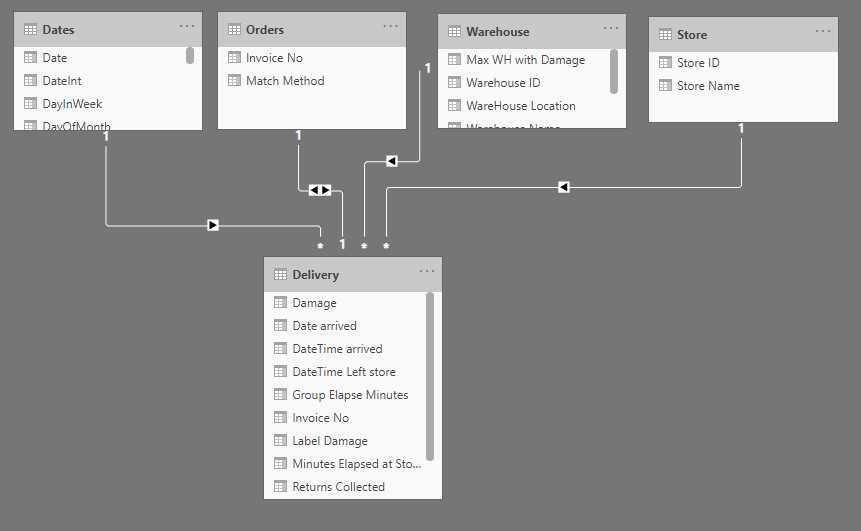
 :frowning:

The data model

Data Model

Dimension: Dates, Orders, Warehouse, and Store

Fact: Delivery. There the problem with the different date formats, I did the following:

  • I changed the date to text.
  • I did analysis of the problem, there were mixed mm/dd/yy with dd/mm/yy. And the Depart date had not errors, I assumed the problem was with the dates with mm > 12, so,
  • I split the dates and time, then I split the dates again in mm, dd, and yyyy. To create my date I concatenate mm, day, and year using the logic “If mm > 12 then use the mm as dd and the dd as mm”,
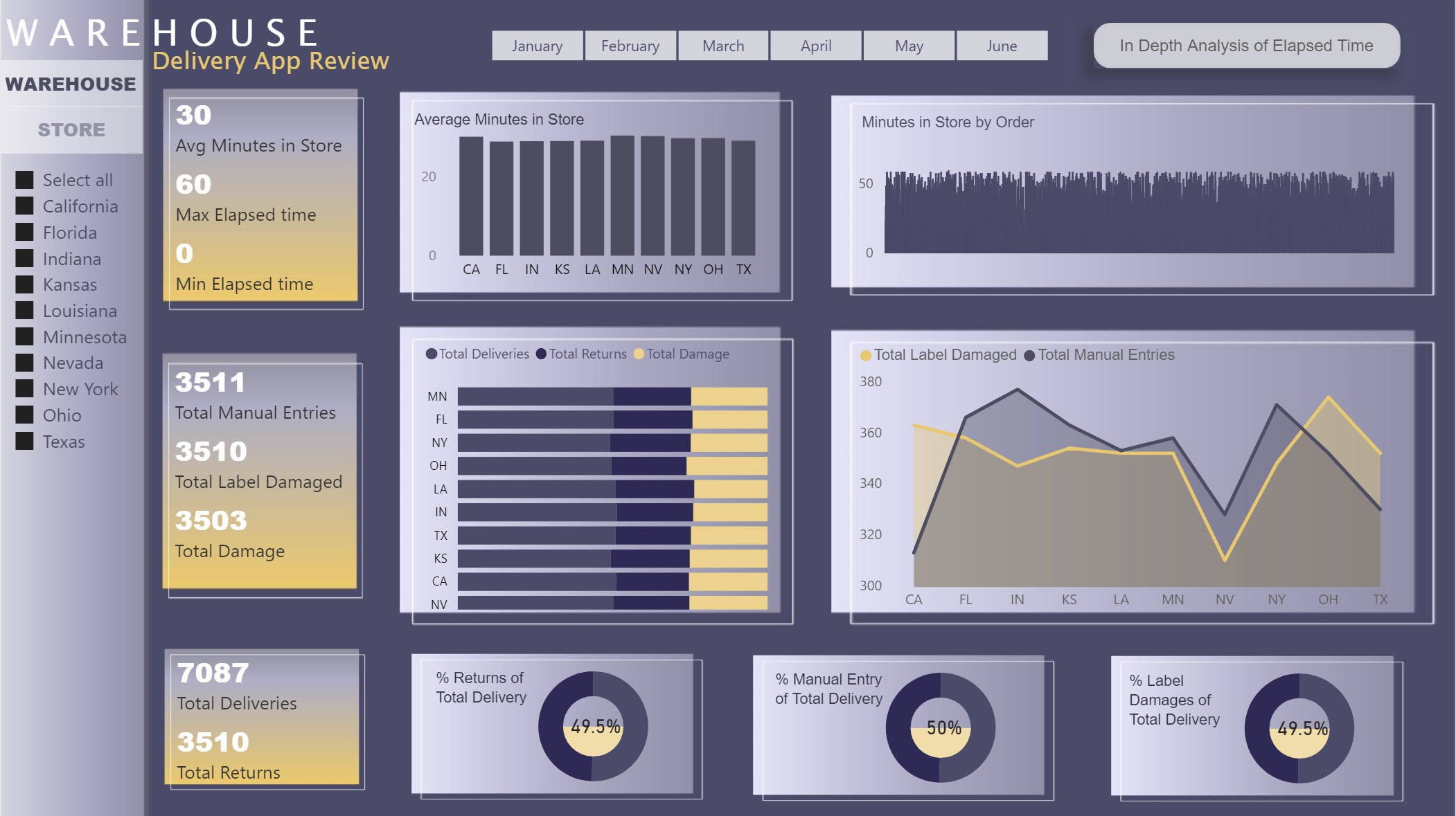
  • Then for the elapsed time between arrive and departure of an order. I create a column with using DateDiff. I got the elapsed time in minutes.
  • I try to make sense of the data using my elapsed column and I decide to use the average, so I create an average measure of my elapse time.

Data Analysis

My questions are:

  • How the elapsed time between arrive and departure of an order is behaving?
  • How many Manual Entries/Cancelations/Label Damage/Damage we have and where and when?
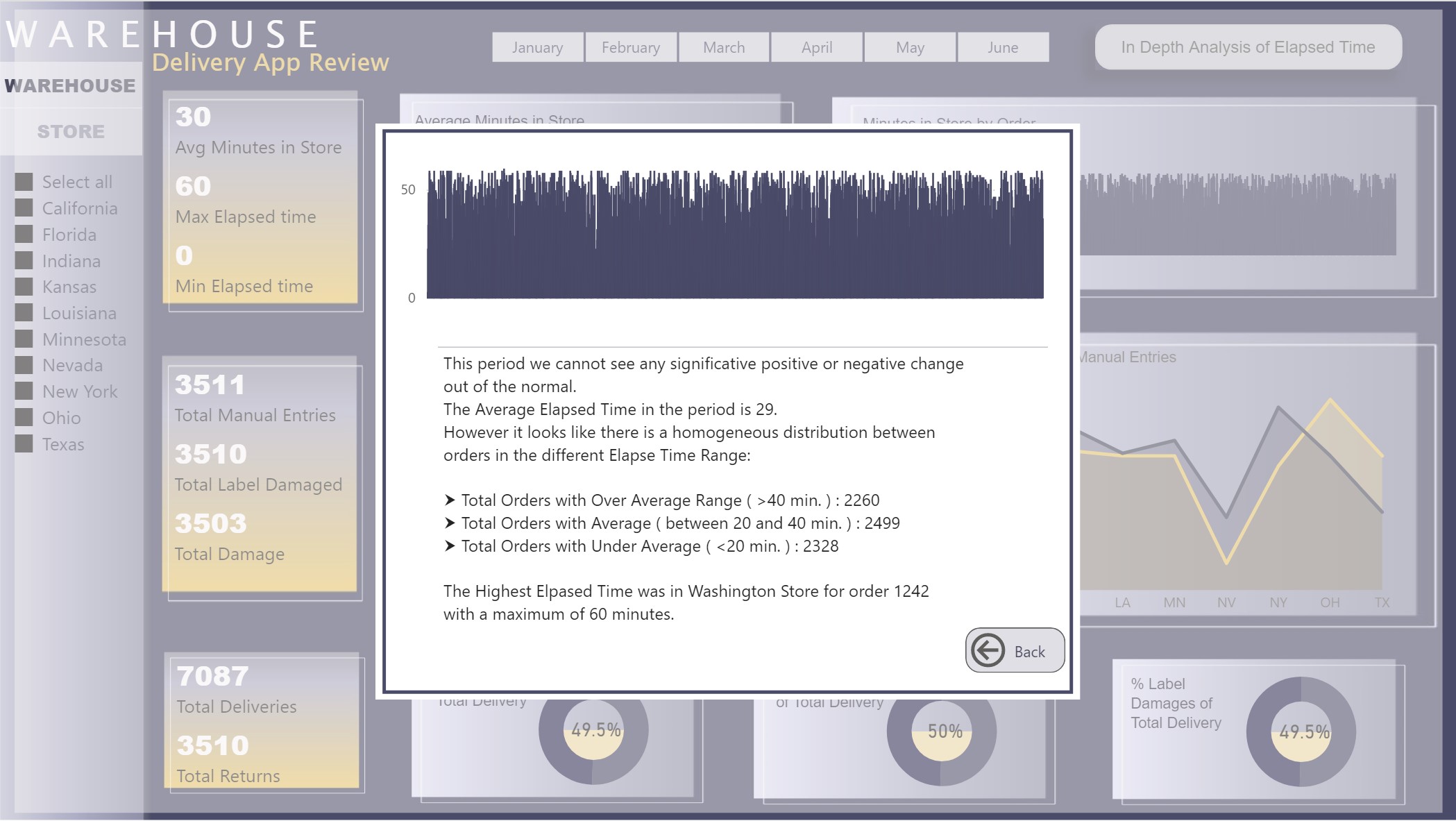
  • I also (to use my narrative) create a more depth analysis of the Elapse Time of the orders.

I made many assumptions for my analysis from the data provided, but I think is okay for this kind of exercise.

I am not very happy with my Analysis window, I found difficult to format the message, maybe using HTML will be better.

QUESTION!!! I could not figure out how to get the store with the highest elapsed time in a measure, I wrote the name, but I wanted to have it dynamic. If some one has a suggestion, I will appreciate your comments.

I hide the field used for creating my relationship in my Fact table.

Design

I wanted to keep everything in one page and use Bookmarks to navigate into the report. This was a hard learning experience, I do not recommended to use it when you have a report that change frequently, is a pain (at least for me it was) to create the bookmarks and connect the action of the buttons with them. I have to do it three times because when you create a bookmark keep the filters and content of the visual, so you have to be very careful everything is as you want it, and if you decide to change something you have to do it all over again. :frowning:

I created the Filled Donut using a bar chart (behind) and a donut char in front.

For the theme colors I looked for some inspiration and I got my design.

I attached the PBIX to this message.

Please let me know if you have any question or comments and suggestions to improve my report.

Thanks,

Diana

Delivery App Data - Diana Bello.pbix (605.9 KB)

3 Likes

Thanks for sharing your inspiration for this challenge. You did an amazing job!

some great work here Diana, and I’m glad you included the PBIX for download - I think anyone needing to see what a bookmark layout of more than one or two visuals needs to ‘look under the hood’ of this report.

I like that you used grouping and naming in your selection pane, this is something that I see in very few sample reports, and I really think it aids the next person who might need to do any design work in it.

Regarding your question on how to get the name of the store dynamically, below is the measure I was going to use in my own report for a similar need, I wanted to allow for a possible tie between stores.
I’m sure with what I’m seeing in your report, you could adapt this to your specific requirement.
again, kudos!

Highest Scoring Store =
CALCULATE(
    CONCATENATEX( ALLSELECTED( Store[Store Name] ), Store[Store Name], " , " ),
    FILTER( Store,[Store Rank] = 1 )
)
2 Likes

Thank you very much Heather,

I will try your formula, so easy, I just got frustrated with the bookmarks in this report.

Thanks

@DianaB,

I hear you re: the challenge and time required to properly set up and maintain bookmarks for navigation purposes. However, subsequent to the March 2020 update, you can do all that with direct page navigation actions tied to buttons, and you can carry the filters back and forth through synch slicers. I have extensive button navigation in my report for this challenge, but it only has two bookmarks in the entire report, both used in association with a “clear filters” button. This navigation would have taken me forever to set up with bookmarks, but with direct page navigation, the whole thing took less than 10 minutes.

I’m in the process of writing up my submission, and will address this issue in the writeup, but if you’re interested, I suggest checking out this thread:

  • Brian
2 Likes

I hear you @DianaB, the first time I tried to do a large-scale bookmark solution (hiding/showing multiple visuals as you did here) - I thought I had completely lost my mind.

I still use bookmarks a fair amount (as you will see if you look at the link Brian shared), but that early project does have me thinking very carefully about how I layout the report. And when I build the bookmarks. Generally means a lot of hiding in my design work.

Reposting here regarding your question.

Use this technique here to find top store names dynamically

Sam

Wow Diana, I really love so much of the small features you have added to your report.

The navigation is superb, as well as the pop up. These are really creative ideas, that I want to steal!

Also the column chart behind the donut chart is another awesome idea.

Its great to see that you actually challenged yourself to learn new techniques. That is exactly what the challenge is all about. After the latest two challenges I’m sure your skill level has gone up dramatically.

It’s also great to learn about these ideas you’ve come up with. We all benefit. Congrats on another great submission.

It’s a clear and succinct report that tells a user everything they need to know within 15 secs which is perfect.

Nice work

Sam

Nice one Heather this is a great solution

1 Like

Thanks @sam.mckay, I applied the TOPN and is working :smiley: You can use my ideas from my reports, it would be amazing to see them in your videos.

Thanks @BrianJ, I will take a look to your report to learn more about the bookmarks. I loved your report.

I laughed when I read this, because I’ve been there many times before. I’m confident the direct page navigation will make it fun for you again. And just give a shout if you have any questions.

  • Brian
1 Like

@DianaB

For the In Depth Analysis of Elapsed Time, the pop up screen, i can see the bookmark and looks like you used selection. Can you please elaborate on this part. Thanks!

Hi @sunip. The pop-up window has four elements; the window is: a graph, a table and a button, the last element is just a white square, you need to adjust the visibility to make it transparent, so nothing else is available, that give you the idea of a pop-up window. I grouped all the elements in a group called window. When you click the button, this group becomes visible on top of the other elements. When you click the back button the group window is hided.

1 Like

Thank you, Diana @DianaB