Here’s @ChadD entry for Power BI Challenge 4. @ChadD, would you like to share how you built this dashboard and what your inspiration is in building it?
My background is finance. My role has always been analyzing data and operations with a focus on continuous improvement. I have supported brand, commercial and sales teams, in service-, manufacturing-, and supply chain operations. I wanted to display what the issues are, where they are, and the impact on operations.
Data Model
Review, update, modify source Excel file “Challenge4.xlsx”
a. Warehouses – no change
b. Delivery – fixed text format of column (H) DateTime Arrived at store
c. Stores – added a State Code column to Stores table.
E-T-L to PBI
a. “Challenge4 CCD.xlsx” with above referenced changes, three tables, Stores, Warehouses, Delivery.
b. “City Location Data.xlsx” - one table named City Location Data.
Transformations
a. Merge as New - Stores and City Location Data tables.
b. New table named Stores and original renamed Stores Staging.
c. Disable load on City Location Data and Stores Staging tables.
d. Duplicated Deliveries table, edited down to Invoices and Match Type as an additional lookup table, but ran out of time to explore it.
e. Create a Key Measures table and Measures Group in query editor.
f. Add a Date table
g. Add a theme.json using EDNA color fan generator.
h. Add calculated column to Deliveries – time between arrival and departure at store.
Get footloose fancy-free writing DAX measures, more than I needed or used, but giving me options while playing with drag-and-drop on the canvas.
The goal in Power BI should be to create a set of visualizations that tell the story with as few words (if any) as possible. People are busy. A few people at this company are on the hot seat about now, with a mountain to climb in front of them.
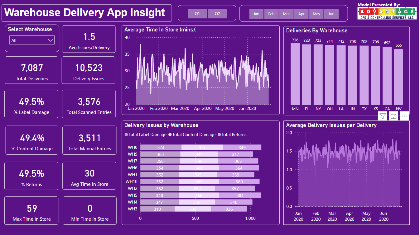
Visualizations: Page 1
Allow flexibility for consumption by the user – add slicers for warehouse and time.
The Cards – just the facts.
Average Time in Store – shows how volatile the metric is and the trend is not improving.
Deliveries by Warehouse – who is handling what volume? Looks to be fairly evenly distributed.
Delivery Issues by Warehouse – what and where are the issues? Fairly evenly distributed as well.
Average Delivery Issue per Delivery – Volatile and running at 1.5X deliveries. Call Emergency – this business is on fire.
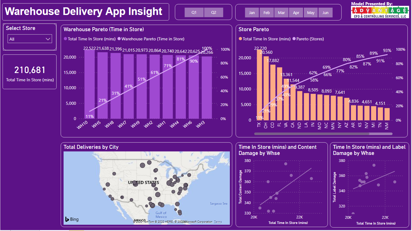
Visualizations: Page 2
Allow flexibility for consumption by the user – add slicers for stores and time.
Paretos – A great quick view of data for an exec is a pareto chart. In this scenario of deliveries, times, stores, and warehouses I thought so. These provide a ranking and a wise starting point.
Deliveries by City map – a quick view of footprint and volume in stores by city. Having it handy is useful for reference.
Scatter Graphs – showing the relationship between delivery issues and time in store. Time is money – labor costs, disappointed customers, frustrated employees, etc.
I love how you’ve been quite bold with your color choice here in your report and it does make it stand out in my view.
Also all of the key metrics and calculations are front and centre which I like also, so there’s no way for the consumer not to see the main insights.
Also I like how you’ve condensed it down to two pages and been quite innovative in some of the insights that you’ve shown. I really like the Pareto chart that you have embedded into the store locations visual.
One thing I feel could be updated, is that the map visual doesn’t suit so much everything else so maybe some considerations there if it was worth including? Also maybe get some contrasting background colors in visuals or to certain grids within your report may have broken up each section a little bit better. Maybe something to consider maybe for next time.
I do really like though how you’ve aligned all the visualizations really well across both pages and that certainly does make it easier on the eye and makes it easier to scan to certain areas and insights within the report.