@EnterpriseDNA,
BACKGROUND:
My approach to these challenges balances four different perspectives:
-
Consultant - I try to role play these from the vantage point of a consultant, focused on answering the questions at hand, while also trying to find ways to provide some extra value to the client. I also pretend not to know info that would be unknown to the consultant (e.g., that the data for these are generated randomly)
-
Client - having spent years as a manager overseeing teams of analysts, I have strong opinions about how I personally like to see data presented. This is why most of my entries tend to focus on one primary question per page and don’t have a ton of interactive features.
-
Forum Contributor - I try to employ techniques that I think others on the forum might find interesting/instructive. For this submission, those techniques included: R script analyses and visuals, direct page navigation with buttons/toggles, calculation of distances from lat-long coordinates (Haversine formula) in Power Query, composite ranking approach, web scraping, and use of custom visuals (Flow Map, Smartfilter Pro, and Cards with States)
-
Student - per the “Deliberate Practice” model, I try to stretch myself each challenge to learn some new techniques. For this one, that focus was spatial data techniques in PBI, not having really explored that aspect of the program prior outside of some basic mapping.
AESTHETICS:
I don’t enjoy the graphical design aspect of this work and am not very good at it, so I typically borrow liberally from people who are (thankfully, including many on this forum) and just to stick to the maxim of “don’t be ugly” so the aesthetics don’t get in the way of the analysis. For this one, I used the Acterys Planning Theme from the Microsoft PBI Themes Gallery
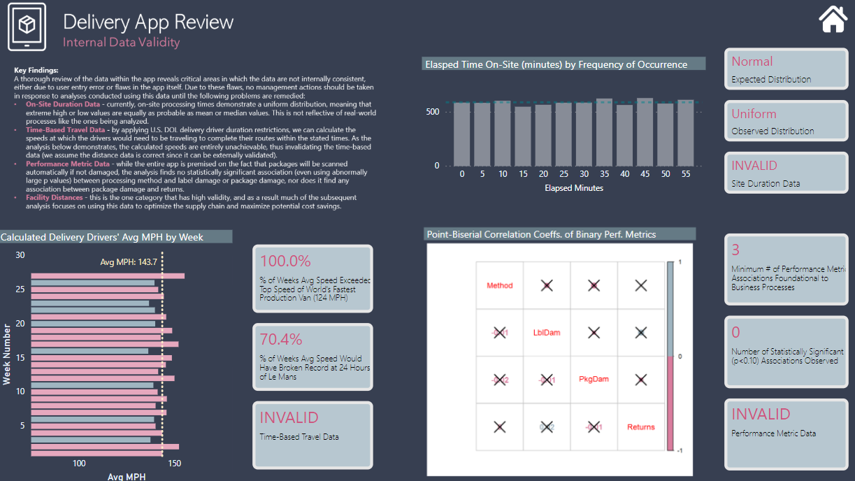
DATA RELIABILITY AND VALIDITY:
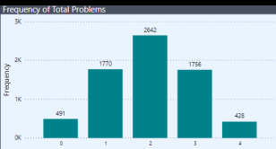
In the real-world, before diving into any analysis, I always ask the question “are these data any good?” (i.e., do they pass basic threshold tests for reliability and validity, and based on the outcome of that analysis, to what extent can/should they be used for management decision-making?). While not comprehensive, I tried to provide some examples of the type of testing I would do in such an analysis, and chose some different approaches than I’ve showcased in previous challenges. Aesthetically, I really don’t like the way this page turned out (suggestions for improvement welcomed), plus I couldn’t find room for this important component, which helps clarify why the uniform distribution of minutes elapsed makes no sense:
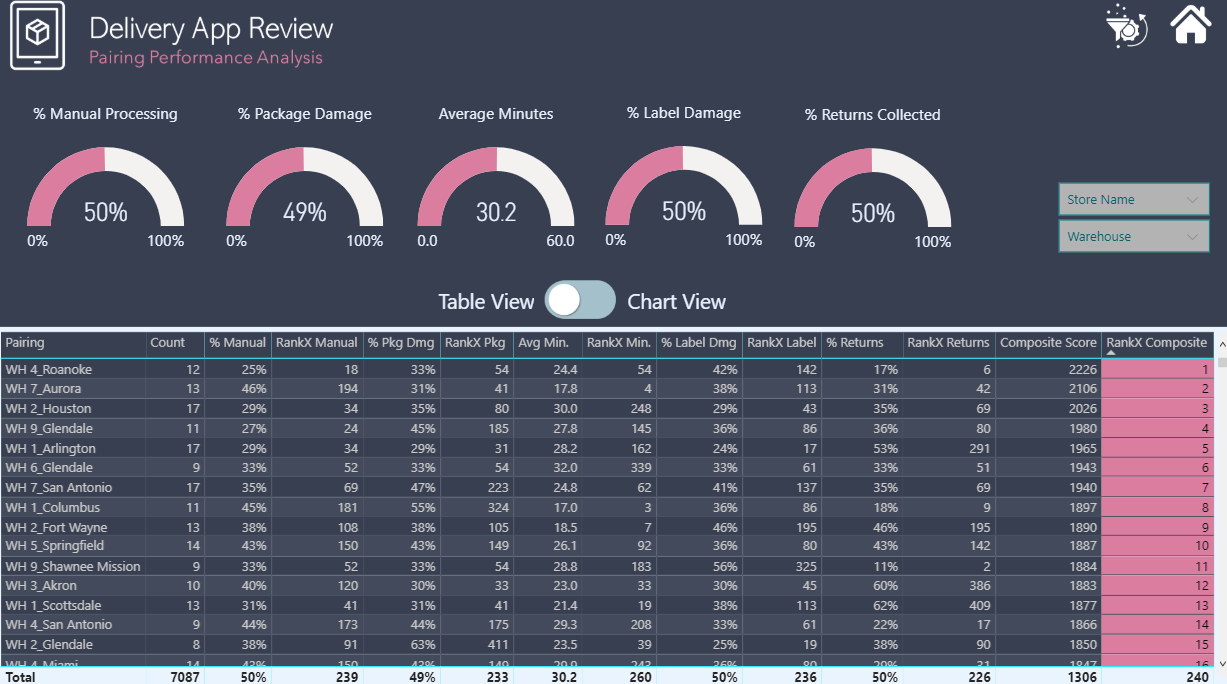
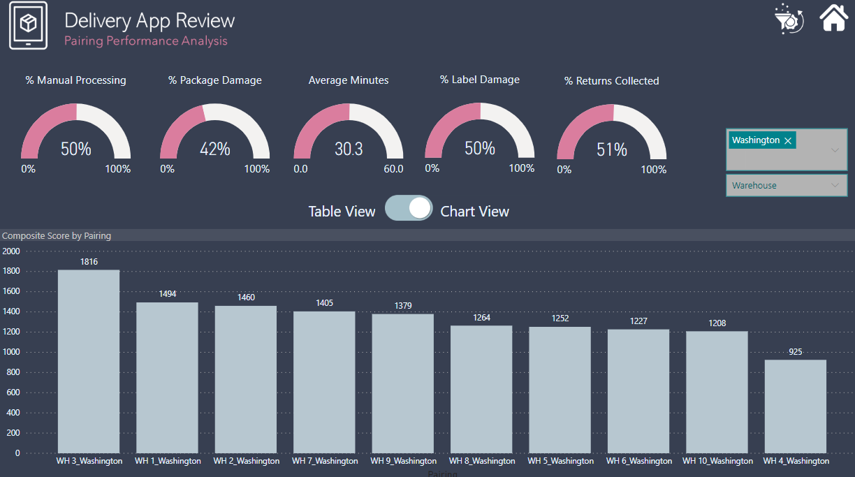
COMPOSITE PERFORMANCE METRIC:
In thinking about a way to address the client’s request for insight into store-warehouse pairs that are/aren’t working well, while also providing sliceable data on the individual performance metrics, I thought back to a composite ranking approach that I worked on this Spring with @Mark. I thought that would work well here too, since it allowed me to collapse five separate performance metrics into a single score, and then allow the client to filter the data by warehouse and/or store (or groups thereof). To create the composite score, I summed the ranks of each pair (1-500) across each metric (5). In this summation, low score would represent better performance, which I thought counterintuitive, so I subtracted the sum from 2500 (5 metrics * 500 pairs/metric) so that higher score would represent better performance. I set the filter conditions to ALL, so that even when sliced, each store-WH pair would maintain a score calculated on the 2500 base, rather than on the filtered subset (this has no effect on the resulting order within the filtered subset, but allows the viewer to see even when filtered, where the pair would rank overall). I used SmartFilter Pro for my slicers, which I think provides both great additional functionality and aesthetics, and I use it now on all my reports.
Visually, I paired the table version of this analysis with a bar chart version, using these button templates, direct page navigation and synched slicers. I like the visual effect of the viewer being able to toggle back and forth, rather than trying to cram both visuals on the same page.
ROUTE OPTIMIZATION AND COST SAVINGS:
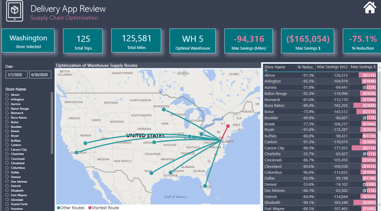
This section was what I did primarily for my own learning, but I felt it fit within the challenge scope in terms of “help management visualize what is happening so that we can decide what the next stage of the transformation is”. Since no locations were given for the warehouses, I made what I thought was a reasonable assumption and located them at the lat-long of the geographic center of the state, web-scraping that data from inkplant.com. I then downloaded a large city database from simplemaps.com including lat-long. The advantage of this dataset is that it also included population, which allowed me to address the problem of multiple cities/towns with the same name, by grouping the city data in Power Query by name and then filtering on the name with the max population. I think this worked well for all but one ambiguous store location (“Aurora”, which could be IL or CO) where the decision rule selected the latter but based on other store locations I think the former is correct (unlikely to have two stores in the Denver area and none in Chicago area), but I treated this data as valid, since it would be instantly verifiable with the client.
The next step was to calculate the distance between each store-warehouse pair in a dimension table I called Distance. The ideal way to do this would be to calculate the actual driving distance between the two points using a Google or Bing Maps API call. However, that proved too involved for the time I had available, so I used the Haversine formula to calculate the “as the crow flies” distance between two sets of lat-long coordinates. @Paul is our resident geospatial data guru, and his posts were essential in figuring out how to do this in PQ.
Once I had distance calculated for each pair, I grouped by store name in PQ and calculated the closest warehouse to each store. This calculation became the basis for my “Route Optimization” mapping, using the MS Flow Map custom visual. It’s a simplified analysis, since it assumes that the closest WH can supply all of the needs of the stores with which they are associated. If we’d been given data on products provided by each WH, we could have relaxed this assumption and done a full-scale linear optimization, which would have been cool. I do like the way the visualization for this component turned out.
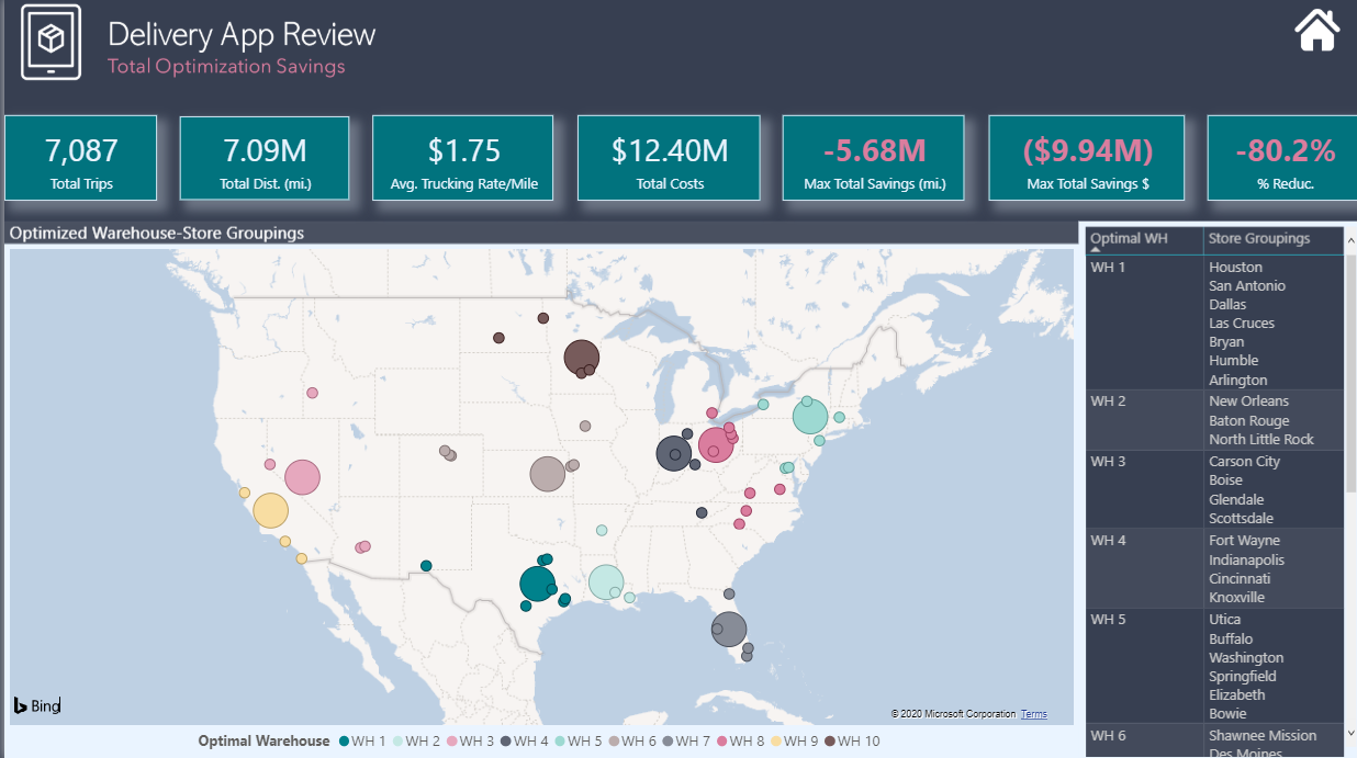
For the final page, I just used the basic PBI map, with a measure to change the size of the dot based on whether the facility was a store or a WH. The most interesting technique on this page I think is the use of CONCATENATEX with UNICHAR( 10 ) to create the table on the right. This is one of my favorite DAX tricks and I was going to do a video on it until Alberto Ferrari beat me to it earlier today. 
Anyway, that’s probably waaaaayyyyy more than enough. As always, huge thanks to Haroon and the Enterprise DNA team for the fantastic job they do with these challenges, and thanks to everyone who participates - I think the exchange of ideas that occurs in the course of these challenges is phenomenal, and I would encourage anyone who hasn’t submitted an entry yet to give it a try soon. It’s a ton of fun, and I guarantee at the end of the process your skills will have improved regardless of what level you started at.
P.S. Here’s my PBIX file:
(Note: I had to pull this down temporarily because it inadvertently revealed some confidential licensing info. Working on masking that, and will repost as soon as I figure out how to do that. Huge thanks to @Heather for letting me know. I learn new stuff from these challenges all the time…  )
)
P.P.S.
OK, it’s back up. I contacted OKViz (the SQLBI folks) and they told me that even if the license numbers for their custom visuals are shared, no one else can use them. Good info to know if you’re considering using them.
eDNA Data Challenge #4 – Brian Julius v2a.pbix (3.7 MB)


 Thank you for sharing with us all this knowledge!