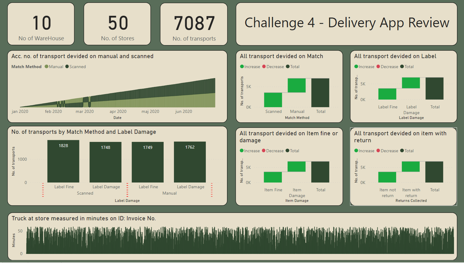
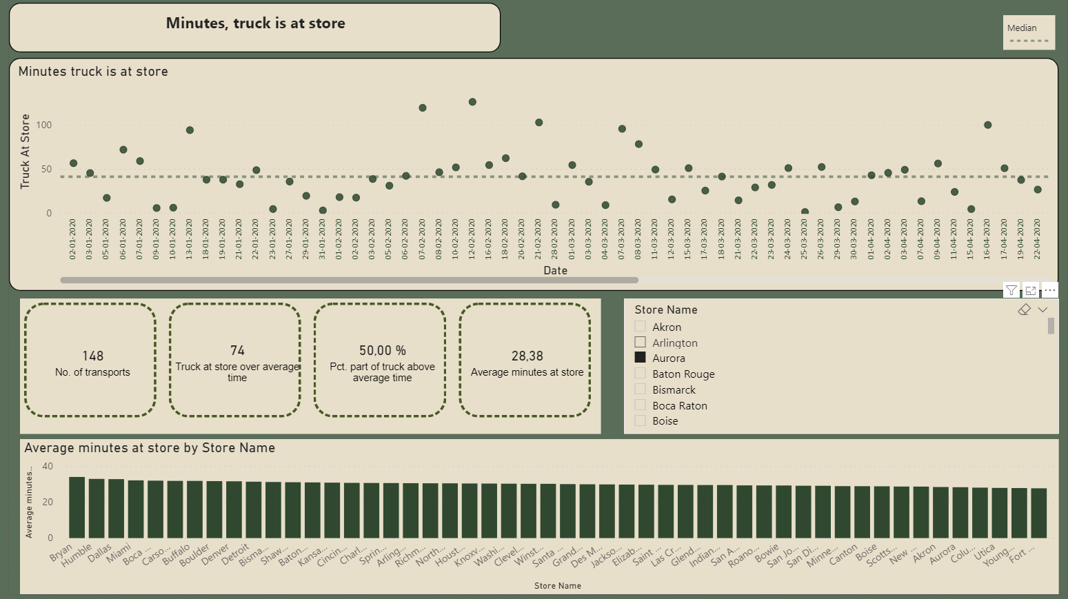
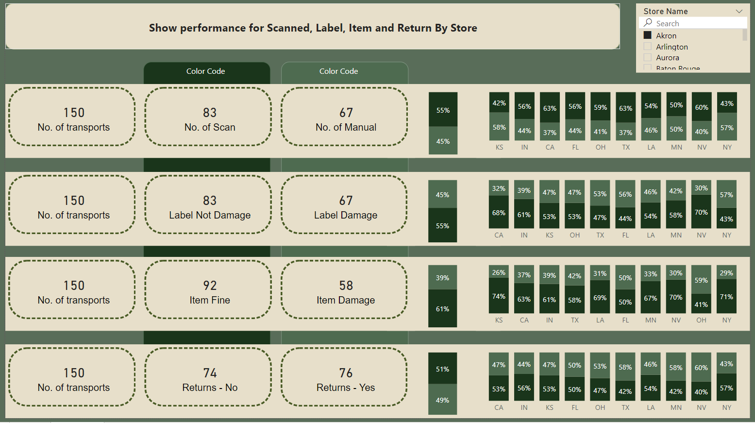
Here’s @Amdi entry for Power BI Challenge 4. @Amdi, would you like to share how you built this dashboard and what your inspiration is in building it?
To learn about the real-life scenario presented for the challenge, be sure to click on the image below.

Really well done on this report @Amdi
The thing I really like the most about it is you’ve really laid out all of the key insights so they are very easy to see and understand. Also I think the simplified colour scheme works pretty well as well.
Couple of things that I think would be easy fixes here to take this report to another level.
The first is I don’t love the waterfall charts. I think that they take up a lot of room and you probably could showcase the inside better with a simple pie chart or doughnut chart.
The other change that would be easy would be to move the title from the top right hand side to the top left hand side. I think the eyes always start on the left generally and have the title on the other side just feels a bit weird to me.
The last really small change I would make is just to be a bit more precise with the alignment in your visualisation’s. You’ll see that some are different positions on the page and they don’t lineup. Just some tiny adjustments that would make your report look a touch more compelling.
I really do love to see the changes from this challenge to the previous ones. I can already see so much improvement on the visual side even though I know that you’ve got the analytical side very much under control based on the great insights that your showcasing.
Let me know your thoughts on these potential improvements and also how you went about putting this all together.
Sam


