Challenge 4- Delivery App Data Entry from Alvi

Here’s @Alvi entry for Power BI Challenge 4. @Alvi, would you like to share how you built this dashboard and what your inspiration is in building it?

To learn about the real-life scenario presented for the challenge, be sure to click on the image below.

power-bi-chal-1

Hi there

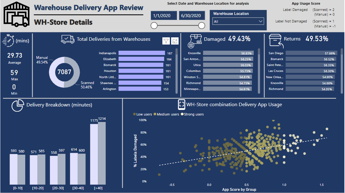
The problem statement for the challenge was focused on the usage of Delivery App developed by the consultancy firm and my analysis was mainly focused to develop some kind of a metric around that for each WH-store combination.

In order to see which WH-store combination is using the App regularly, I have created a metric called ‘App usage score’ and the average value of each WH-store combination is calculated, based on the number of deliveries.

The scoring system for ‘App usage score’ for each delivery I have used is

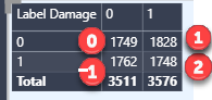
Label Damaged (Scanned) = 2
Label Damaged (Manual) = 0
Label Not Damaged (Scanned) = 1
Label Not Damaged (Manual) = -1

The scoring system benefits the app users (those who scan) with an extra point for scanning even when the label is damaged, and penalizes (with -1) all those who do not scan, even when the Label is perfectly OK.

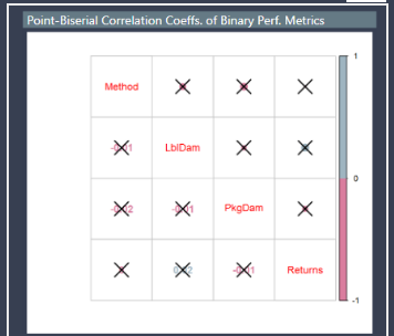
The average app score for all WH-Store combination is then used to segment the WH-store combination in User Groups (Strong, medium and low). I have used a scatter plot to compare the average app score with % Labels damaged. Other parameters like Parcels damaged, Returns collected and Time spent can also be used for comparison. The reason behind using Labels Damaged was to highlight WH-store combinations trying their best to use the app, even with labels being damaged, and vice versa. The management can then work with these combinations for follow up action in the next phase of app development.

The other key measures are avg, min and max time spent for each WH-store combination inside the store, the total number of deliveries and how the delivery can be broken down into Timing Groups for each WH-store combination, parcels damaged and returns collected for all WH-Store combinations.

I have used 5 categories, [0-10], [10-20], [20-30], [30-40] and [>40] for Timing Group based segmentation and all deliveries are further divided into Manual/Scanned

I have tried to limit myself to a dashboard instead of a detailed report to avoid an analysis-paralysis situation, as I feel that ‘Delivery App usage’ was the main parameter and rest of the measures can be easily seen in context with app usage on the dashboard.

Color scheme and layout is inspired by the pattern of most designs showcased by @sam.mckay on the portal.

Looking for feedback / suggestion on the submission so I can improve in future.

Thanks

Abu Bakar Alvi

2 Likes

Alvi - I think you are right on track with the idea of an overall score to try to evaluate the app usage. Before I abandoned the project, I was working on a similar logic. I really think it’s the only way to evaluate something of this type.

I also like that you have kept your layout uncluttered - there is a lot of information, but you’ve used spacing to good effect to give the eye a rest here and there. This is something that is often forgotten in design, the user is going to be overwhelmed if you cram too much in.

1 Like

Thank you @Heather for your feedback.

I feel , and I have also mentioned in my explanation, that too many visuals (often giving the same information) can cause analysis-paralysis. I heard the term in some dataviz video and I liked it. I totally agree with your feedback about clutter.

Thanks again for sharing your point of view

Really well done on this report @Alvi

I like many aspects of it especially around how you’ve used grids and colors quite effectively. I think some of these colors don’t work perfectly together so maybe just simplifying which ones you actually use in the report is a good idea. But overall it looks fantastic, including how you’ve used the icons which I’m always a big fan of.

I also really like the flow of the insights where at the top you can make some selections and then you’ll see the filtered results very succinctly below.

I can also see your thought outside the box a little bit with your insights and created a scoring mechanism which you’ve used for the grouping that you’ve done in the scatter chart. I love this type of analysis and you’re really building on top of the raw data that’s been given for the challenge and trying to extract something unique out of it.

I also like how you’ve keep things down to one page but been able to showcase all the main insights that the challenge asked for. Sometimes this can be difficult in itself to do and to me you’ve done it really well while also keeping good spacing between metrics and all the visualizations.

Appreciate the writeup as well I can see that you have put a lot of time and effort into this one and you can see that by the high quality output.

Sam

1 Like

Thank you @sam.mckay for the feedback. I will be looking into better color selection in the next challenges and great to have somebody like you appreciate my work.

Thanks again!

@Alvi,

Let me echo the comments above in terms of there being a lot to like about your submission. It’s a clean, attractive design that draws your attention directly to the primary questions by putting those results right at the top. I also really applaud the innovative thinking in developing the app usage score – it’s a creative attempt to add additional insight and value to the analysis.

However, if I might offer some constructive feedback, I believe the scatterplot analysis is misleading and the upward trend observed is the combined product of random variation in the data and an artifact of your scoring system, rather than a significant trend in actual usage. Here’s my argument:

  1. statistically, there is no relationship between whether a label is damaged or not and whether it gets scanned or processed manually, as the correlation coefficient between these two variables is not statistically different from zero (no relationship).

image

  1. the data are almost perfectly randomly distributed between the four combinations of label damage/no label damage and manual/scanned processing

image

  1. despite the randomness of both variables and the lack of relationship between them, your scoring system assigns increasingly high values to each of the four cells. Thus by plotting a random variable (label damage percent) against another variable that is an increasing function of that first random variable (app usage score), you are naturally going to see an upward sloping trend even though there is no relationship between label damage and processing method.

This is a danger in scatterplots in general – looking at only one pair of variables within a complex system can sometimes be misleading and/or difficult to interpret. It also highlights the importance of initial data review, which flagged the performance metric data as not valid for purposes of comparative site evaluation and management decision-making.

Hopefully this provides some interesting food for thought. Overall though, I really liked your entry and your writeup and look forward to seeing more of your work in future challenges.

  • Brian
4 Likes

Thanks @BrianJ for your excellent feedback

I think just mentioning the app scores in a table or just top/bottom ranking based on the ‘app score’ would have been more appropriate. Putting it in a scatterplot against Label Damage is indeed misleading for this particular dataset.

I will keep in mind your suggestions for future analysis and thanks again for sharing these valuable points

Best Regards

2 Likes