Hello All,
The story of building this report is the following:
I started by reading carefully the request of this challenge. I wanted to make sure I understand the objective of the exercise. I then paused and thought of similar topics I might have seen, read in the past.
I downloaded the excel file and started looking at the data. The data was not crystal clear for me, so I asked for more detailed information.
I started with the DataModel, followed all the best practices I learned from Entreprise DNA courses. I imported a DateTable, renamed my tables, columns, and grouped the tables into groups.
I created relationships and arranged the tables so that the flow of the relationship is clear (from top to bottom).
I started creating basic DAX fomulas, and created my Key Measure’s Table. I then started to build visualisations into simple tables, to see the data, see the trends, explore and write down comments.
Once I understood well the data and had all my findings ready, I started to think about how to present it.
I wanted to make a memorable experience for the user.
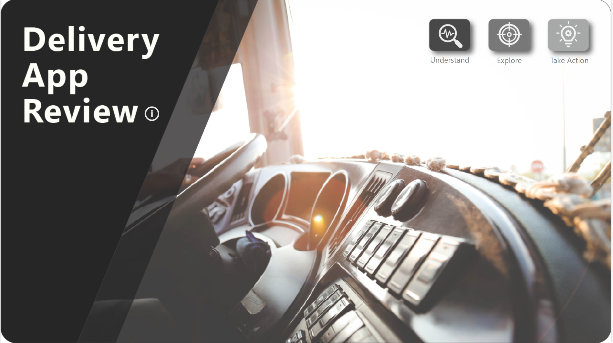
I wanted to add an unexpected little treat that will get attendees in the right mood. It had to be a report that will be clear enough and easy to understand. In order to do that I created a report that introduces the subject in an organized manner. I thought about 3 main axes in the presentation: Understand, Explore and Take Action.
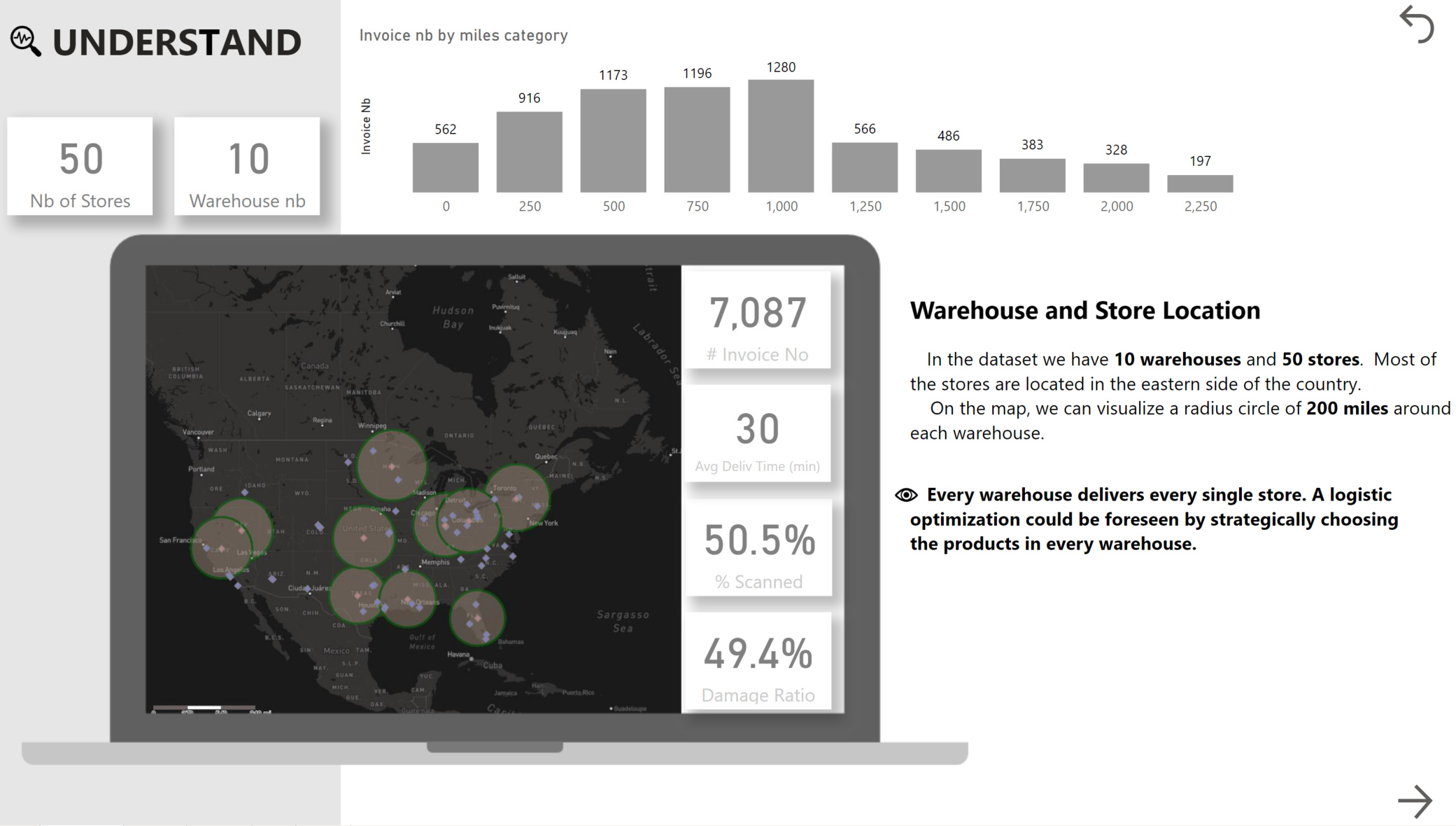
Understand
This is the part where I introduce the subject, where are located the warehouses, where are the stores. I added information regarding the distance between each warehouse and store. I wanted to show the first finding: the warehouses deliver each store, and the stores can be situated far away from the warehouses. I grouped the distances in bins and created a column chart to see how many invoices are being delivered by distance. The finding was that after 1000 miles, we have lesser invoices, but still, there is room for optimization.
Explore
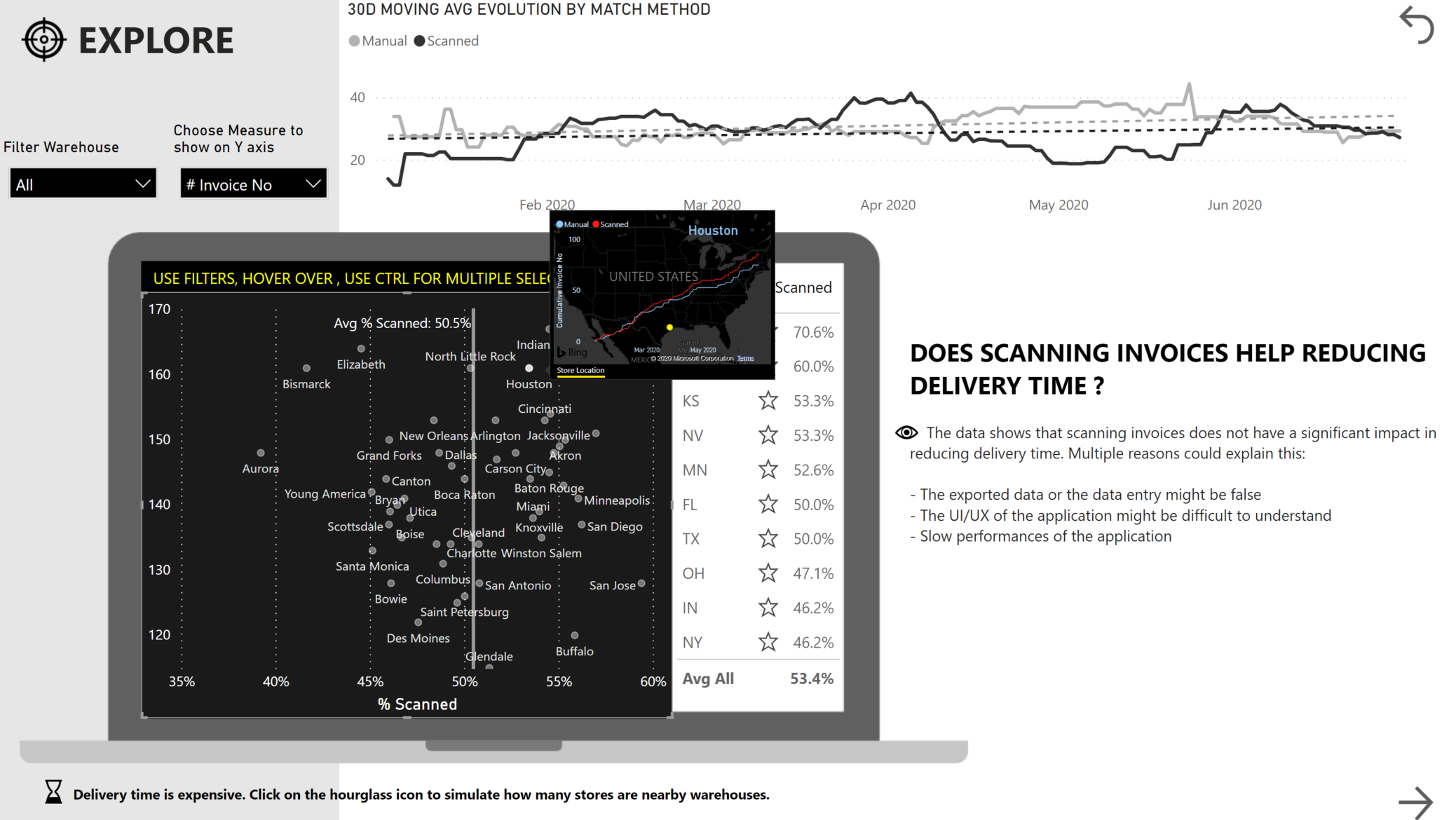
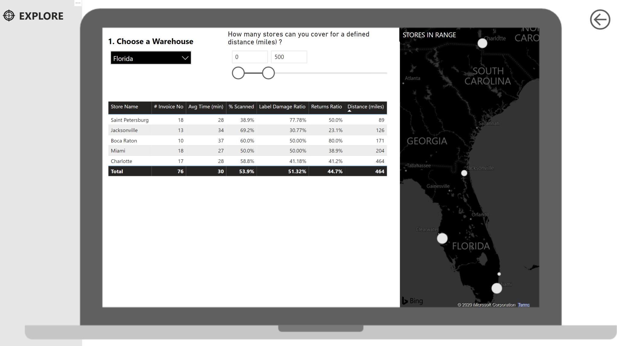
I wanted to create a fun and interactive section. A place where the user can slice and dice, explore, create their own visualizations, create their own simulations. I wanted to provide here the information asked in the challenge regarding the performance of scanned/manual by warehouse and store.
I tried to put myself inside the management shoes and ask the question they would ask. Does scanning invoices help reducing delivery time?
In order to build the EXPLORE section I had to try new techniques I never tried before with supporting tables. I advanced by try and error. Many of the ideas I had didn’t work, even though I searched for hours for a solution. I suppose it is part of the learning journey. In any case, I didn t want to create a report as I normally would. I took more risks, I pushed my limits so that I can learn and progress.
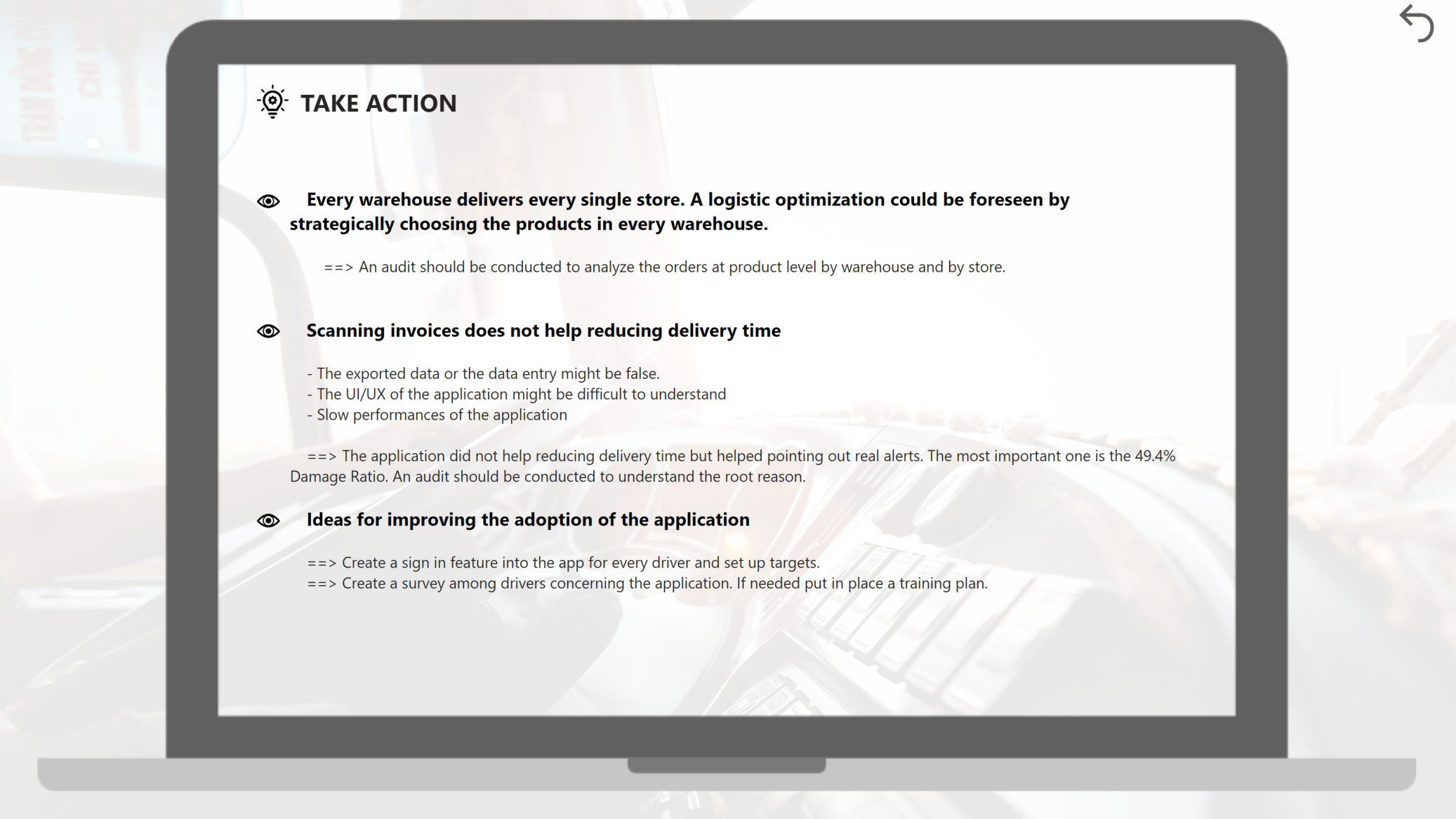
Take Action
The take action part is the section where I propose actions and consolidate all the findings presented in the report. It is the last section that would be consulted by the management, the one where you need to summarize your findings and aliment the discussion for the next steps of the project.
There you go… this was my experience and the steps I took to create this report.
Best regards,
Alex
P.S My report is attached below
Challenge 4 Alex Badiu.pbix (2.3 MB)