Hello all!
Please find below my submission for Challenge #14 - Link report
A very interesting best practice check list. I will keep it for record and thank you for sharing
All,
Here is my entry for C14. Used Charticulator for all of the visuals in this report. Tried to come up with some creative ways to show the key metrics. On vacation right now, so might be a while before I’m able to add a full writeup. Would love to hear your comments on the visuals!
Link to Report:
Thanks
Jarrett
Hi everyone,
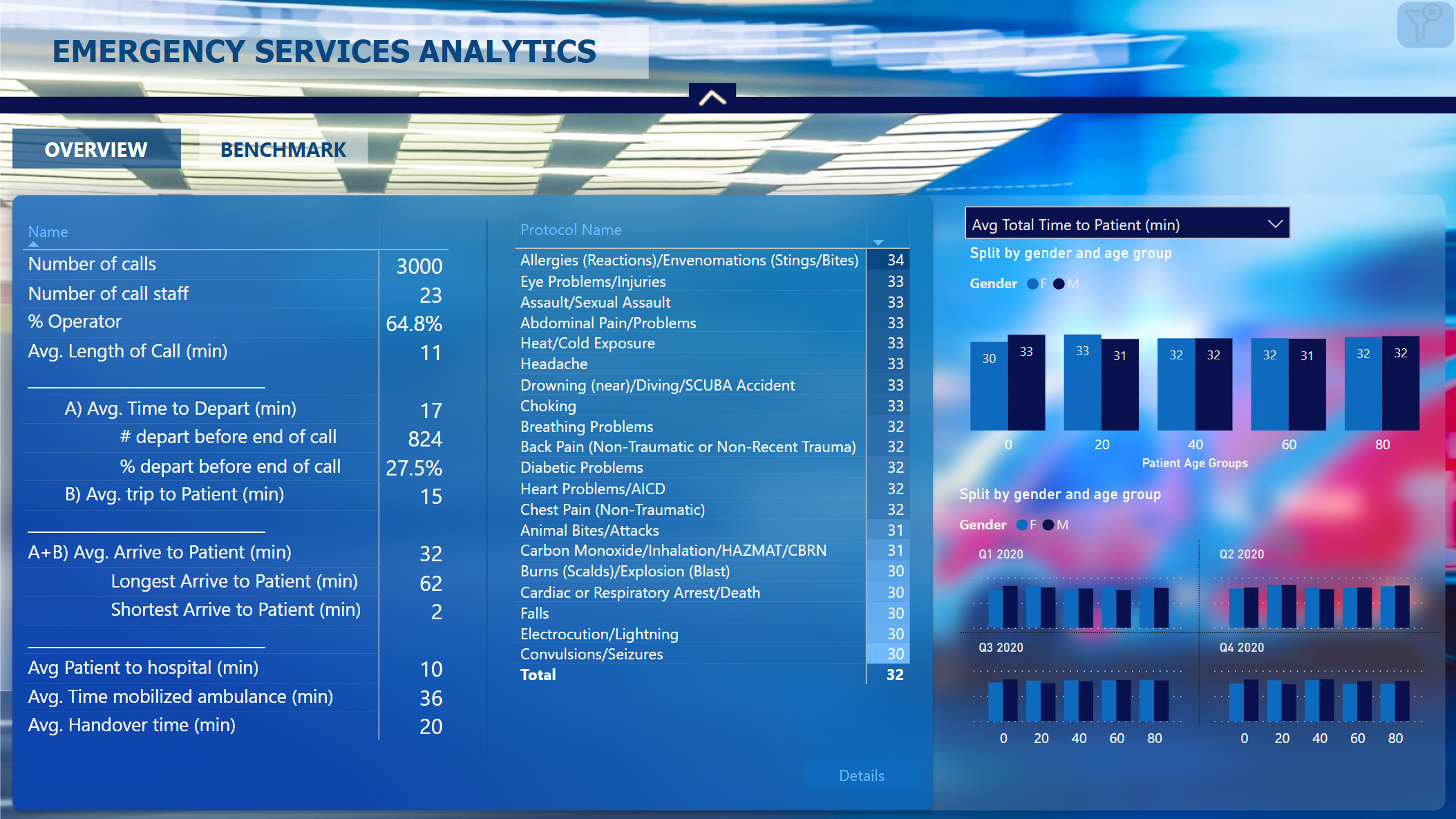
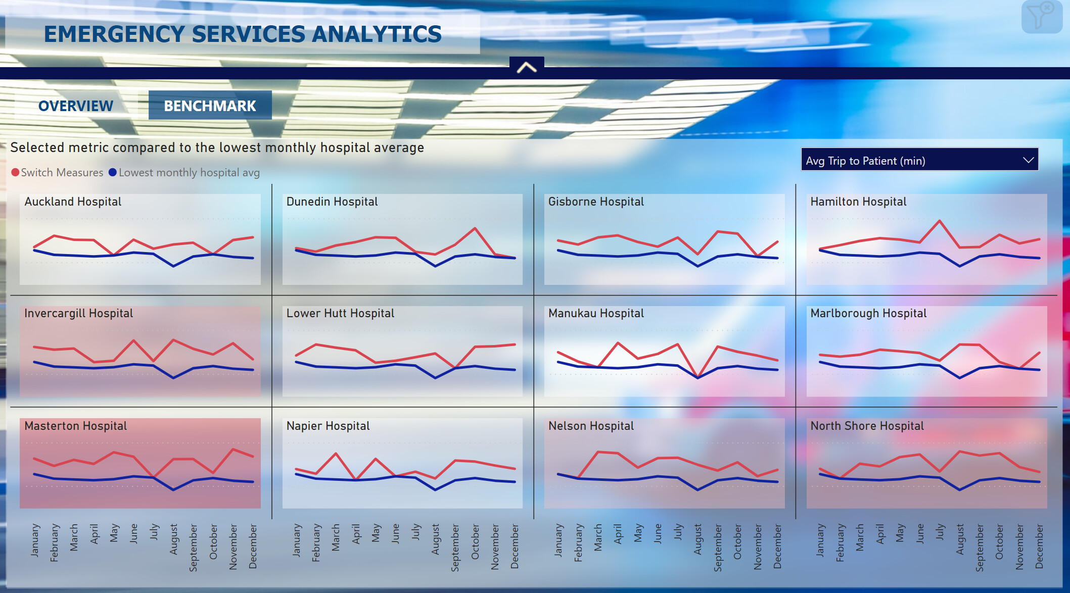
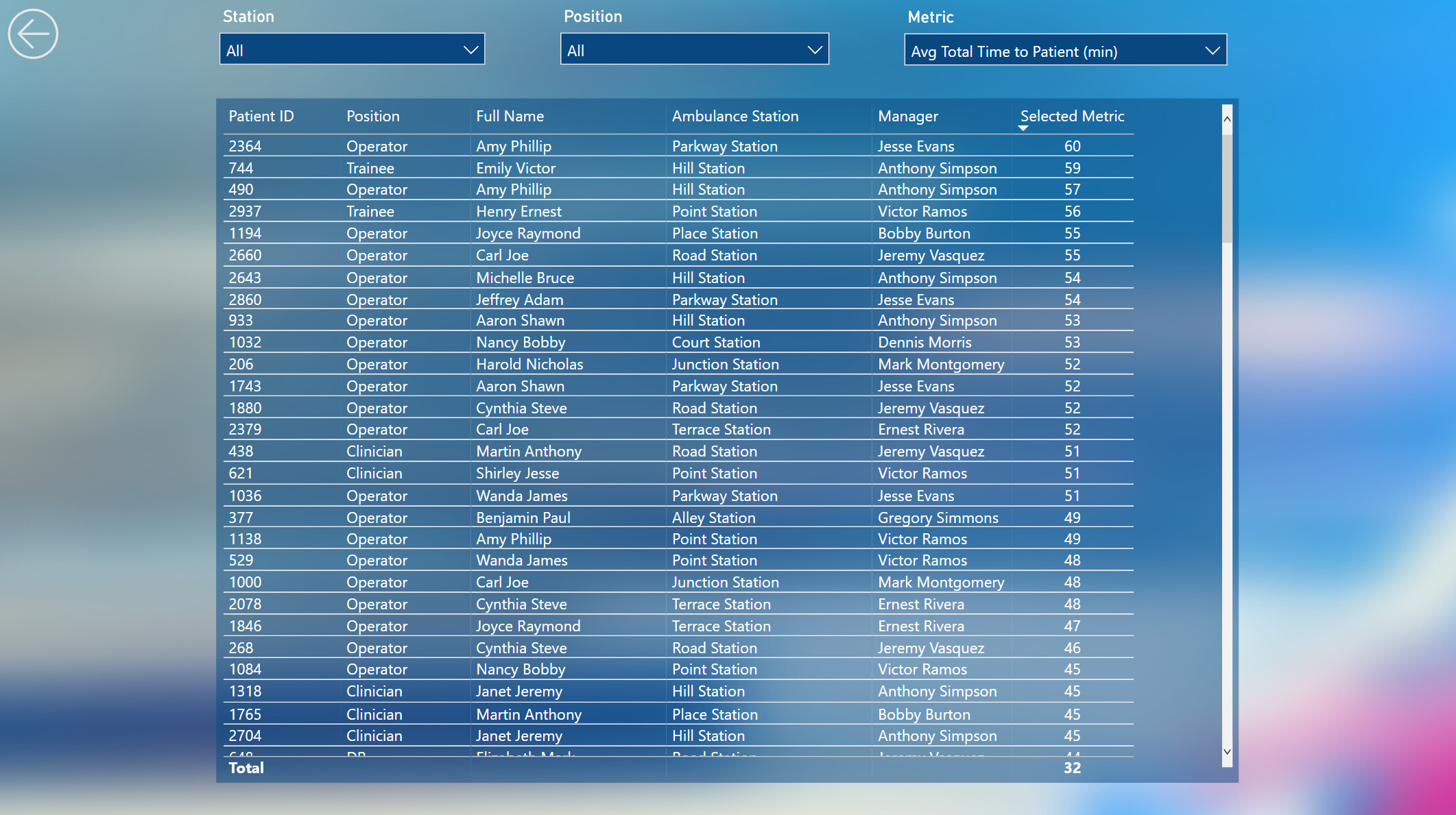
here is my workout of Challenge 14 Emergency Services Analytics.
Published in Power BI Services Challenge 14 Emergency Services Analytics Delta Select , thanks to @BrianJ
and attached : Medical emergencies handling v15 DeltaSelect.pbix (502.9 KB)
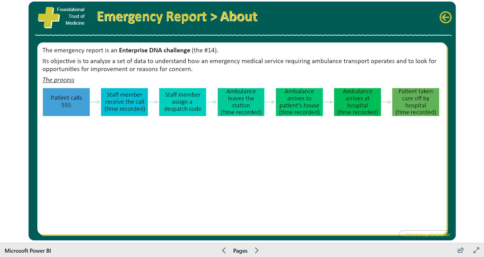
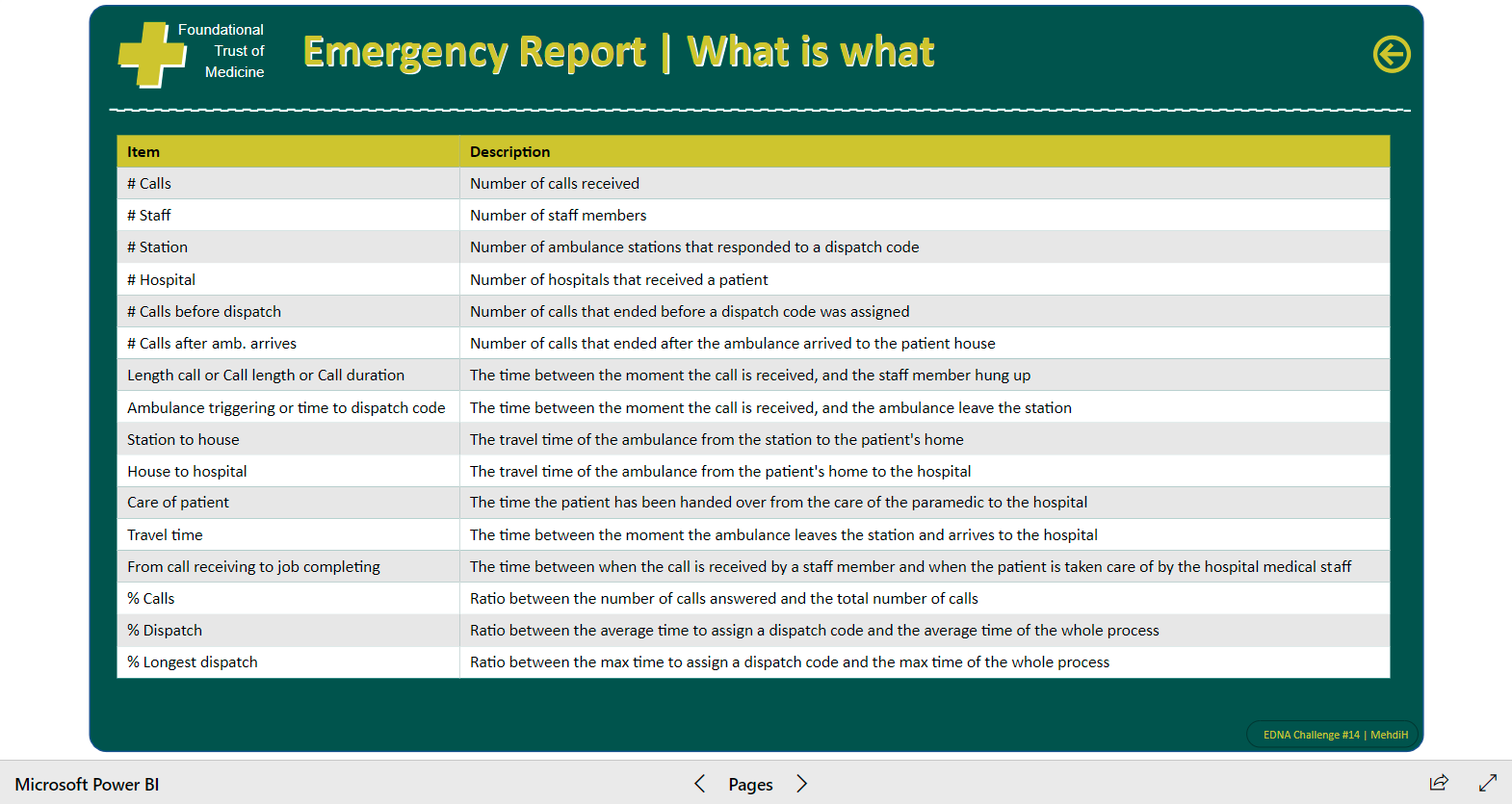
This analysis report focuses on the time it takes to bring a patient under hospital care after an emergency call, the duration is measured in minutes.
The report contains generic analytic reporting (3p) and Anomalies analysis (2p).
Anomaly is defined as all patients’ hospitalizations which takes longer as a threshold time in minutes.
As the user defined threshold time can be varied till near zero, the Anomalies analysis could be used for detailed and complete analysis.
Insights and analysis of the duration can be made through report-filters from different angles of view.
Build up of this workout:
Used/imported the University of Melbourne color scheme json file via Power BI View–>Themes → Browse for Themes (https://community.powerbi.com/t5/Themes-Gallery/bd-p/ThemesGallery)
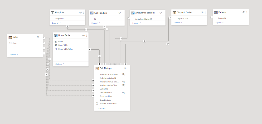
Data is used as provided in Excel for this Challenge, the data model exists of one fakt-table CallsT of the 3.000 calls, the other data provided is used as lookup-table, I added an age group and a month lookup table (instead of the often used date table).
Three calculated columns are added to the fakt-table CallsT:
A slicer “Anomality Call to Hospital Care” is added with a range from 15 till 80 (minutes) through Modeling → New Parameter What if in Power BI, whereby a user can determine what is seen as anomality; all anomalies can be analysed in the two anomaly report pages.
Three DAX measure-groups are created:
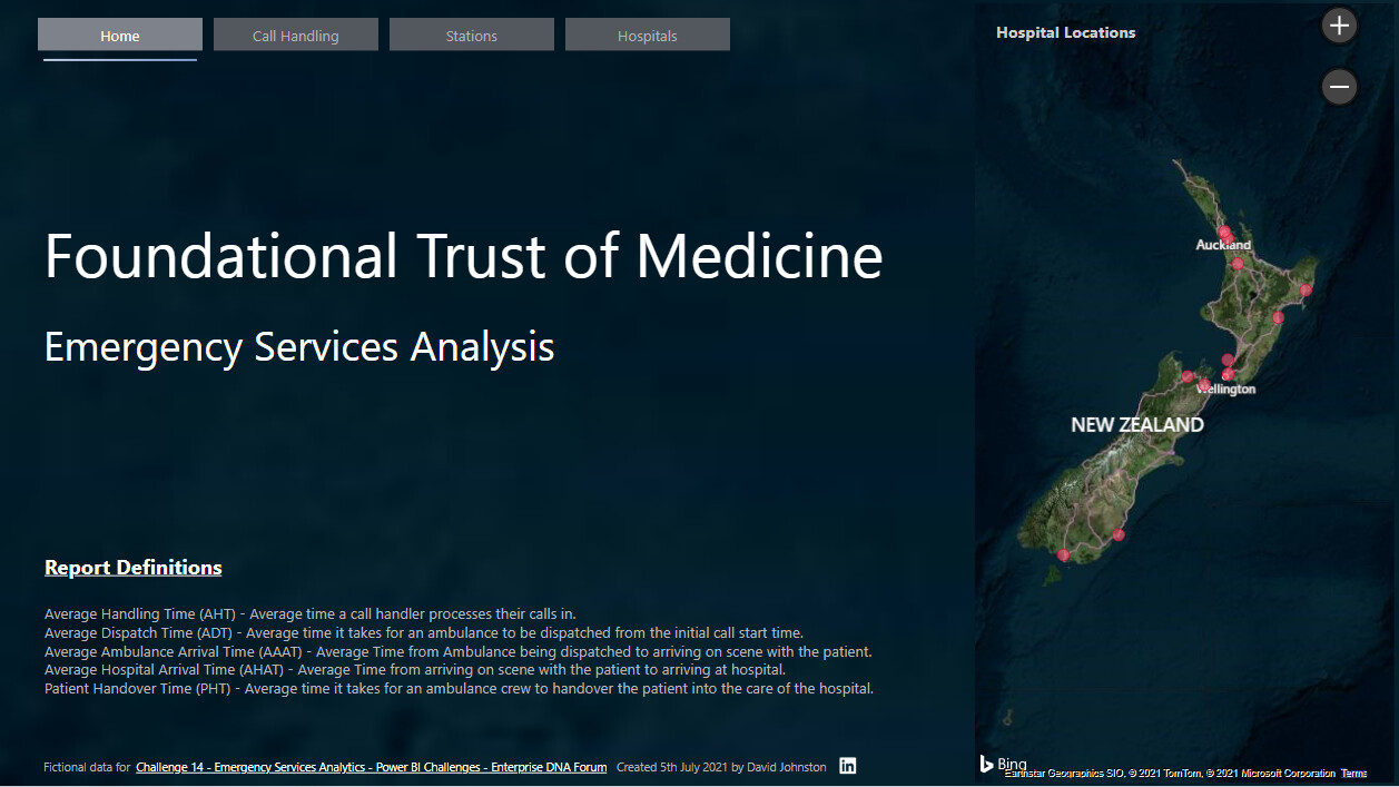
The report contains of a content page, five reporting pages, and an explanation page, see appendix.
A further development of this report might be a dashboard with required key management information. I really enjoyed this challenge.
Kind regards, JW
APPENDIX:
The five report-pages with example selections:
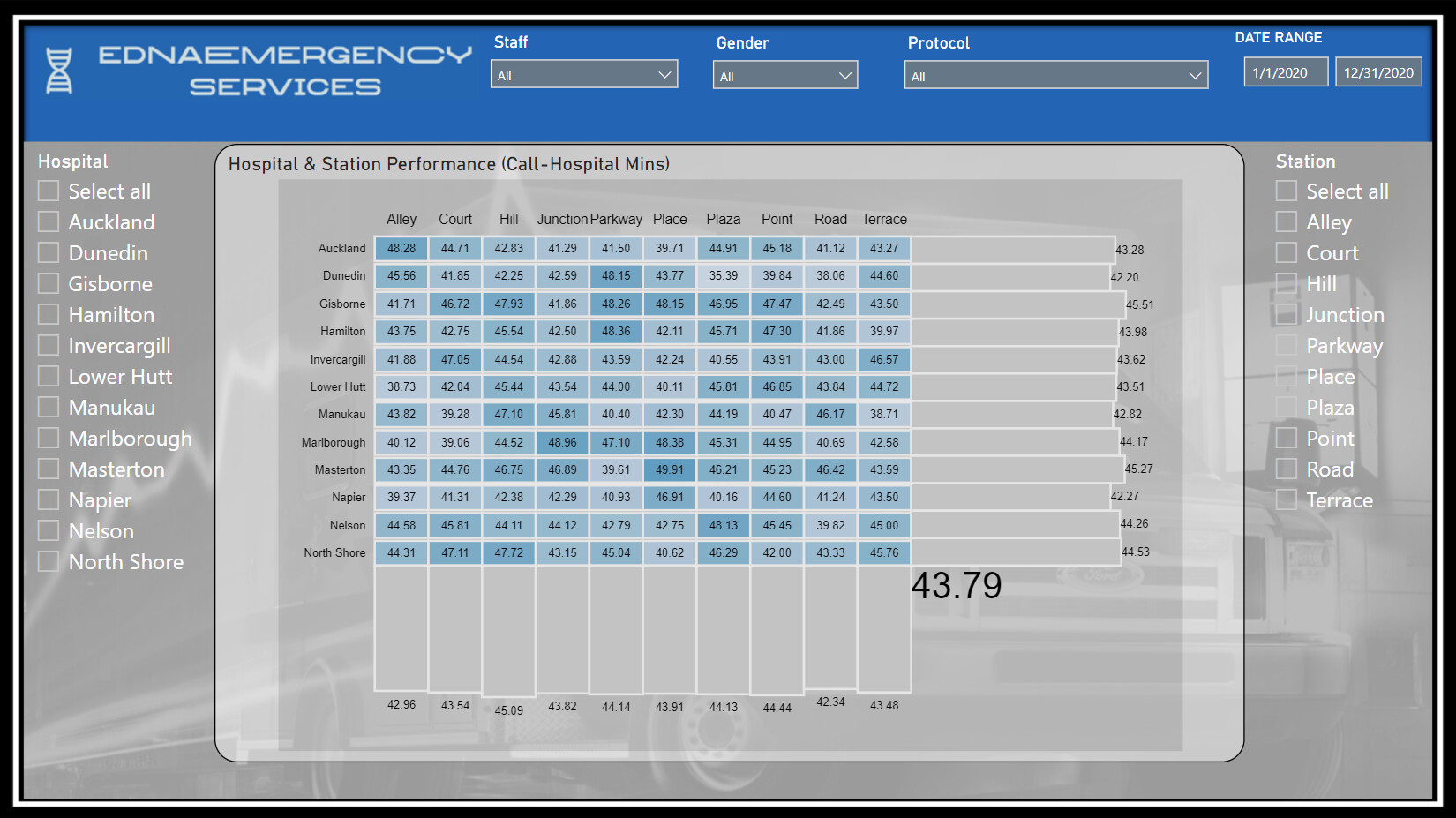
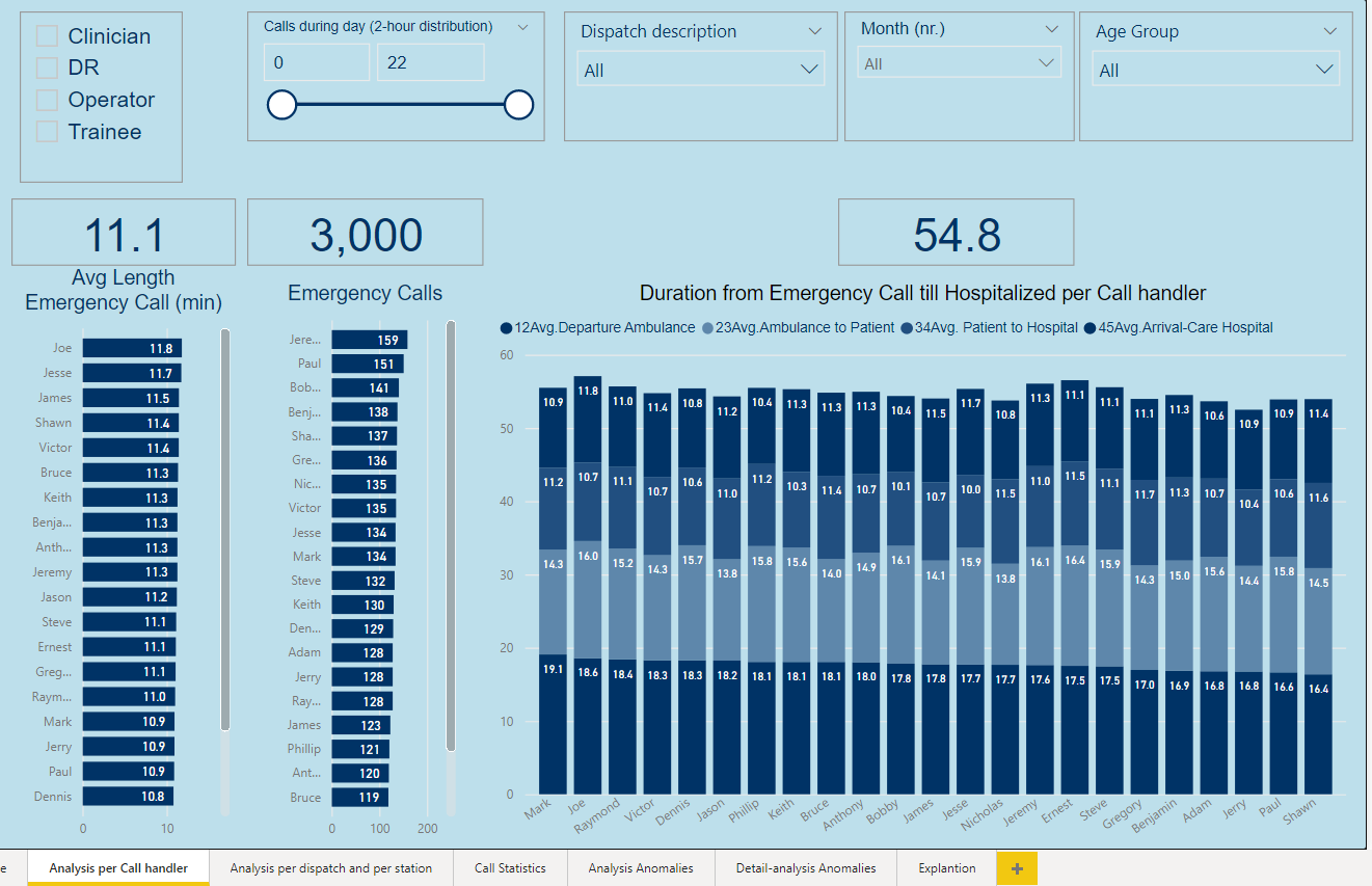
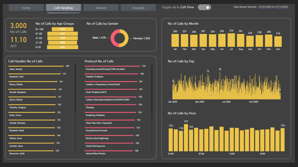
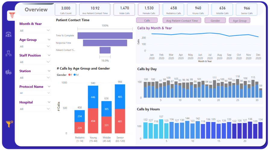
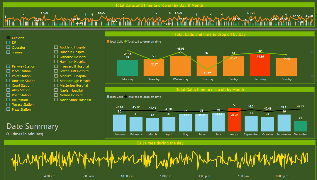
Page " Analysis per Call handler" with all calls, no selection made.
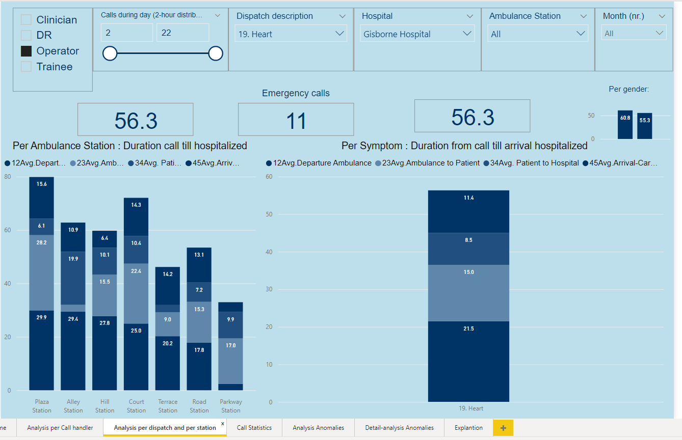
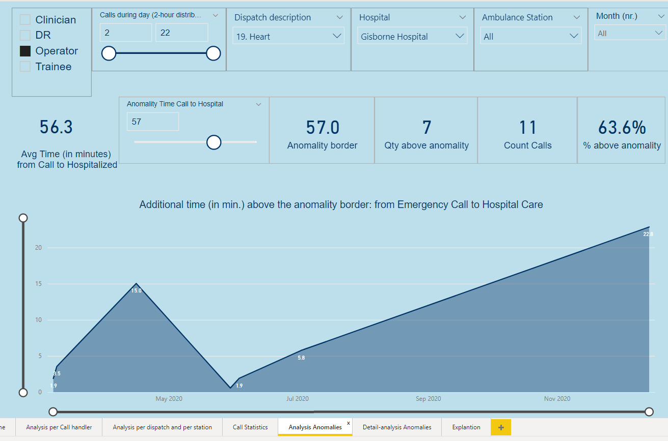
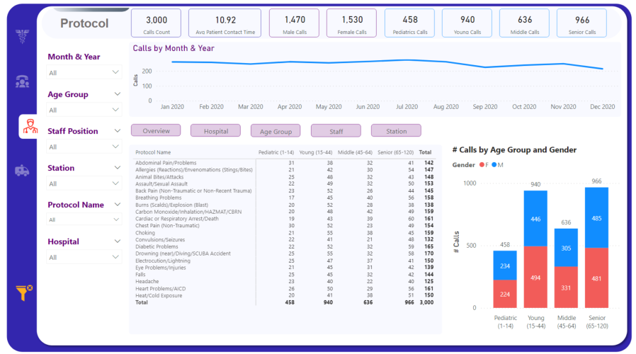
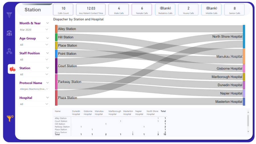
From page " Analysis per dispatch and per station" information of dispatch 19 Heart towards Gisborne Hospital
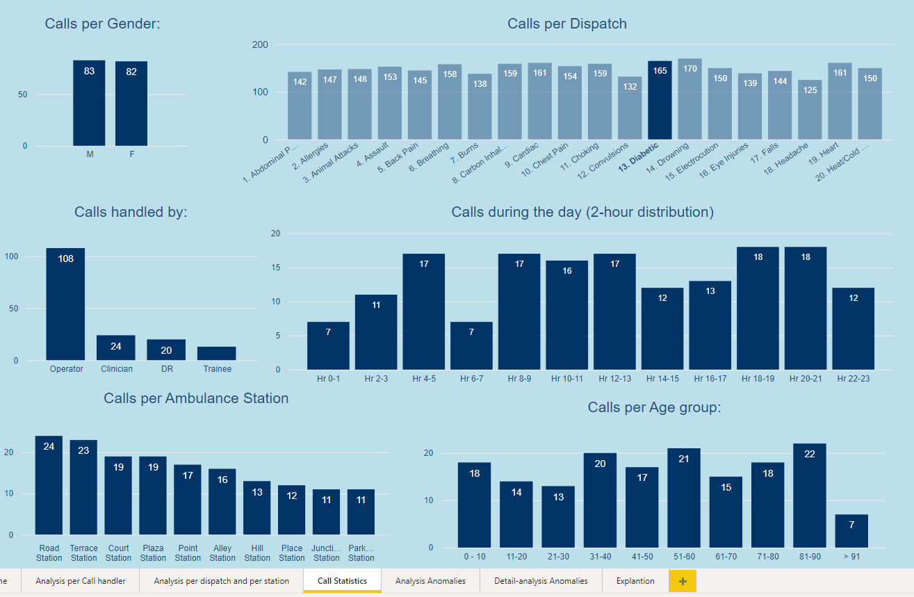
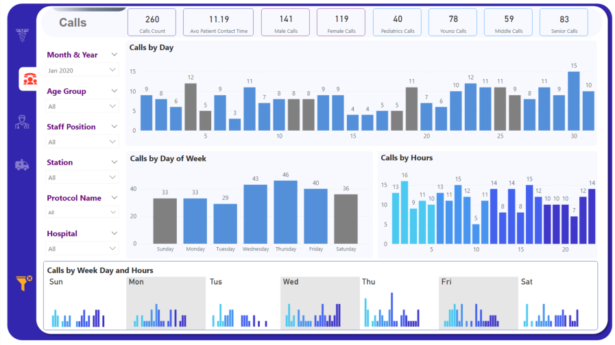
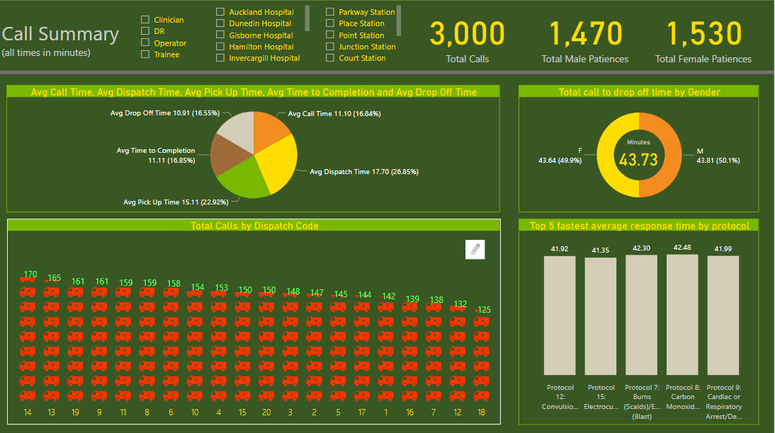
From page “Call Statistics” quantity information of dispatch 15 Diabetes
From page " Analysis Anomalies " information of dispatch 19 Heart towards Gisborne Hospital
From page " Detail-analysis Anomalies" detail information of dispatch 19 Heart towards Gisborne Hospital
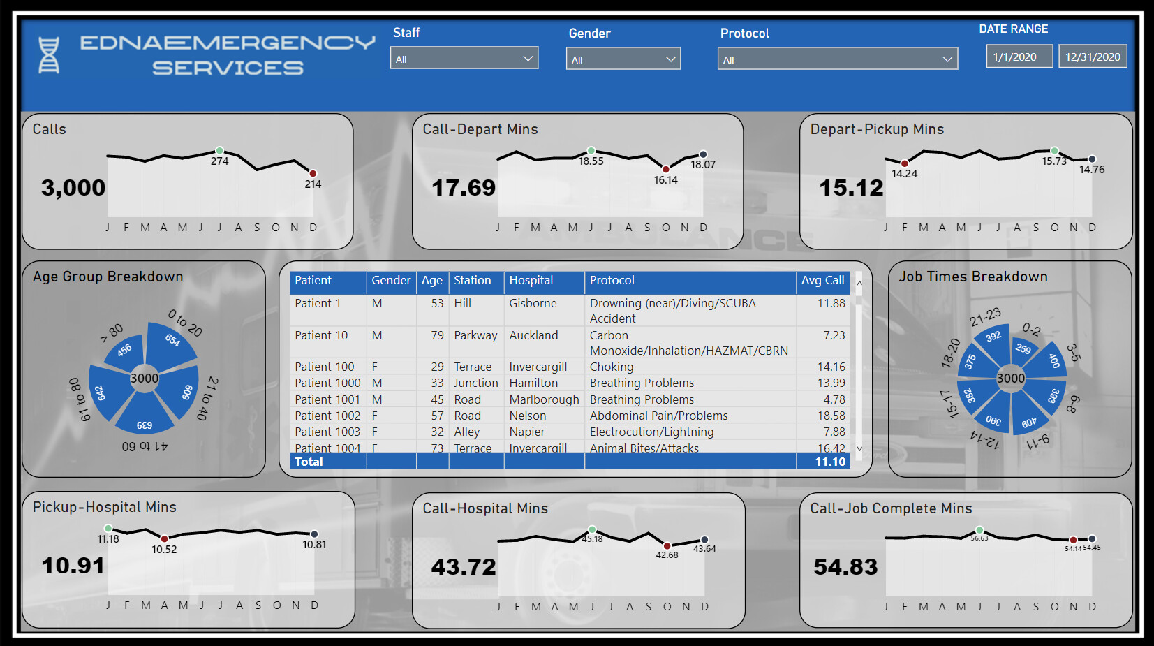
This is my first time submitting an entry to an EDNA Challenge, also realised it was my first time creating a PBIX project that was for something other than work. I can’t say I’m fully happy with my effort, quite a few things I’d change now but ran out of time. Still really happy to have submitted an entry, thanks again to the EDNA Team for these challenges, I may not have submitted an entry for the other challenges but I’ve loved looking over & picking apart the other submissions and learning that way too.
Some obvious influences on my report design were from @MudassirAli submission for Challenge 10.
EDNA Challenge 14 DJ.pbix (3.0 MB)
David
I have always advocated for using these Challenges as a way to experiment, stretch yourself and try things you might not otherwise do in your real-life work reports, and I think this report embodies that approach in dramatic fashion. Of the three new elements you’ve tried, I would rate them as follows:
Custom KPI cards – stand-up triple. I think these are terrific visuals that attractively convey a lot of information at once in a relatively small space.
Selective Row/Column Heat Map – game-winning grand slam. This is truly one of the best visuals I’ve ever seen. The ability to choose the rows and columns, and have the heat map recalculate dynamically is amazing. Other than “something something Charticulator…”, I have absolutely no idea how you accomplished this. I can’t wait to see your write up and PBIX file to figure out how I can build this and incorporate it into my reports.
Deconstructed Pie Chart - foul ball that hits a spectator in the head and sends them to the hospital. Hey, we can’t win 'em all, but kudos for trying something different. However, I find this visual really distracting, hard to read and interpret, and much less effective than a simple bar chart would be.
Overall, incredibly innovative, interesting and valuable report that I think will have a lasting impact, in terms of the way I expect many of us will build our KPI cards and dynamic heat maps.
Phenomal submission! 
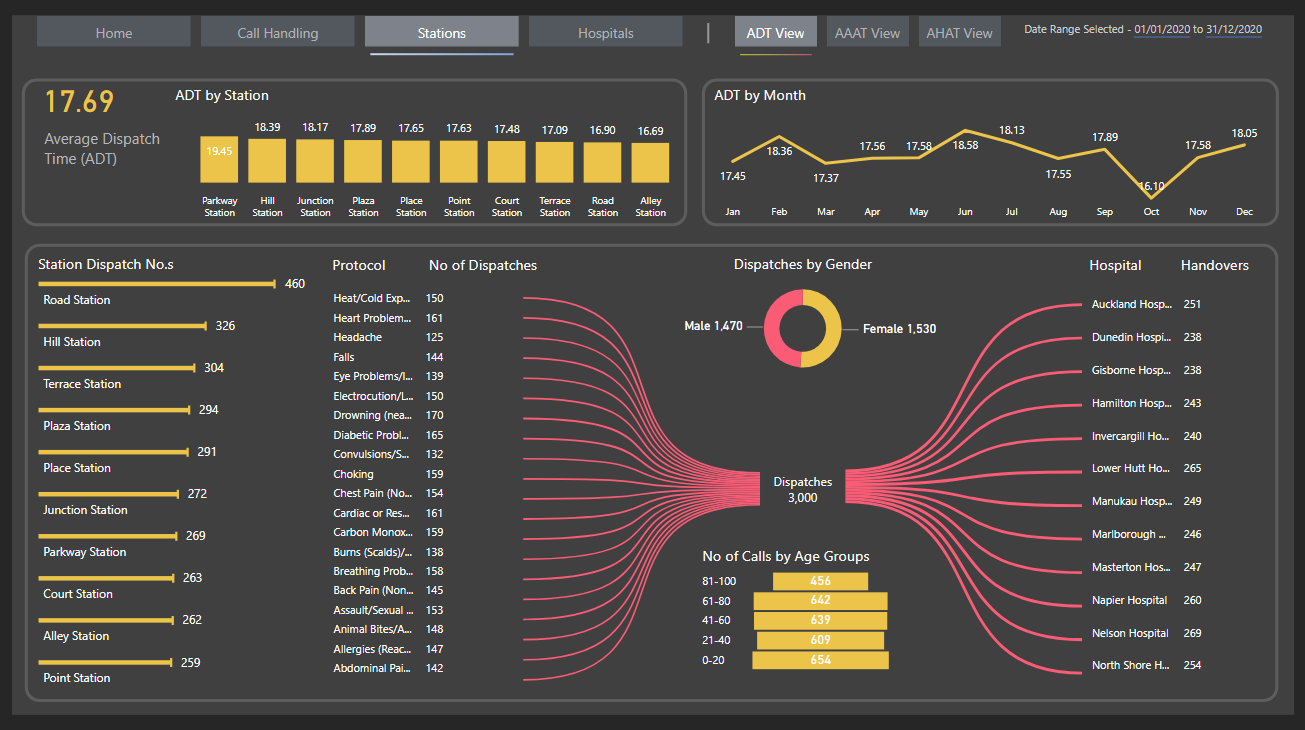
This is an absolute knockout first entry. First, it just looks gorgeous, and has a really fluid, intuitive navigation experience. I particularly like the use of the toggle to double the amount of information on the call handling page without interfering with the great aesthetic look of the report, the multiple views available on the station page, and the bowtie visual on that same page (I think that’s a really nice variation on the decomposition tree).
Just a wonderfully conceived, designed and implemented report.
Can’t wait to see more of your work in future challenges.
Thank you for the kind words, much appreciated!
I will be submitting a wk 14 response, but I seriously doubt it will be in time of the deadline. My actual work takes priority, sadly :-(. With that being said I will post something as close to real-world as our company uses daily, not that it will be any better than the AMAZING ones you all have submitted.
If I post after the deadline, will it still show up here, or can I send to Brian/Sam and they will post if they want?
Some absolutely fantastic entries so far. Well done everyone.
@cwnoll ,
Feel free to post absolutely any time. Some people come back to challenges they missed months after the challenge deadline, which is absolutely fine and encouraged. And if you need it published to the web, just send me a copy of your PBIX file to brian.julius@enterprisedna.co and I will gladly send you back the link to the report in the Service.
Here is my first submission in eDNA challenges. I did not find the time before to participate but I definitively believe that this is one of the best ways to explore new horizons, learn and develop new skills.
By working on this project, I got to know the New Zealand better and these holidays for example or the peak hours in Auckland.
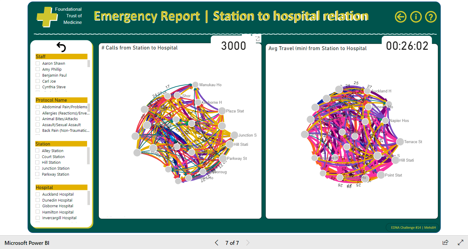
This challenge allowed me to improve my knowledge on the date table. and I used a time table for the first time. I also let me to explore the “Force-Directed Graph” custom visual.
Of course, I still have a lot to improve and even learn.
Best Regards
Mehdi
Make sure to post the images, so we can see your work within the forum post.
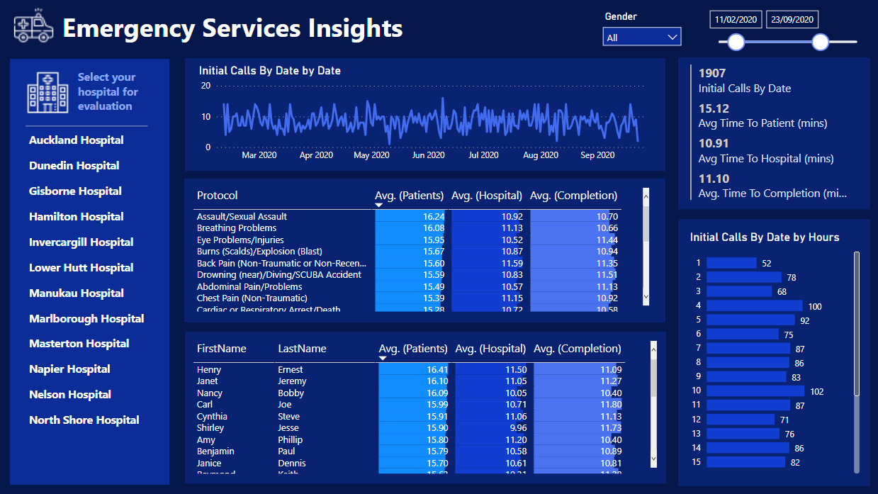
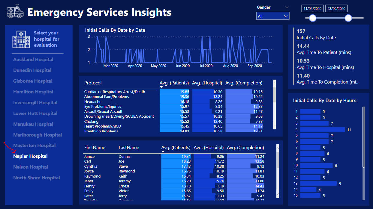
Just finished up my own submission for the challenge.
I’ve kept it short and to the point on this one.
Nothing to fancy on the visualization side but enables the user to walk through all the data and make there own assessments.
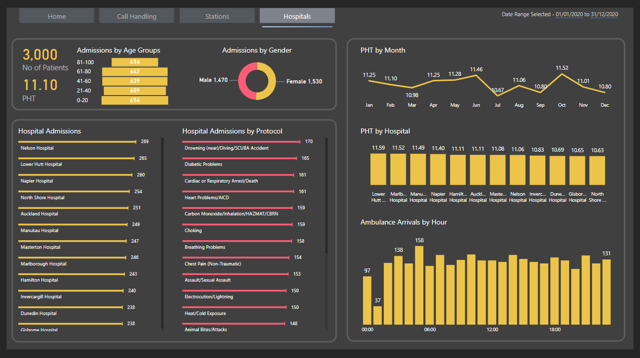
I decided to tell the story of the data through the hospital selections
There’s plenty more that could be built into this report. It has a solid setup. Another developer could easily pick this up and make many customizations. Continuity is key.
The biggest improvement I can still make which really stands out to me is the details and text around some of the insights. Just to make it clearer what consumers are actually looking at. Easily improved though.
Publish to web link
Enjoy
Super report, well done
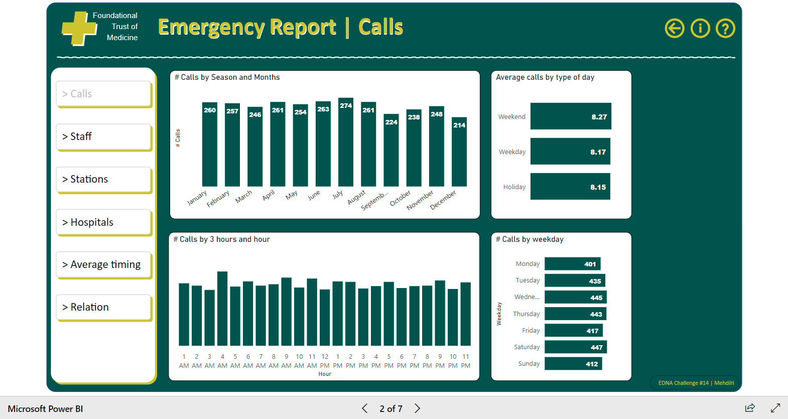
@DavieJoe, the graph on slide 3 showing the distribution of calls is awesome. Where did you find it?
Hi, please find my post attached for Challenge 14.
I accepted the #EnterpriseDNAPowerBIChallenge
Challenge 14 Steven Stanford.pbix (940.9 KB)
It’s a custom visual called Bowtie