Cancellations as a percentage of sales goup.pbix (2.4 MB)
Hi
If possible, could I get some assistance with an issue I’m having.
It’s all based on recurring sales.
There’s a Sales dataset with all the transactions.
The Pledge Stats dataset details of the recurring pledge including start date and cancel date.
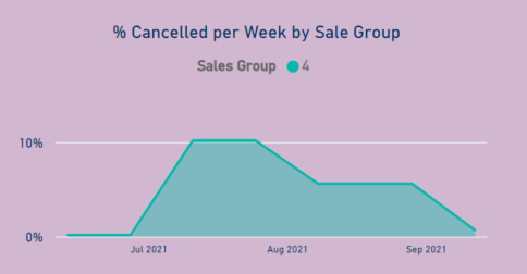
My manager wants a chart for each sales group showing how many cancelled that week as a percentage of the number of people who were active at the beginning of the week in that group (i.e. had made four sales at the beginning of the week.)
For example, for the chart with the legend of ‘Sales Group 4’, this is the group that at the beginning of the week were active (Circle Open < the beginning of the week date and Circle Current = ‘Yes’) and had four sales transactions. By the end of the week, some would have cancelled (based on circle closed date). So the data point on the chart would be (those who cancelled during the week who had four sales at the beginning of the week) / (all those who were active at the beginning of the week with four sales).
Some customers might have made their fifth sale during the week but the active number is based on the beginning of the week.
Thanks.
@KieftyKids Can you please create a table in Excel highlighting the numbers? This will reduce the unnecessary to and fro, and I won’t have to spend too much time in understanding your model. 
Hi @AntrikshSharma
Thanks, I’ll post a table later today.
Hi @AntrikshSharma
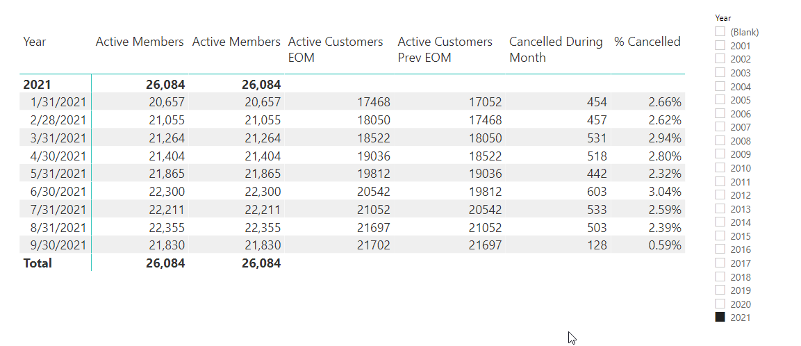
Firstly, I’ve changed the period to monthly. I thought that would be easier.
I managed to work out the active numbers for all customers:
Supporting table.xlsx (5.9 MB)
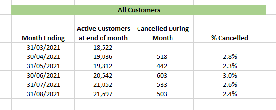
That is, at the end of March/start of April there were 18,522 active customers. During April 518 of those customers cancelled their regular transaction. That is 2.8% cancelled during April.
What I couldn’t work out was how to split the customers into Sales Groups.
That is, for example, at the end of March/start of April there were 1,000 active customers who had made four transactions. During April, 100 of those customers cancelled their regular transaction. That is 10% cancelled during April.
Does this make sense?
@KieftyKids Here is the solution as per the Excel file, I added a new Month Ending column in the Dates table:
Cancellations as a percentage of sales goup.pbix (2.3 MB)
1 Like
Hi @AntrikshSharma
Thank you for the solution.
Unfortunately the part I’m struggling with is how to calculate the monthly cancellation rate for each sales group.
For example, say at the end of March/start of April there were 1,000 active customers who had made four transactions. During April, 100 of those customers cancelled their regular transaction. That is 10% cancelled during April.
I’m sorry but I don’t know how to calculate this in Excel.
Hi @AntrikshSharma
Sorry its taken so long but I’ve finally worked out how to calculate the sales groups. Included in the attached spreadsheet is the table for sales group 2.
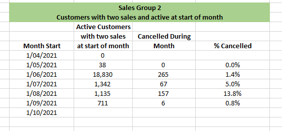
The I’ve doubled checked the results and they are correct. (I needed to create some extra columns in the Circles worksheet to count the number of sales at the end of each month.)
Thanks
Supporting table.xlsx (4.2 MB)
Hello @KieftyKids , glad to know that you are having progress with you inquiry. Kindly mark the answer that solved your inquiry as SOLUTION so that other users with the same problem can benefit from your post.
Another thing, kindly take time to answer the Enterprise DNA Forum User Experience Survey, we hope you’ll give your insights on how we can further improve the Support forum.
Thanks!
Hi
If anyone’s seem my inquiry, do I need to set up calculated columns like I have in the spreadsheet to work out how many sales each customer has made at the start of that month or is there an easier way to reach a solution of calculating the percentage who cancelled their recurring transactions per sales group each month?
Thanks