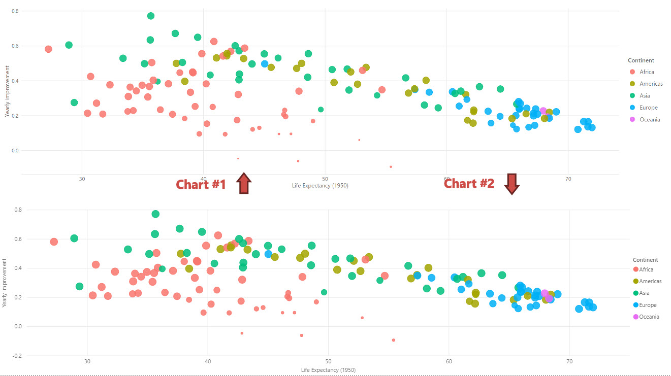
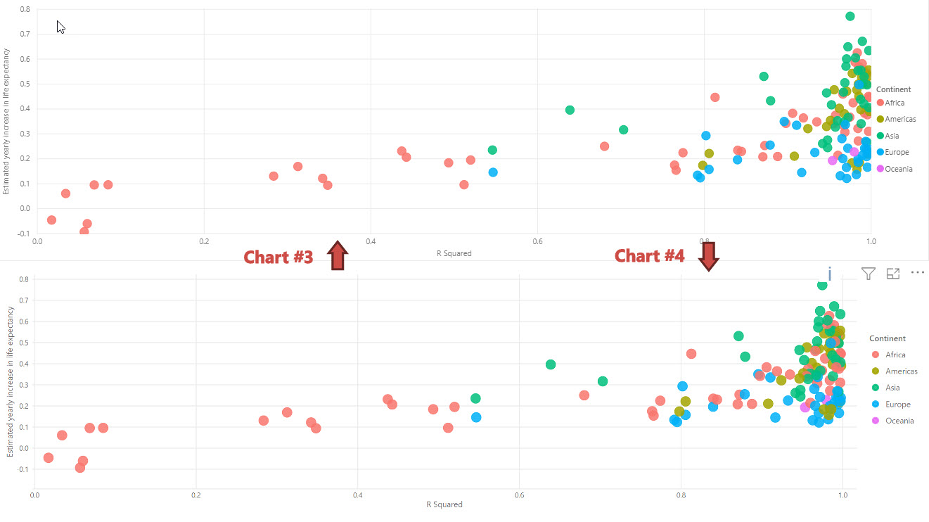
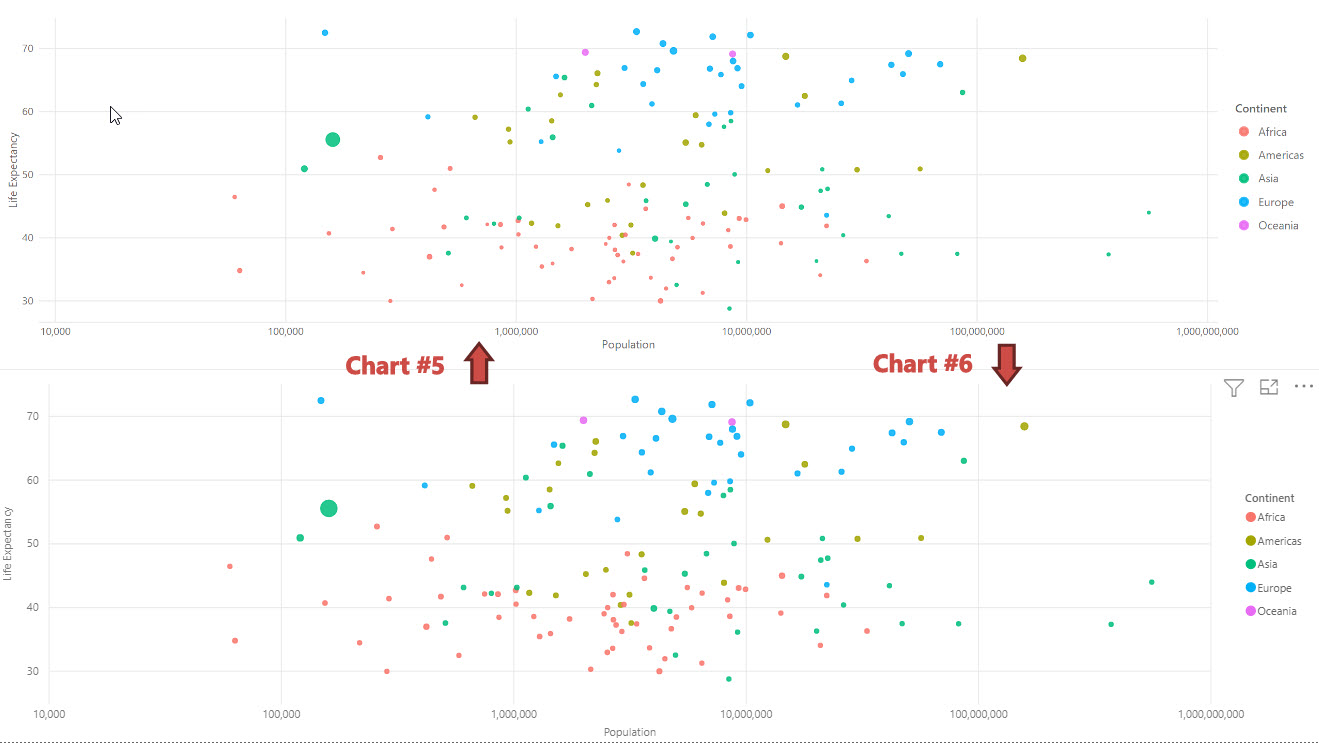
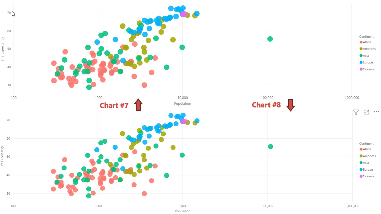
So yesterday I decided to try something that I thought would be a fun challenge to throw out to the EDNA community. My goal was to see if I could create custom R and Python visuals that look as close to the Power BI equivalent as possible. Yes, I could easily have just made these charts using the Power BI standard visuals, but I wanted to test my visualization coding skills just as a challenge to myself.
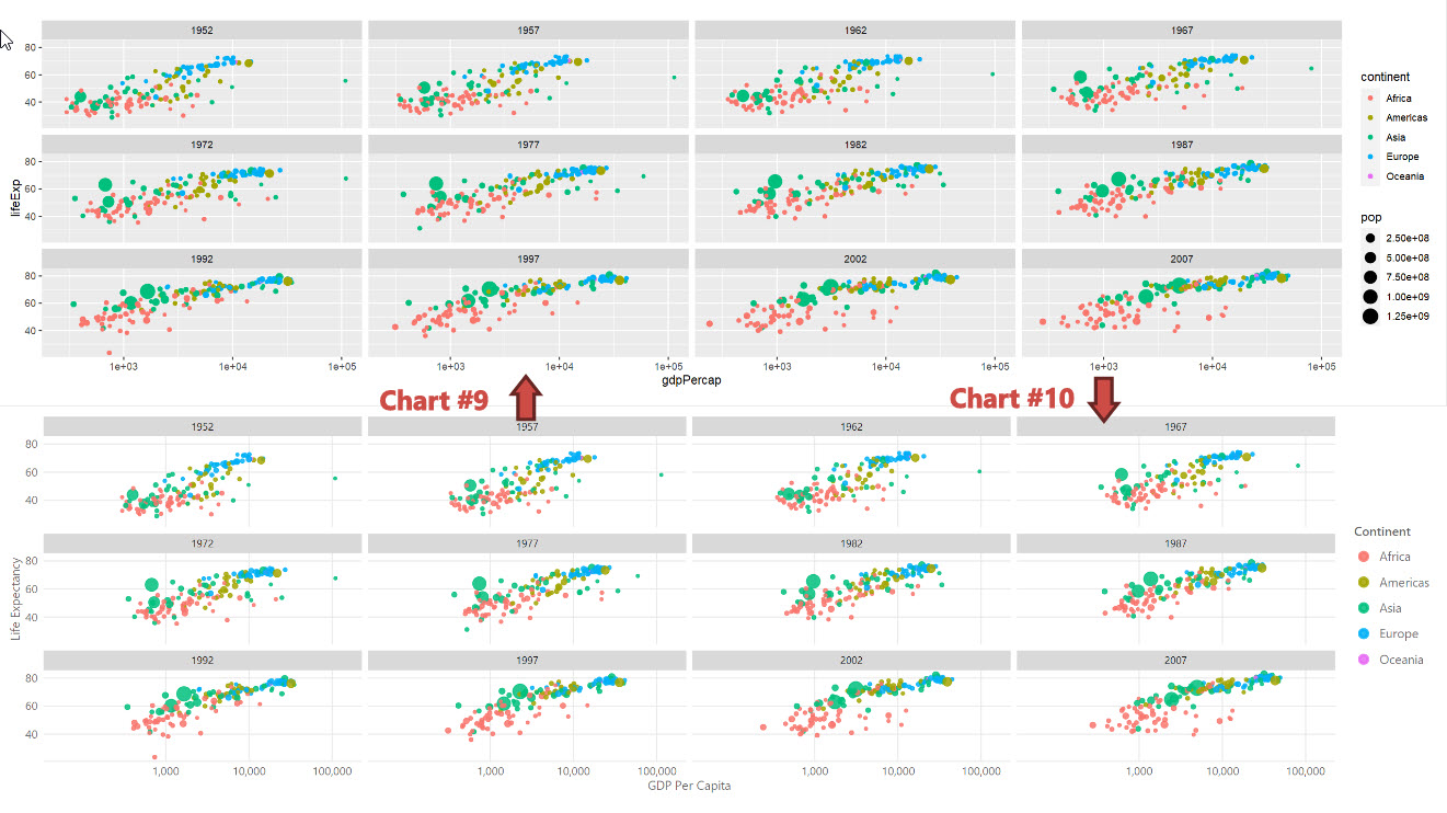
So here’s the challenge: There are five sets of charts below, some use the standard Power BI visuals, some are custom visuals. Your job is to identify which charts are which. The only bit of advice I will give is that just because two charts look the same, doesn’t mean one is a custom visual and one is a standard Power BI visual. Both could be custom visuals, both could be standard Power BI visuals, there could be one of each. Your job is to determine which is which.
Voting
- 1
- 2
- 3
- 4
- 5
- 6
- 7
- 8
- 9
- 10
0 voters
Just realized I could vote too so you can see the correct answers based on my votes after you have voted 
