I did ask this, but I suspect in the wrong place. So what I would like to do is plot data points over date around its average and standard deviation, here is the data;
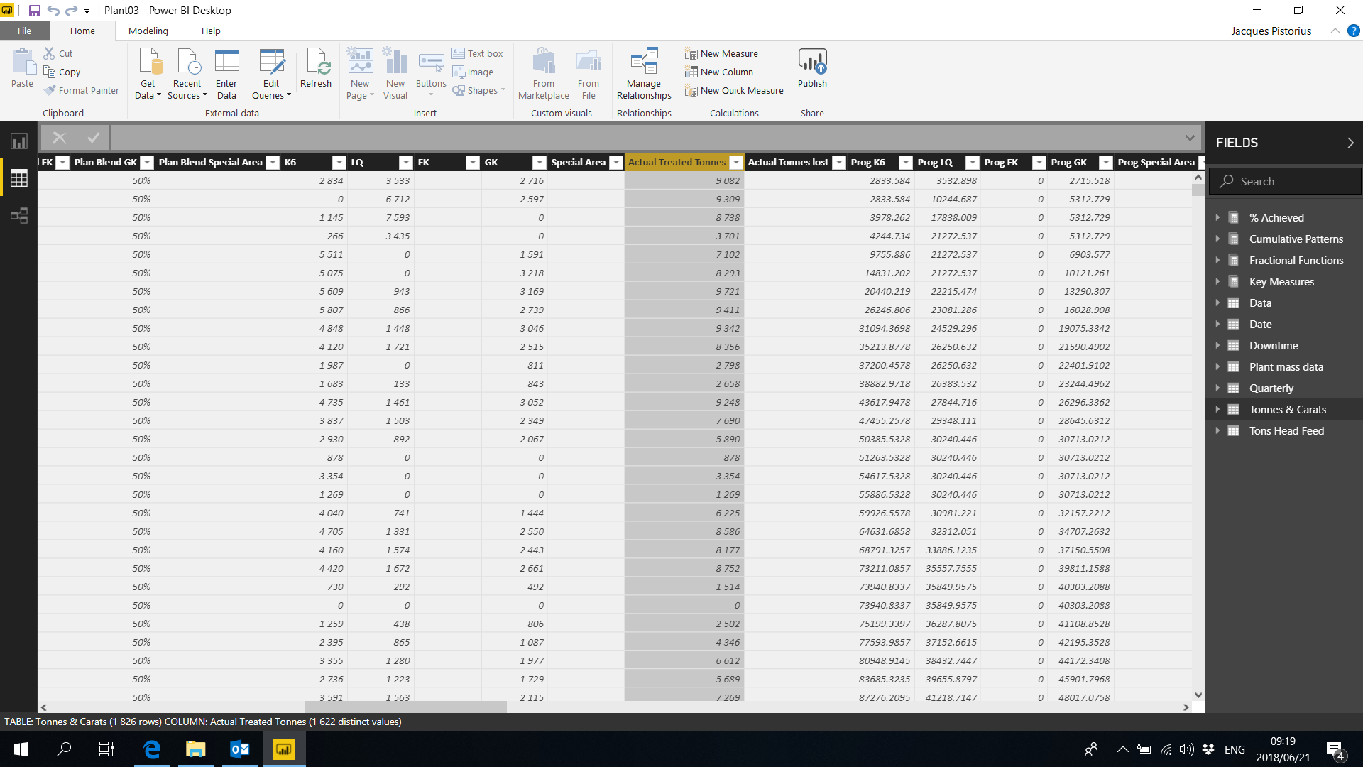
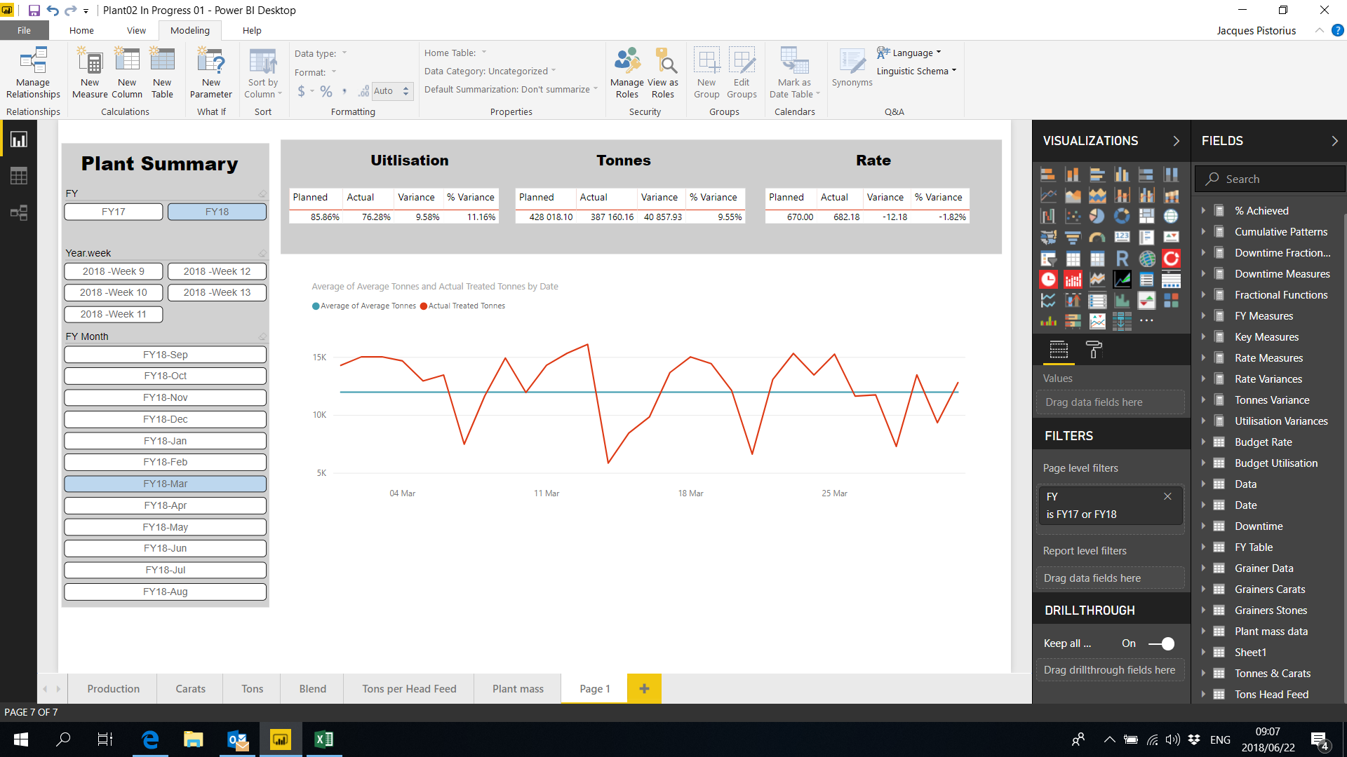
If I plot this over dates on a line graph it keeps on calculating the average for every single date value on the X-axis. It seems power bi sums the tonnes for date value on the x-axis, divided by the amount of date values, which is just one, meaning giving me the tonnes value for that day. I cant seem to calculate a sort of lifetime average for day, week, month, …ect.
If you could please help with this?
Then I would also like to plot a normal distribution for this over the following data intervals
Just a little bit more on the average, the average and standard deviation should be for the FY, but the graph must be plotted over days since I want to show the daily data points around this FY average and std.
Thank you for the reply. I’ve tried AVERAGEX, but the problem is, because there is only one data point per day, the average per day is just again that particular amount for that day which just gives me the tonnes per day.
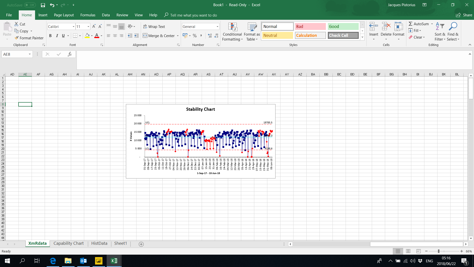
I don’t know if you will be able to see it, but there is light blue line which is the average for the financial year and the two red lines are obviously the standard deviation with then the tonnes for each day plotted inside and around the standard deviation and average respectively.
Now I think AVERAGEX in a calculated column can work, but then I assume its going to be (Total tonnes for whole table)/(count(data points)) and I need to be able to get the average for just the FY.
Ok I’m a bit confused then, as you described you wanted to find the average of this column and then place it in a line chart with a daily context. So you’ll have to give me more detail around the ‘average’ that you actually need.
I don’t recommend placing an AVERAGEX in a calculated column. You won’t need to. But I would have to understand what average you mean. Is it a moving average, and rolling average, monthly average, weekly average. Understanding which one is very important as the formulas will all be different
One recommendation with these (and just generally when learning DAX) is to look at the numbers versus the visualisations. When you see the numbers you can get a much better grasp as to what a formula is actually doing and it’s behaviour in a certain context.
In this context it would be a moving average in FY now that I think about it, meaning I want to calculate the average tonnes per FY so it will change from FY to FY. The result should be a flat average per FY, so when I plot the tonnes per day over DATE(days), I want to see a straight line which is the average tonnes for that particular FY with the daily tonnes plotted over around the FY average.
The straight line I am referring to would be a simple Average = (Total tonnes for FY)/Days per FY. A simple example would be; lets assume my tonnes for the current FY so far is 10000 with 4 days into the financial year, my average tonnes/day for this FY would be, 10000/4 = 2500. Assuming the tonnes for the 4 days was as follow, day 1 = 2500, day 2 = 5000, day3 = 500 and day 4 = 2000. When I plot this on a line chart over days, I would like to see a straight line which is 2500 for every day, with my tonnes for every day plotted around this line.
It feels like I am making this a lot more complicated than it should be due to my lack of knowledge on dax.
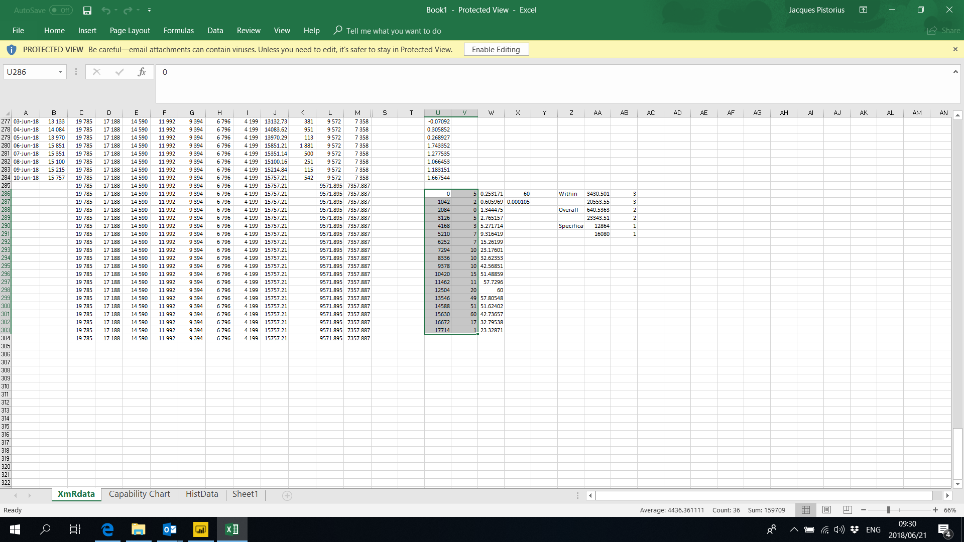
Ok so I found a way to do it, quite a work around, but alas it worked.
Ok sure, so if you wanted to calculation average per financial year you could use a measure formula like this.
CALCULATE( Average( tonnes column), ALL( Dates), VALUES( Financial year column from date table) )
That is one way to get that calculation.
Regarding the standard deviation, I haven’t worked with this too often but there is both PERCENTILE.X and also a range of STDEV functions.
I would have a look through all of these function first to see which one you think will give you what you need as they all have slightly different nuances to them.
Then check out this tutorial as a bit of a primer on how to structure statistical analysis type formulas
The standard deviation technique will be similar to this example, just using a different function