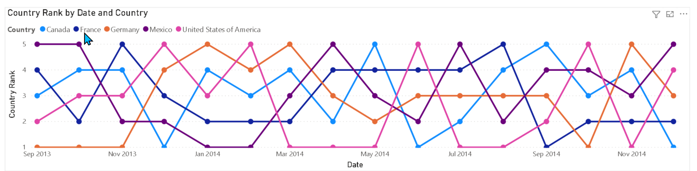
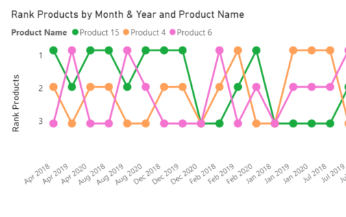
I know this is probably something so ridiculous on my end. I want to show the RANK of 1 at the top of the bump.
I know I could use the multiply the rank by *-1
I know this is probably something so ridiculous on my end. I want to show the RANK of 1 at the top of the bump.
I know I could use the multiply the rank by *-1
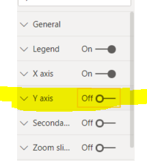
In this case I need to show the Rank so I can’t hide the Y Axis.
@jbressan - Any other thoughts?
Hi @mbraun
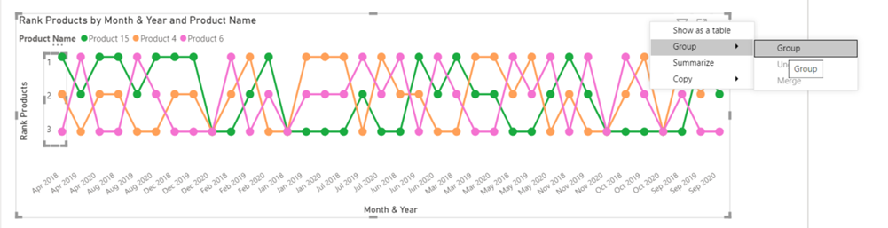
You can put the rank number with text box and hide the background to the bump chart
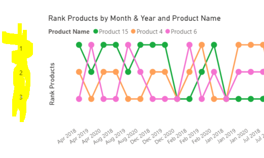
This is the result
Finally Select both visual and Group
unfortunately, as @jbressan has pointed out, there is not a way to do this through native visuals in PowerBi.
For now, you can use one of the work-arounds, or you can see if one of the third party visuals will do this. I believe xViz has this in their Multiple Axes Chart, but that is only free for use in the Desktop - once you publish it to the service the visual will not show up.
I do recommend voting for this in the Ideas forum - perhaps if more people would vote for it, this option would be added to the chart options: https://ideas.powerbi.com/ideas/idea/?ideaid=53c66069-82a3-493b-9358-df126ea9457f
@MudassirAli can confirm definitively, but I am almost certain this is also possible to do within Charticulator.
ah yes, that would make sense, thank you @BrianJ 
@BrianJ - Thanks I was hoping it was possible with the native visualization within PowerBI.
In that case, I think youre out of luck but for the type of clever but kludgy workaround proposed by @jbressan.

Hi @BrianJ
For outbox solution with R and Python
Thanks. R is my go-to option for visuals that can’t be created in native PowerBI. @bradsmith turned me on to an amazing R package called Esquisse that lets you create great-looking ggplot2 visuals through simple drag and drop.
Also, here’s’ a video on creating Bump charts in Charticulator:

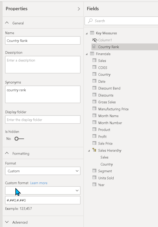
@BrianJ - I little backwards way but it worked…
Rank Formula:
Country Rank =
RANKX(ALLSELECTED(financials[Country]),CALCULATE(SUM(financials[ Sales]))) * -1
Then on the modeling screen, I set this for the custom number format ! (see screen shot)
@mbraun This is very easy and more customizable in charticulator than creating with native PBI visual. If you can give me the pbix file with dataset, I will be happy to jump in this one.
Bump Chart.pbix (124.5 KB)
@MudassirAli - Here is the .pbix for you.
Hi @mbraun! We noticed that your inquiry was left unsolved for quite some time now. We strive to answer ALL inquiries in the forum.
However, if you are sure that you provided all pertinent context to your concerns and read how to use the forum more effectively and still find your question unanswered, you can check out tutorials to learn this yourself as your membership also comes with relevant resources that may help you with your Power BI education.
While our users and experts do as much as reasonable to help you with your inquiries, not all concerns can be attended to especially if there are some learnings to be done. Thank you!