Your dataset as an Excel file (again, sanitized if necessary)
A detailed mock-up (marked-up screenshot of the visual in question or Excel file) showing your desired outcome.
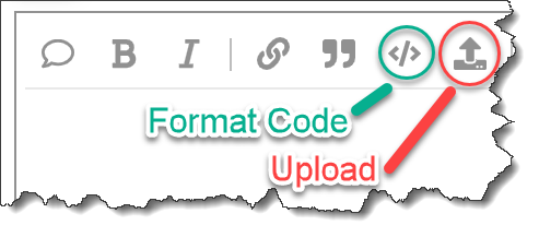
Also, if you provide DAX, Power Query, or Deneb JSON code in your post, please format it using the built-in formatter.
(From the sounds of it, you’ll need a composite visual (2 histograms side-by-side), but the wip PBIX file, data file, and mockup will provide more info.)
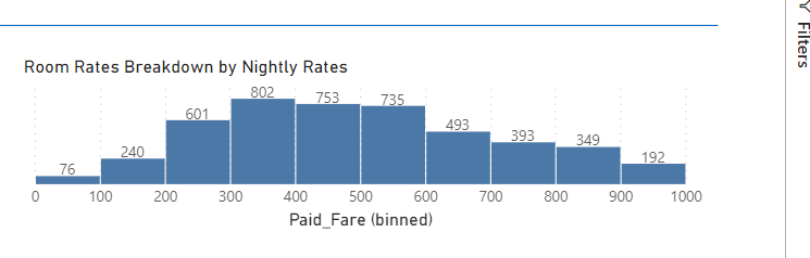
Here is a sample. You can see that the Room_Rate has values above 1000. Anyway for the histogram to combine every value above 1000 into a single bin. Obviously there are manual workarounds within powerbi but wondering if this is something that can be done in vegalite with the source being just the rates. DummyData_Histogram.pbix (1.5 MB)
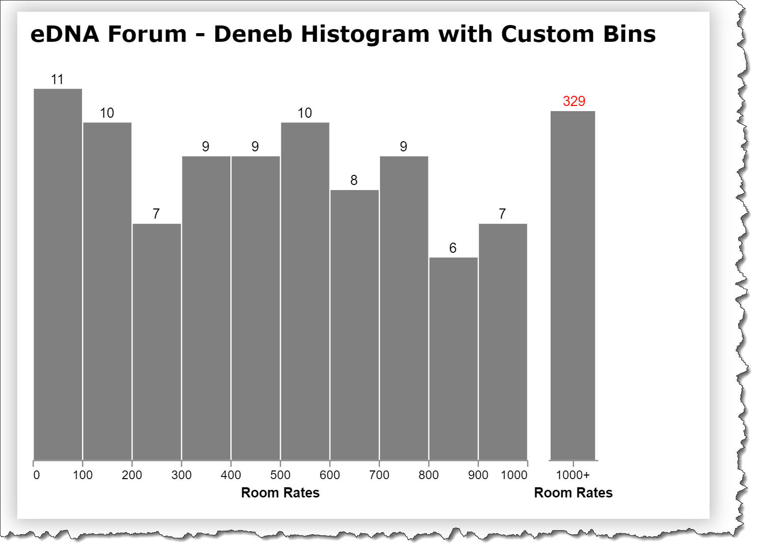
After a quick search, I was unable to find out how to set custom bins in a Vega-Lite histogram. What you can do, however, as I thought, is to create a composite visual with horizontally concatenated visuals, in your case with the left one a mostly as-is histogram (just with a filter to under 1000), and a right one that is a standard bar chart (with a custom field setting the “value” to 1000+ and filtered to over 1000).
This generates quite disparate numbers for the Y-axis, so you’ll need to give some thought and adjust as necessary. Perhaps a mock-up in PowerPoint? Nevertheless, here’s my work-in-progress.