Hi, I have a bar chart of invoice amounts collected by client. There are 4 different invoice types and each is broken out on the chart. (A Client can have up to 4 bars) The Clients name is on the Y-axis down the side and the amounts are on the X-Axis. I have one client who is far larger than every other client so the chart scales on the X-Axis to accommodate the large client…but the rest of the bars are tiny for everyone else due to the X-Axis automatic scaling. Short of filtering out the large client, is there a solution for this so the chart can be seen for all clients? I have data labels turned on.
Have you jumped into the formatting area and had a look at what you can do with the x and y axis?
You should be able to change it so it doesn’t automatically go to the scaling option.
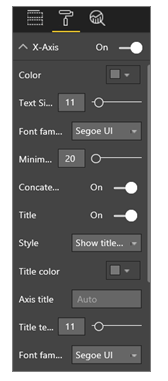
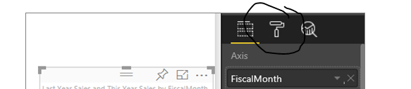
You can do this in the paint roller area on the right hand side
You can change many things here, I’m confident you’ll find what you need.
Come back if that doesn’t work out.
Thanks
Sam
I found if I do not start scaling at 0 and pick a larger number, I can go with Log scaling rather then linear…once I got there, I was about to make it look better. I tried manipulating this before but was not getting anywhere. After your response, I guessed I had not gone in deep enough so I started testing everything and got out of linear scaling. Not sure if that is what you meant…but it did work…