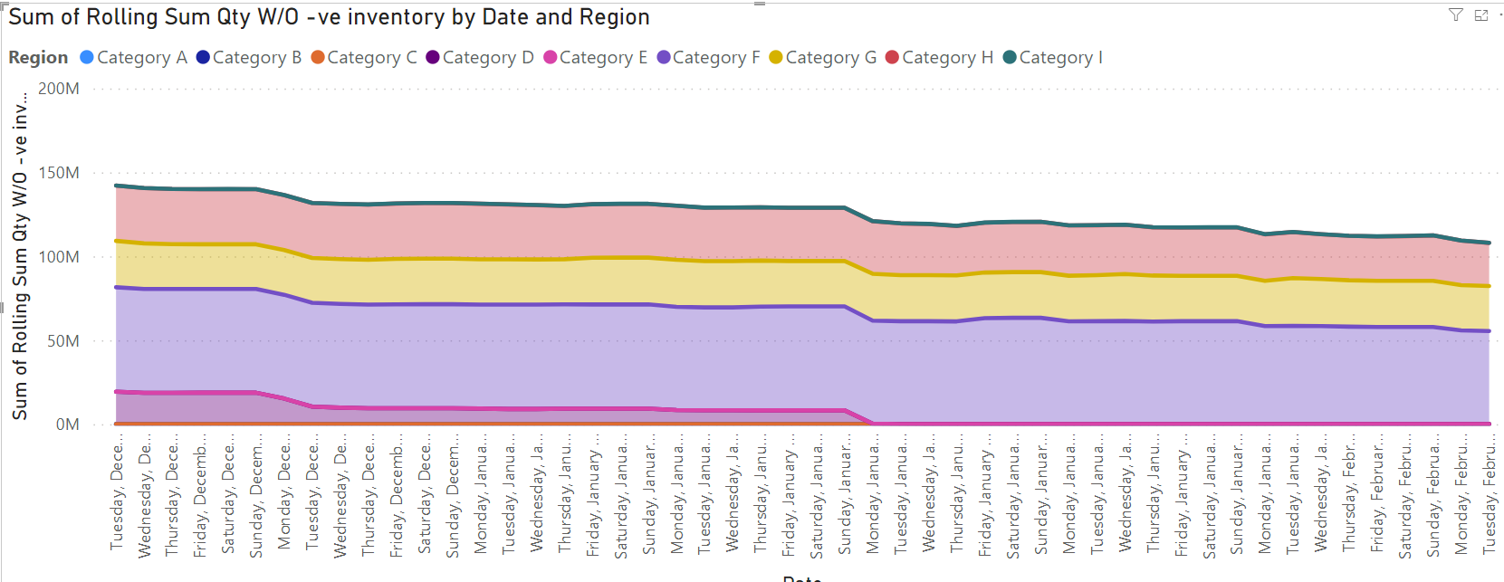
Hi, I am trying to plot some data on an Area chat and the zeros in the chat are making the chat look funny
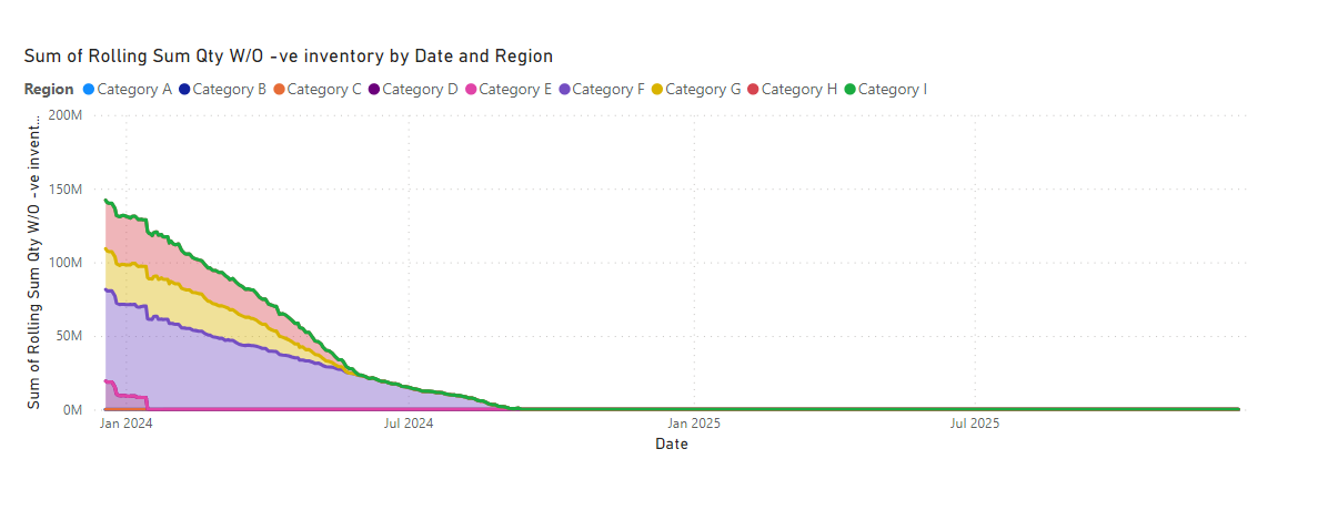
the area chat is making the values look like the values are down to zero, but when you over that part, you will notice other categories have values available there.
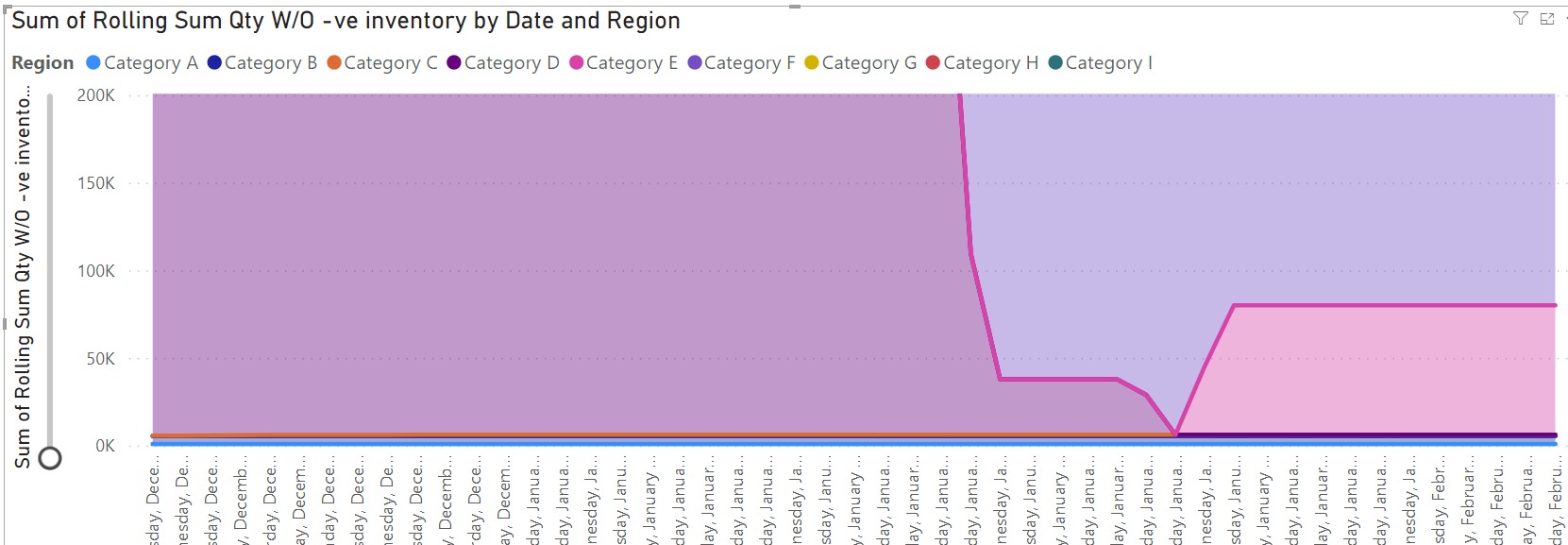
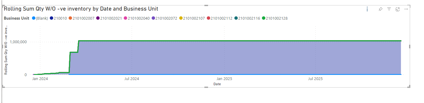
Thesame dataset when i changed the category, it looking pretty fine
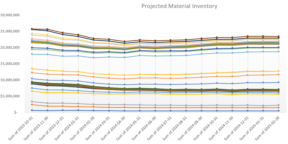
why the chart in the first image is the way, its still daunting, but that not even he issue, the first graph was plotted in excel using thesame dataset he was able to achieve thesame thing
My ask is how to I change the scale on the area graph for it not to nose dive the way it is now, show the remaining values throught the time series.
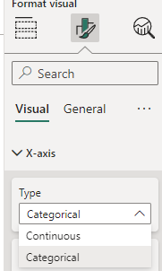
I tried changing the minimum and maximum value of the Y axis but it didnt work
find sample pbix file
Area_chat QTY.pbix (61.1 KB)