Is there a way in Power BI to annotate a line graph like the attached picture?

I would have to think this is able to be done someway. Never really looked at doing this, but can see the benefits for sure. Happen to have any of the data behind that screenshot, or something similar? This is a good challenge for sure
I’m aware of two ways to do this:
- if you’re willing to use custom visuals, there are a number of those, including the one below, that can handle this.
- alternatively, you can do this in R, and import the R script visual into Power BI. (I’m guessing the same could be done with Python, but I don’t know Python…)
- Brian
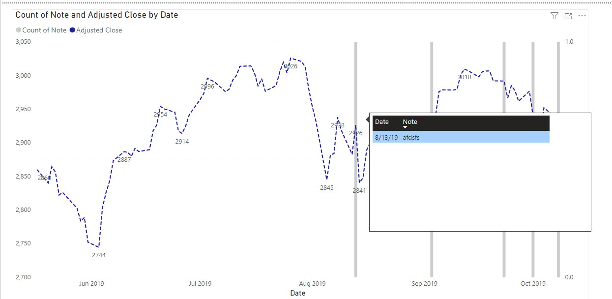
What about using Tooltips? The following chart is the S&P that I grabbed from Yahoo and then some random notes. But you could set up your data model so that the notes are dependant on whatever is shown in the chart. I’m not sure it’s possible right now to show the text directly on the chart dynamically, but ill keep looking around
Check this out - Microsoft Pulse Chart custom visualization. Pretty powerful tools for annotating line graphs.
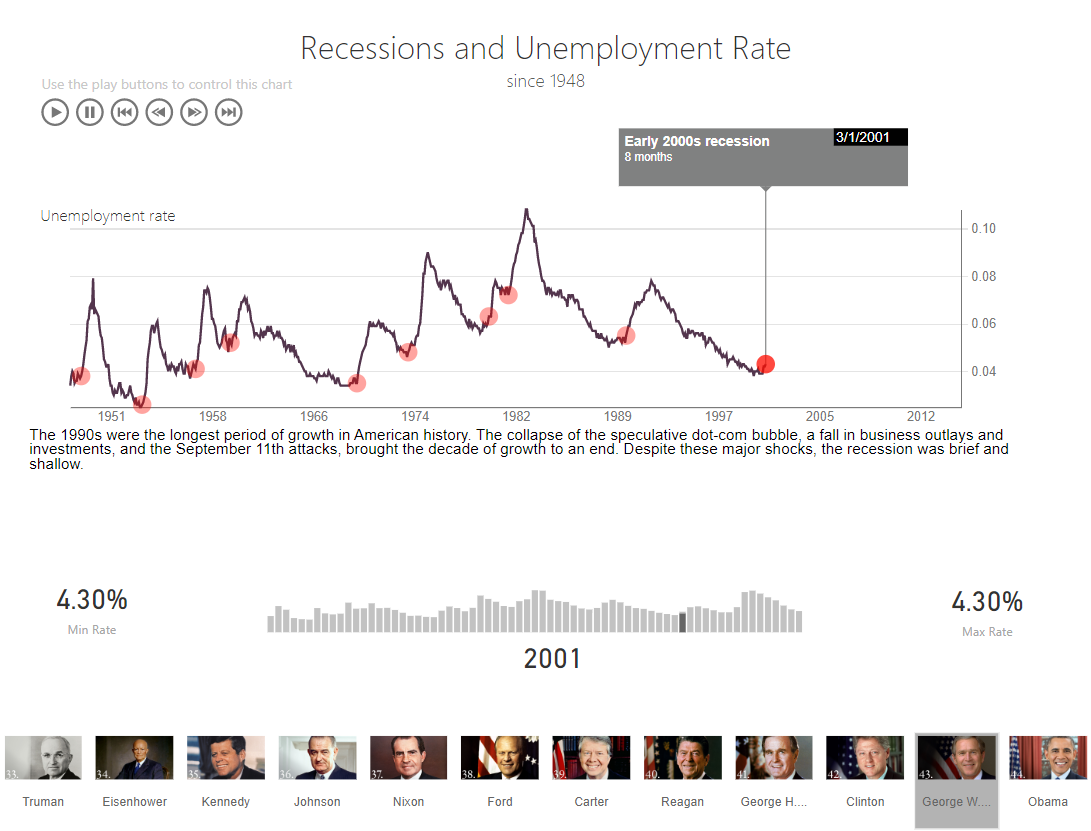
Here it is in action.
- Brian