Hi, I am looking for a combo chart visual (bar + line) that supports analytics = I need to draw a constant 5% dotted line.
Currently the native visual doesn’t support it.
I was looking into ZoomCharts TimeSeries visual which comes with the analytics = Threshold (is being called ) … but the visual has bug which crashes when I zoom.
Does anyone know other vendor besides ZoomCharts ?
Thanks!
I really recommend just doing this with DAX. Any reason why you’re not considering just doing it this way?
Using DAX, Is my preferred option always compared to using any of those forecasting features at all. You just have so much more flexibility and dynamic ways that you can set your formulas up, compared to any other option including custom visuals hitch are generally unnecessary.
Sam
Hi Sam,
This is purely for visual display needs. not really a Dax calculation.
Where the Combo (bar & line) wont let me set a constant line for 5%.
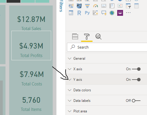
Easy fix, you just need to turn off the dual horizontal axis. You can do this very simply in the formatting area of that visual, by switching the secondary axis to off
Ha! I need both Y -axis in my case. 
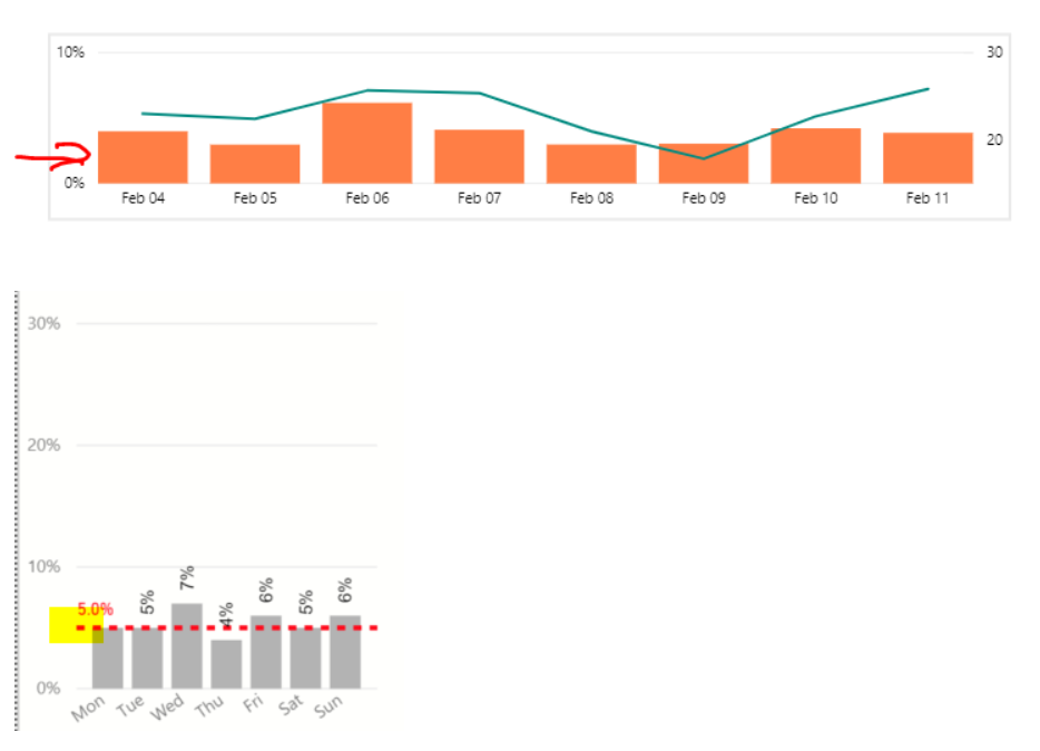
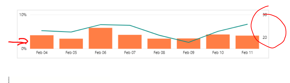
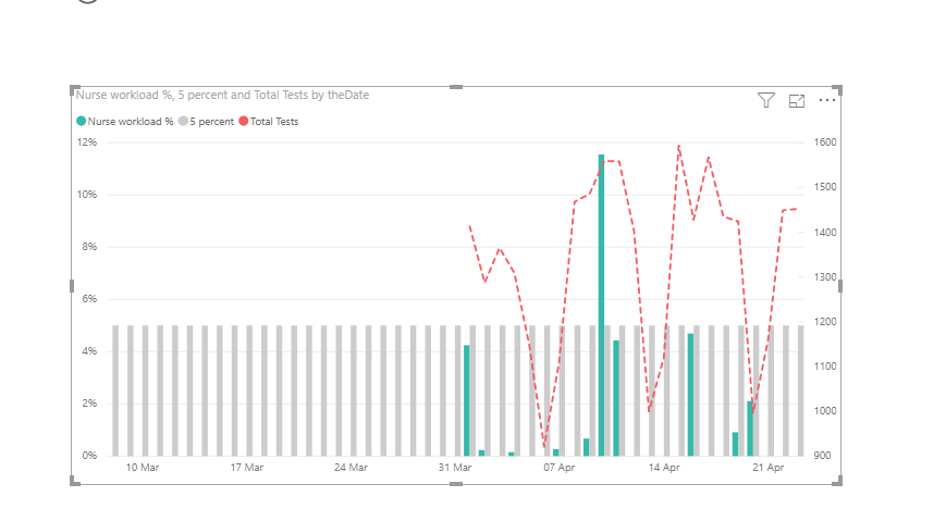
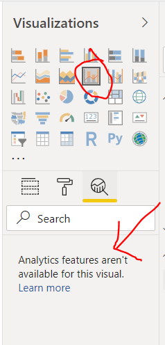
I just want to make sure I am not missing anything. The native Combo chart doesn’t allow me to draw constant line. It’s missing the analytics pane features… (see my 1st post pic)
You need to turn off the secondary axis in here
Hi Sam, In my scenario, I need the secondary axis for my graph. It’s a representation % on the left, and total # on the right.
and I need to draw a constant 5% red line for visual. PAS-New- AccessNumber attempt - added open orders compute.pbix (1.0 MB)
ok this shouldn’t be difficult then. All you need is a measure with 0.05 in it. Then change it to a %.
Alternatively you can just create a more dynamic calculation in a measure that will always equal the 5% and that way you don’t really need both axis
Sam
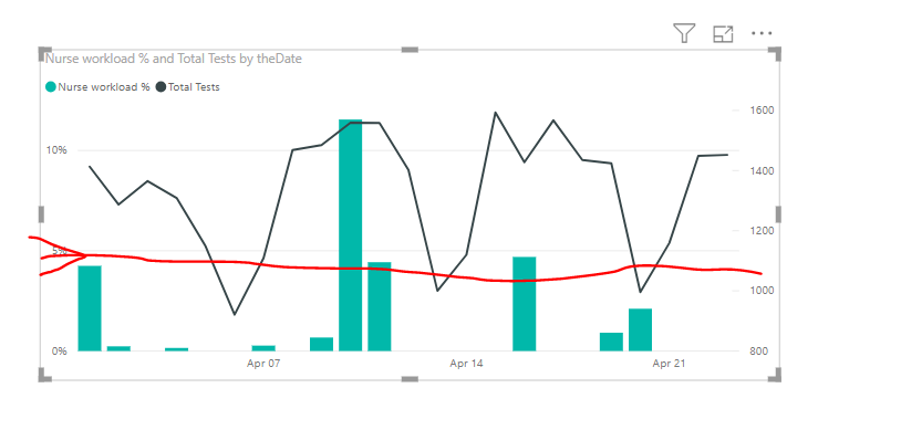
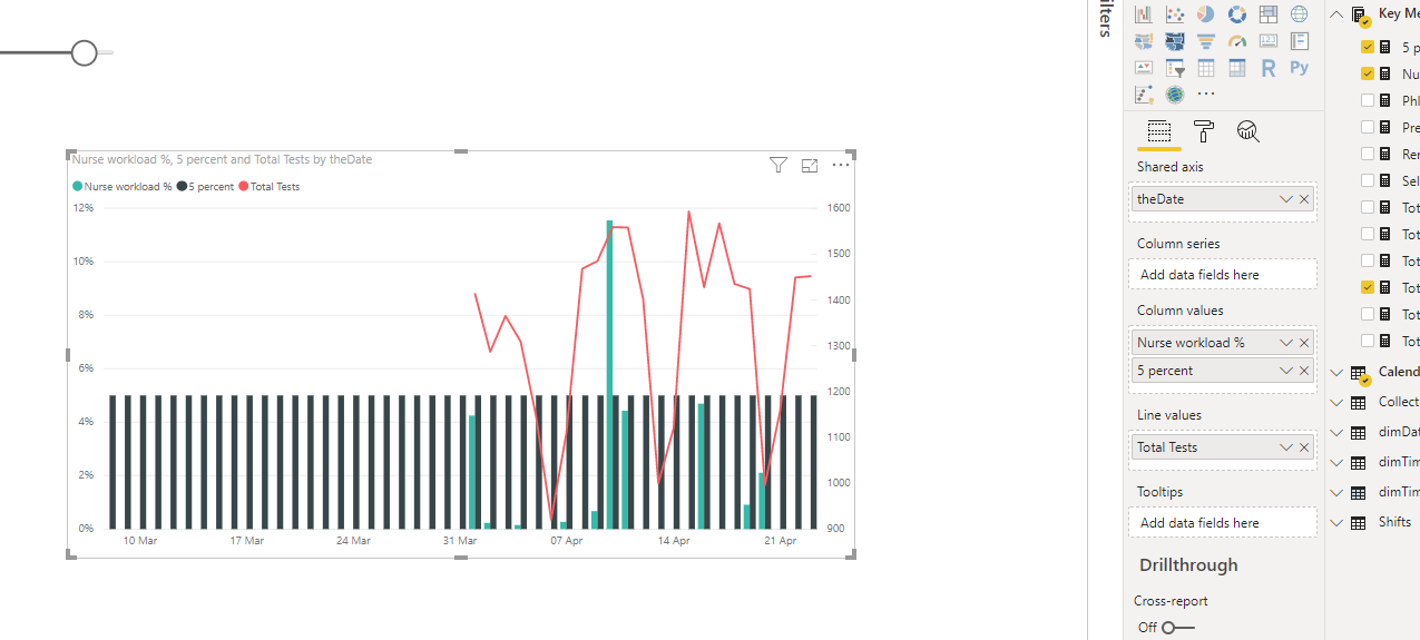
I did that, but the 5% line should ‘belong’ to Y-Axis (left) not the secondary Y-Axis. The 5% needs to be ‘line’ instead of bar in this case… 
It looks like you can only place one line value across the visual because the other line you’re using is for the other axis. (as in the %s)
How about just playing around with some colours and change to the visual when you have something that looks like the below.
Maybe to this
Just have a play around and see what works.
Sometimes there is limitations with Power BI but this one does make sense.
Sam