Allocation of Brand(Category) Budget using monthly seasonal fsctors

Hello: I have a couple of questions around process and DAX calculations for allocating brand budgets with monthly seasonality factors , allocating both $ and units down to the level of daily forecasts. My excel attachment may do a better job of highlighting the scenario I’m presenting to this forum.

I made up all the numbers in these files.

My question has to do with something in the budgeting sessions Sam created here on Enterprise DNA. I’m wondering how to best, using Power BI allocate an entire budget with monthly seasonality by brand? I attached a excel file with some examples figures in units and $ to for allocation. The seasonal factors mimic most closely, the toy industry. My attached excel file has two tabs to give a more tangible explanation. Thank you in advance for any input. Best regards, Bill

Budget Allocation Question w Seasonality.csv|attachment](upload://iyfCn8iBvCUjIzRQl6KbEKvkrJU.csv) (300 Bytes)

Hi,

Have you checked Sam approach regarding seasonal budget allocation. If not I suggest you to go through it. I am sure it will help.

Hello:

Thank you for your reply. Yes, I have watched the video and my question adds the additional complexity of not having an overall budget, but separate budgets for each brands. In a way it’s melding 5-20 total brands with different seasonality - which then could get pushed down to the sku level.

The video really is good but it’s these extra steps. Maybe it is if statements or switch true?

What do you or the forum think?

Thanks again!

Bill

@Whitewater100,

Interesting question, and thanks for attaching the relevant data. Unfortunately, it doesn’t seem your Excel file uploaded properly. Can you please retry, since taking a look at sample data will allow us to provide a more specific response.

However, without seeing the data my thoughts immediately turned to using CROSSJOIN of date at the month level with brand (call this Table A). If you go down to the SKU level, you could do a second CROSSJOIN of Table A with SKU. Alternatively, all of this could be done in Power Query as well.

However, once I see your data I’ll be able to provide a better response.

Hope this is helpful.

  • Brian

Hi Brian:

I did the example file over to sort of match a Power BI report that I’m attaching. The report isn’t great looking, more for trying things out like this forecasting and seasonality question. I will send the same two attachments over on gmail too in case they don’t load here.

I sincerely appreciate the help!

Best regards,

Bill

Budget Allocation Question w Seasonality.xlsx (12.0 KB) MyFakeRetailRpt.pbix (2.5 MB)

@Whitewater100,

Thanks - both files came through just fine this time. Once I recover from the retina damage caused by that electric green background, I will dig into this tonight and get back to you with a detailed response.

  • Brian

@Whitewater100,

Sorry for the slow response on this – got hung up on a big work deadline. Once I dug into your data, I realized while this would be doable in DAX, Power Query Is definitely the way to go. Here’s the outline of what I did:

  1. Brought the Annual Brand Forecast and Seasonality Profiles tables in from Excel and cleaned them
  2. For the Seasonality Profiles table, unpivoted all the columns except for Brand
  3. Did a left outer join of (2.) and the Annual Brand Forecast table into a new table called Monthly Fcast by Brand
  4. Created two new columns in this new table - one the product of the monthly seasonal factor by Brand and the annual $ forecast by Brand to create a monthly $ forecast by Brand. Then did the same thing for quantity by month and Brand.
  5. Just for good measure, I added a 1 to N index column to the final table. Figured it may end up being useful either for sorting columns in your visuals and/or in your DAX formulas.

Here’s what it looks like when completed:

From there, you can either create a physical relationship to your Calendar Table using a bridge table to deal with the many to many relationship on month, or just create a virtual relationship using TREATAS. In situations like this, I used to do the former but @sam.mckay has sold me on the latter approach. It’s really a matter of personal preference, since either approach will work fine.

I’ve attached my solution file so you can see the details of the Power Query steps.

I hope this is helpful.

1 Like

WOW. That is so helpful and no worries about the work deadline. I really appreciate you digging into this for me.! Because you did the spread within the tables it seems like that is all I would need to compare again actual monthly figures (in the practice sense). I’m not sure if you can help on one last thing I am trying to do with this. (Daily spreads of the now monthly budget amount. Google is blocking me sending you the file, so I will try sending my last issue on the forum.

I tried throwing in a measure to allocate the brands by day, which I obtained from one of Sam’s video’s to spread by day. I’ve attached the formula I was trying to replicate. But is only spreads the same amount ( total/365) for each day and doesn’t consider the different monthly budget total quantity. Just year.

Again I appreciate your help very much.

Best regards,

Bill

2020 Forecast Qty Allocation = vAR DaysinContext = COUNTROWS(‘20Dates’)

VAR DaysinMonth = CALCULATE(COUNTROWS(ALL(‘20Dates’)), VALUES(‘20Dates’[MonthnYear]))

VAR CurrentMonth = SELECTEDVALUE(‘20Dates’[ShrtMnth])

VAR CurrentBBrand = SELECTEDVALUE(‘Monthly FCast by Brand’[Brand])

VAR MonthlyBrandBudgets = CALCULATE([Total Budget Qty], TREATAS(VALUES(‘20Dates’[MonthnYear]), ‘20Dates’[MonthnYear]))

RETURN

IF( OR(HASONEVALUE(‘20Dates’[Date]), HASONEVALUE(Dates[MonthnYear])),

DIVIDE(DaysinContext, DaysinMonth, 0) * MonthlyBrandBudgets,

[Total Budget Qty])

My table looks like this:MyFakeRetailRpt - Solution (1)A.pbix (2.7 MB)

@Whitewater100,

Great - really glad to hear that was helpful.

Just a couple of preliminary notes first:

  • Don’t worry about sending files through Gmail or other direct means. Per the rules of the forum established by @sam.mckay, all business has to be conducted via the forum. In addition to answering individual’s questions, the goal of the forum is to serve as a knowledge base for all members.
  • Be sure to mark your date table as a date table, and validate on the date field. This is an important safety check to ensure your time intelligence functions will work correctly.
  • Be sure to turn off the “automatically detect relationships” options. I noticed your current file had a bunch of nonsense relationships connected to the tables we created yesterday, and I’m certain that the autodetect is the culprit. If Power BI is a masterpiece (and I think it is), autodetect relationships is the mustache and Groucho glasses scrawled on the painting by vandals when the security guard was asleep. I removed all these relationships, since our monthly budget forecast table is a disconnected supporting table that we will link via virtual relationships using TREATAS.

OK - on to the daily allocations. You are very much on the right track here, but veered off course in a few important but easily remedied ways.

  1. If you notice, your Total Budget Qty never varies, despite looking like it’s displayed in context individual by date. The reason is, as mentioned above, that there is no physical relationship between this forecast table and the date table. If there was, your measure would work perfectly:

Total Budget Qty = SUM(‘Monthly FCast by Brand’[Brand Qty FC])

However, we now have to create the relationship virtually via TREATAS within the measure:

Total Monthly FCast Qty TREATAS = 

CALCULATE(
    SUM('Monthly FCast by Brand'[Brand Qty FC]),
    TREATAS(
        VALUES( '20Dates'[MonthName] ),
        'Monthly FCast by Brand'[Month]
    )
)

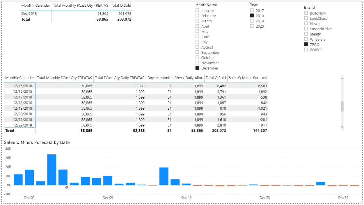
And Boom! With three short additional lines of DAX, we’ve now both created the virtual relationship between 20Dates and Monthly FCast by Brand, AND solved our many-to-many relationship problem on month name. Our forecast budgets are now varying properly by month:

image

  1. In terms of the daily allocation, you correctly tried to make the virtual connection using TREATAS, but connected the wrong element:

TREATAS(VALUES(‘20Dates’[MonthnYear]), ‘20Dates’[MonthnYear]))

What this basically did was connected the unique MonthnYear values from the 20Dates dimension table back to itself. While this surprisingly didn’t throw an error message, it also didn’t really do anything. Instead the unique MonthnYear values from the 20Dates dimension table need to be connected to the appropriate matching column in your fact table:

TREATAS(
VALUES( ‘20Dates’[MonthName] ),
‘Monthly FCast by Brand’[Month]
)

With this change, as well as changing the reference to the measure in 1. above, the revised daily allocation formula now runs like a champ:

Total FCast Qty Daily TREATAS = 

VAR DaysinContext =
    COUNTROWS ( '20Dates' )
VAR DaysinMonth = [Days in Month]
VAR CurrentMonth =
    SELECTEDVALUE ( '20Dates'[MonthName] )
VAR CurrentBBrand =
    SELECTEDVALUE ( 'Monthly FCast by Brand'[Brand] )
VAR MonthlyBrandBudgets = [Total Monthly FCast Qty TREATAS]
    
VAR DailyAlloc =
    IF (
        OR (
            HASONEVALUE ( '20Dates'[Date] ),
            HASONEVALUE ( Dates[MonthnYear] )
        ),
        DIVIDE (
            DaysinContext,
            DaysinMonth,
            0
        ) * MonthlyBrandBudgets,
        [Total Monthly FCast Qty TREATAS]
    )

RETURN
DailyAlloc

Now, it’s a pretty simple matter to get our Actuals - Forecast by just subtracting the two measures. The only complexity here is adding an ISINSCOPE test to determine whether to return the daily or monthly value, depending on the row header of the matrix visual:

Sales Q Minus Forecast = 

IF(
    ISINSCOPE( '20Dates'[Date] ),
    [Total Q Sold] - [Total FCast Qty Daily TREATAS],
    [Total Q Sold] - [Total Monthly FCast Qty TREATAS]
)

Here’s what it all looks like when put together:

Honestly, I steered away from TREATAS for a long time, because I didn’t fully understand what it was doing or how to use it, and the Microsoft explanation is complete gibberish. However, Sam’s video that I posted above does a fantastic job explaining it, although you may have to watch it two or three times (I did…) to pick up all the nuance. However, it’s definitely worth the effort since you can do some nearly magical things with it once you understand how it works.

Long post, but I hope this is all helpful. Full solution file posted below.

1 Like

Hi Brian:

This is amazing input and thought. Great greatness!!

I just got home at 10:00 p.m and and brain cells depleted. I wanted to thank you immediately and will dive into this tomorrow. Who ever you do wok for must be more than pleased! I’m truly thankful.

Best regards,
Bill
P.S. I’ll think of something clever to say tomorrow, or try…

@Whitewater100,

Wow – thanks! This forum has been such a great resource and a huge help to me that it’s nice to have the opportunity to pay it forward a bit (and besides, who doesn’t love toys?..)

If you have any other questions after working through the revised example, just give a shout.

– Brian

Hi Brian:

That was great work. It took me a while and I’m closer to understanding the formulas but not ready to go without these aids you have provided. It will probably be enhanced if I create an append file to sales 2020 to do some current year comparisons. You set up nicely with the comparison to 2018 and the slicers. I had no idea the resource forum could be so helpful.

Thanks again. I’m going to digest all this cool stuff over the next days. Best regards, Bill

@Whitewater100,

Funny you mention 2020 current year comparisons. As I was working through the most recent solution, I started with current year in mind. I wrote the DAX code and it returned nothing but blank values, checked it again and still blanks. Finally I checked the sales data and realized there was no 2020 data. Sometimes it’s the simplest things that get you…

  • Brian

Hi Brian:

I think i owe you a reply. Your input was fantastic and I really appreciate it. Together with what I have been learning thru Sam’s classes I was able to create some reports. I attached one. How does this one look - as for being professional and helpful? Have a great rest of your week.

Best regards,
BillForecast Allocation Series Three.pbix (913.9 KB)

@Whitewater100,

Looking at your report, you’ve got a lot of great information here and behind the visuals, your measures are really well-organized, so you’re in a good position to develop effective reports. Some constructive suggestions:

  • Think about the “story” that you want to tell on each page - where you position your visuals, how you format them, and the relative size you allot to them tells the viewer a great deal about what you think is most important. For example on page 1, I definitely take away that you are telling me the product performance table is the most important element on the page. (Note: think about a different format for your date field in this table - the longform with day spelled out takes up a lot of space and IMO isn’t very readable)

  • Give careful thought to font and color choice - here, the wide mix of fonts is pretty distracting to me, and personally I would go with a dark background theme here. Look how changing theme to the canned “Innovate” dark theme makes the graphics “pop”:

  • I don’t think the gauge charts are particularly effective in conveying progress to a goal. I might instead consider a bullet chart visual with a clear target marked, and present the information both in terms of raw numbers and percentage progress to goal. Here’s a terrific guide that I use in trying to find the best visual for the type of information I want to convey:
  • While the slicer panel is a cool technique, I’m generally not a fan of its use since I think it’s important for the viewer to be able to see what the filter context currently is. With the slicer panel, once you make your selections and re-hide it, it’s not immediately apparent what results you are looking at. You’ve got plenty of real estate left on the page to include the slicers on it directly. Also re: slicers, if you have a report-wide filter set for year, why do you also have a year slicer?

  • Not enough space is allocated to the Budget Allocation to Sales visual, since it’s impossible to read the x-axis without mousing over each individual element.

I would strongly recommend going through this course start to finish:

@sam.mckay has put together a terrific set of tips and best practices that will immediately elevate the visual quality and effectiveness of your PBI reports.

Finally, here’s a site I found recently that I think is very useful for developing attractive color themes:

As I said up front, the analytical foundation of your reports is strong – which is the hard part. With some tweaking per the above videos and recommendations I think you will be able to develop a terrific report from this.

Hope this gives you some useful food for thought.

  • Brian
1 Like